.gif)
.gif)

There’s a lot that goes into the psychology of color and how different shades and combinations can impact the emotions of your audience. If you’re saying one thing in a presentation and your color combination is saying something different, your audience will feel conflicted. Your color palette speaks before you do. That’s why picking your presentation theme is just as important as how you structure your slides. Color influences— and greatly affects— the perception of your presentation and the power of its message.
Picking colors that complement each other is key for various reasons. Color impacts the readability of your slide and can dictate whether or not your audience will retain the information you’re presenting to them. In fact, research shows that people can recall color schemes better than they can even recall objects. With that in mind, it’s a good rule of thumb to opt for contrasting colors that complement each other and make the text on your slide pop. Many designers will tell you to pick two colors that sit opposite from each other on the color wheel in order to achieve the right balance of harmony and contrast.
All that to say, the weight of the success of your presentation lies in the hands of your color combinations (among other things, of course).
10 Color combinations we’re loving for presentations
Try one of these color combinations for your next presentation to grab your audience’s attention and improve retention rate.
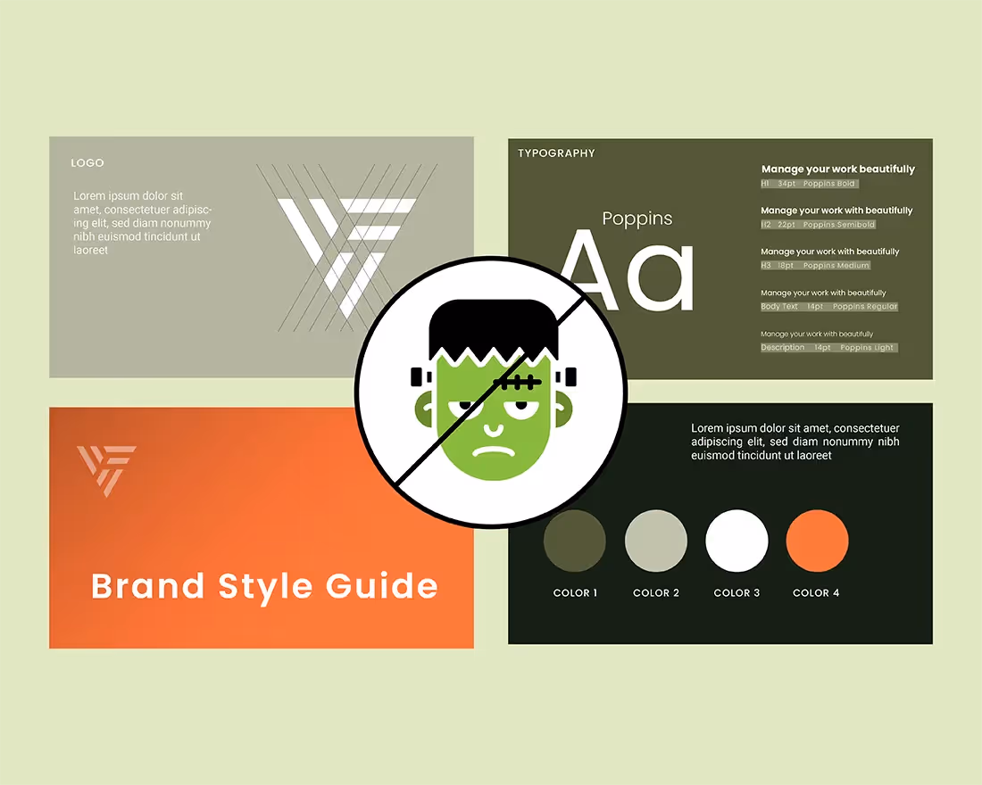
Your brand colors
If you are creating a presentation for business, our first recommendation would be a color palette that reflects your brand colors. You can customize any theme and replace the colors with your own by clicking on the color wheel icon on the left hand side and selecting edit theme. From there you simply add your own colors by inserting your unique Hex color codes.
Magazine
The teal and golden colors of the Magazine theme borrow elements from the 1950s and 60s, and give off a modern, vintage mood. The color scheme is a bit muted without compromising the wow-factor of the bright colors.
Pop
The Pop theme is exactly what it sounds like - youthful, trendy, and fun. With purple, blue, and an orange-red color it makes your presentation more playful without lacking professionalism. The colors complement each other in a way that makes the audience feel enthusiastic and creative.
Moody Blues
The color blue is oftentimes associated with freedom, calmness, trust, peace, inspiration, and loyalty. For companies pitching themselves or their brand, it makes sense to include blue in their presentation. The Moody Blues theme incorporates three different shades of blue that complement each other in a way that provides enough diversity and contrast.
Cheeky
The Cheeky theme has bits of retro inspiration, while still being modern in its own right. The color yellow yields feelings of creativity, happiness, and optimism. And this theme pulls in shades of the yellow family for an overall warm and welcoming look.
Museum
Museum is both bright and subdued with its warm and cool tones. While the colors are vastly different, the combination of mellow and bold contrast one another to make your slides stand out.
Desert
Red can have some negative connotations, but it also represents courage, power, and passion, which are extremely strong emotions for a brand to evoke from its audience. The Desert theme pulls colors from the red family that brings to mind a warm, calming desert sunset.
Space
In the Space color combination you have a more muted green with a bold orange and gold. It’s an unexpected combination that works really well together and is versatile enough to fit your story.
Bold
The Bold theme is true to its name: bold. But it’s not over the top. Because of the blues and soft coral, it boasts a calming element that will make your audience feel more at ease as they’re following along with your presentation.
Neutrals
Nothing says modern like a mix of contrasting neutral colors. We have pre-built themes like Monochrome and Newsprint that offer different shades of blacks and grays, but you might also experiment with light neutrals like a sandy tan or white.
Apply it to your presentation theme
All of the above can be applied to your deck by selecting a theme for your blank presentation. You can opt for a different theme, or customize one to fit your own branded needs, by clicking the color wheel on the left hand side of the screen and selecting edit theme. From there you can choose from various palette options on the drop down menu or upload your own colors before applying it to your deck. Once you update your theme it will automatically be applied to each slide in your presentation so you don’t have to manually tinker with colors moving forward.
If you do choose to customize any of our pre-built themes, it’s important to keep the rules of color in mind so that your presentation remains legible and professional.
You can do too much when it comes to color. For example, it can be hard to read text on backgrounds with really brash colors, and you can easily make a mess of your slides by combining the wrong shades. When in doubt, we recommend keeping your palette simple. Two colors can be enough and still make your slides stand out. If you want to experiment with different colors and theme styles you might try including a bolder color for smaller accents and a more toned down color for larger shapes, or a gradient (ombre) palette.


.gif)