


Here's the scenario: Your friend invites you over for a dinner party at their new house, after months and months of talking up how gorgeous their new place is decorated. You walk in and gasp—but not out of delight. There's pattern upon conflicting pattern; the paint colors are so bright they give you a headache; and that oversized sectional sofa is just so brown. You find it all to be a bit repulsive, and can't believe you are interpreting the interior design in such a different way than your friend. After all, good design is good design, is it not?
Actually, the idea of what is, and what is not, good design is pretty subjective. But thankfully, there are some ruling authorities out there; people that have proven with their own work that certain designs hit the bullseye (while others clearly miss the mark), so we can better differentiate between the two.
One such authority on good design, German industrial designer Dieter Rams, went so far as to outline 10 specific design principles (below) that must be followed in order to achieve design greatness.
But since we’re not all professional designers, a little more context would help us understand each principle. It would also help to know how to apply it to our actual lives—be it interiors, product, graphic, UX, or even culinary arts.
Luckily, we just launched an entirely new brand identity over here at Beautiful.ai, so we’re prepared to provide real, tangible examples of what good design looks like when Dieter’s principles are applied. This way, you can see good design come to life (#humblebrag) in our new logo, website overhaul, updated illustration style, fresh color palette, modern font style, and more. So let’s break each of Dieter Rams' 10 Design Principles down...starting with the first five (the second half are here):
#1: Good design is innovative.
Irish poet and playwright Oscar Wilde once said that “Imitation is the sincerest form of flattery that mediocrity can pay to greatness." In other words? Copycats have very little talent (he said it, not us). It’s no wonder that Dieter requires innovation as the first of his ten basic principles. Some synonyms for innovation include change, transformation and revolution—which we admit is easier said than done.
However, if you study Dieter's designs, they weren't revolutionary in a loud way; they were evolutionary in a subtle and thoughtful way. They were improvements on what had come before, and a nod to what was to come.
We'd like to think our new brand identity could also be described this way. While we are deeply grounded in the classic elements of design, our product (Design AI presentation software) was made for a new, more progressive generation. And we wanted our new visual identity to reflect that as well; the end goal being a more modern brand that truly embodies the future of work.
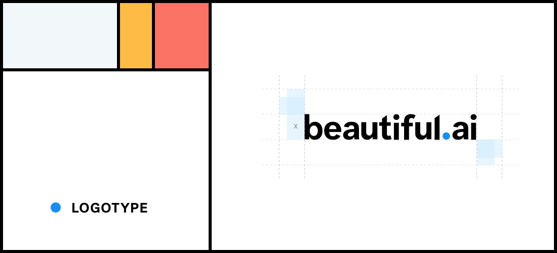
And we started with the logo.

The old logo (above) was clean, simple and legible—all good things. We used a capital Montserrat font so the visual weight was evenly distributed between each letter. But we can all agree that it lacked personality, and design "edge."
We knew we wanted to ditch the caps and find a new, more modern typeface, but the challenge was finding symmetrical balance with the word Beautiful. As you can see, the first part of the word is far heavier than the last, with all the round vowels and big capital B. So we lowered the B; applied some artful kerning expertise; connected the “ai” with the rest; and placed a delightful little dot in between the first and last parts of the logotype.
Then we had to decide on typeface. We tried on basically every sans serif font, from Helvetica to Unica to Post Grotesk. The last one felt the closest, but we still cut off a tiny bit of the "t" and the "l" for that "edge" we craved.
It was actually a painstakingly detailed process, but one we felt was worth it.
#2: Good design makes a product useful.
Dieter Rams elaborates on this design principle by saying it must be "not only functional, but also psychological." In other words, good design solves a problem.
Anyone that’s tried Beautiful.ai can agree that our product has succeeded in being "useful." But that doesn't mean the brand is off the hook; every element must also adhere to the same principles of design as the product, for the sake of consistency.
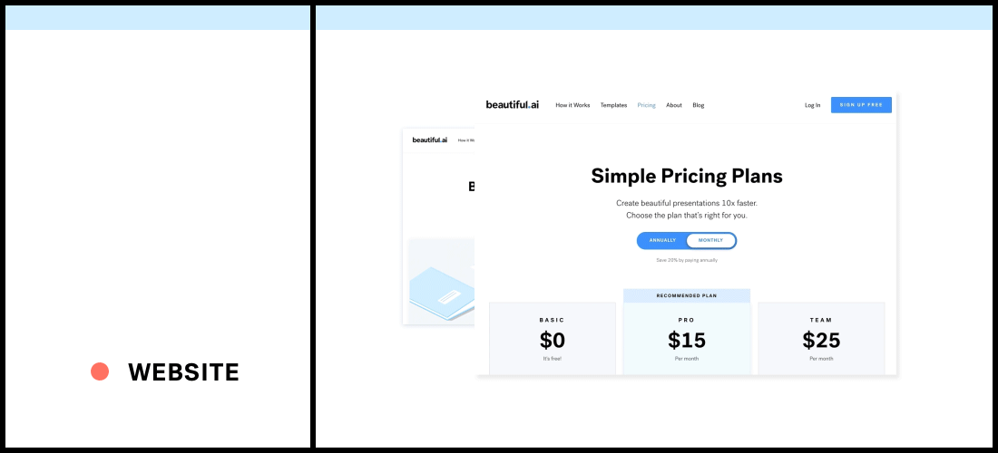
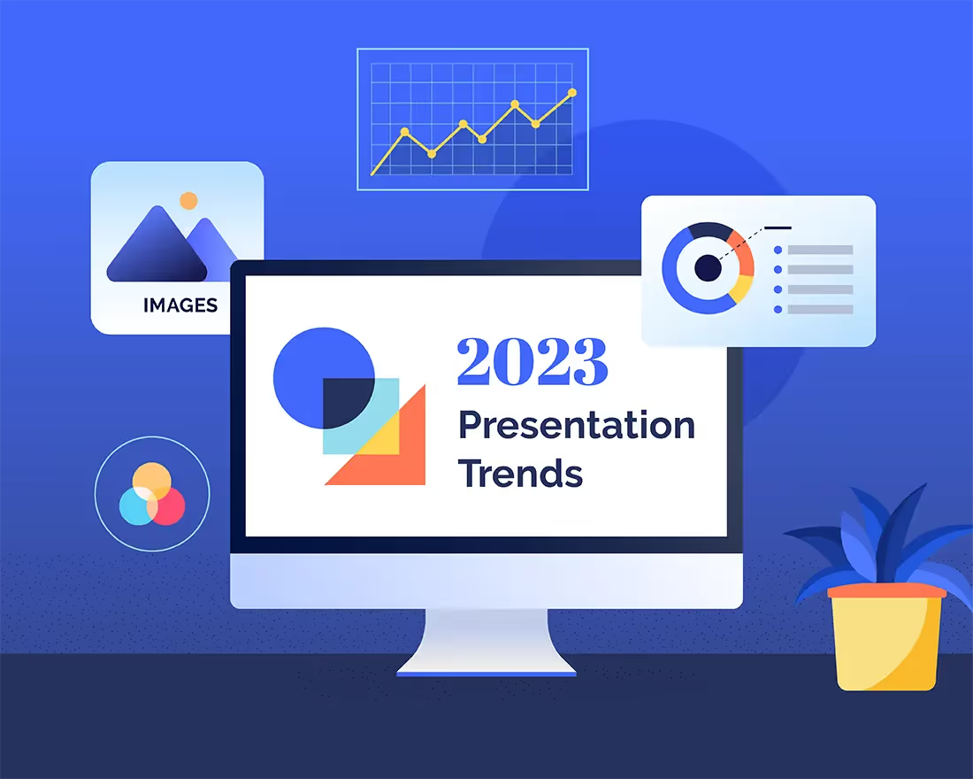
In terms of the new Beautiful.ai web design, that meant adopting a utilitarian but thoughtful visual hierarchy; a well-designed layout with delightful animations and illustrations; minimal use of color, lots of negative space for breathing room; clear calls-to-action so the user experience is intuitive...aka new visitors know what step to take next (Log In, Sign Up, Get Started, et cetera).
We hope you find our new website to be both visually pleasing and useful at the same time.
#3: Good design is aesthetic.
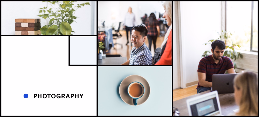
According to Dieter, "products we use every day affect our person and our well-being," and we wholeheartedly agree. Good design should be well-executed, aesthetically consistent, and it should evoke some sort of emotion. What better way to do that than through the use of high-quality imagery?
If you use Beautiful.ai to create your presentations, you know that there are hundreds of thousands of free stock images at your fingertips to choose from. They are all professional photos, and are worthy of standing alone as a focal point on a slide so you are able to keep your text minimal (which is Rule #1 of Presentation Design).
When it came time to freshen up our brand photography for our relaunch, we took this principle of design—aesthetic—very seriously, and scrapped all the stock photography we had used on our previous website. Not only did we hire a professional photographer to fly in and take original photos for us, we partnered with not-so-stock photo providers like Stocksy and Twenty20 for other creative needs here and there.
"I really wanted our blog to have an artistic, editorial feel," says Beautiful.ai content director Diana Bitting. "We have a next-gen product that makes presentations both enjoyable to create and delightful to experience. We wanted to encourage that more positive view of 'presentations' through photography that depicts a new, improved workstyle."
In our new brand identity, through thoughtful and relevant imagery, we were able to make our website and marketing platforms more elevated, more sophisticated, more emotional (and therefore, more aesthetic). All the makings of a great brand.
#4: Good design makes a product understandable.
Design isn't good if it can't be understood—yes or yes? We feel this principle is pretty straightforward: a fork is a fork, a table a table, a laptop...you get the point.
Truly understandable products (cough, Beautiful.ai, cough) are intuitive and easy to adopt. Say you’ve used PowerPoint to create your presentations your Whole. Entire. Life. You must understand, then, how some products can be very difficult to understand.
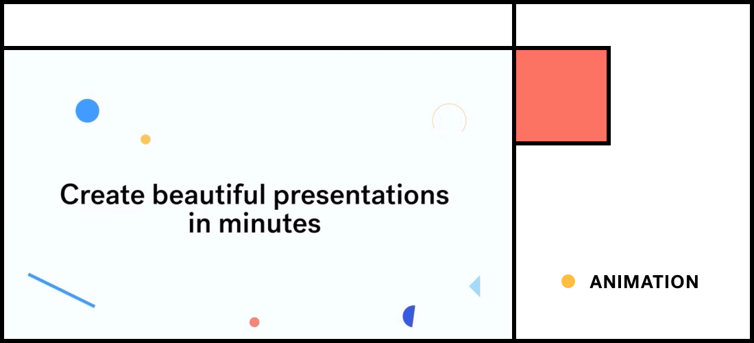
Our new brand animations are super helpful in this case, because they act as mini demonstrations of our product. They tease out some aspects of our product, and help bring it to life in simple, digestible tutorials.
These bite-size animations are a brain-friendlier approach to cognitive load time for new information — giving people the comfort and delight of finding out about all the cool features under the Beautiful.ai hood one at a time. Thus, they avoid information overload and “new tool anxiety.” Easy peasy.
#5: Good design is unobtrusive.
Being unobtrusive is another way of saying understated, clean, minimal...aka lots of white space, less text, and conservative use of graphics and images.
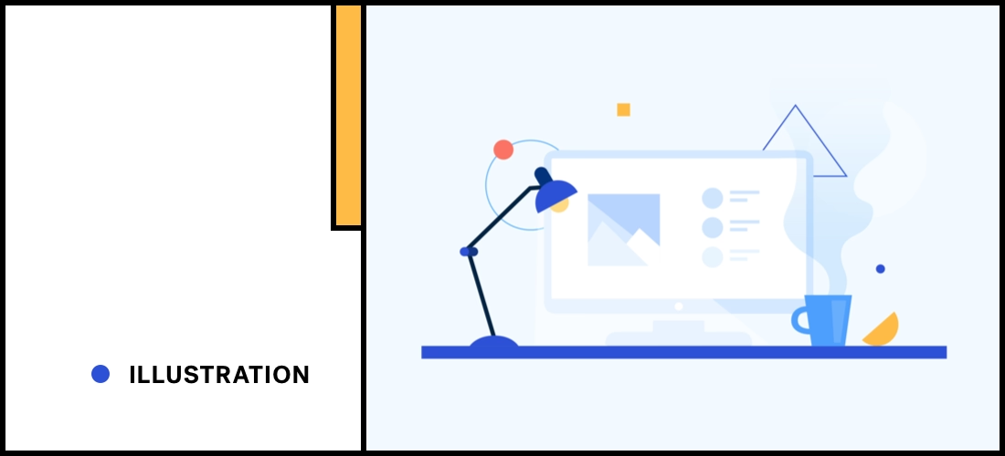
Our new brand illustrations and mixed media creative is a good example of adding fun and engaging visual design elements that are a subtle, unobtrusive method of communication.
“Illustrations communicate what words and photos cannot, and can deliver a message that resonates better with the audience,” according to Beautiful.ai Art Director Anuja Kanani. So, basically, our brand animations help to tell our story in a more concise way.
This type of effective design allows us to express ourselves, and our product, in a less obtrusive way than a loud, busy graphic would.


.avif)
.gif)
