
Nobody is perfect, just as there is no such thing as a perfect presentation. Even the most talented TED Talks presenters could improve in some way or another. That being said, there are ways to make a presentation that audiences will love, and there are presentation habits that audiences hate. The key is understanding the difference between the two.
Envision the last presentation you watched. Was it exciting, informative and inspirational, or was it dull, confusing and irrelevant? If you answered the former, then you can probably identify what made the presentation exceptional. But if you answered the latter, you might not know exactly where the presentation was lacking.
In order to improve public speaking and presentation skills, you’ve got to know what qualities audiences hate, or you won’t know what to avoid. Check out the following 10 things your audience hates about your presentation, along with tips on how to fix them.
1. You’re using an outdated software
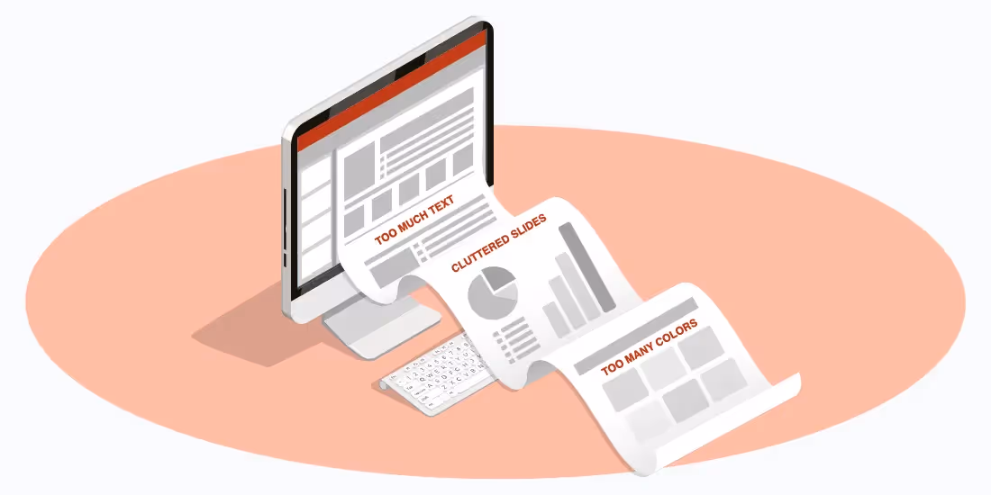
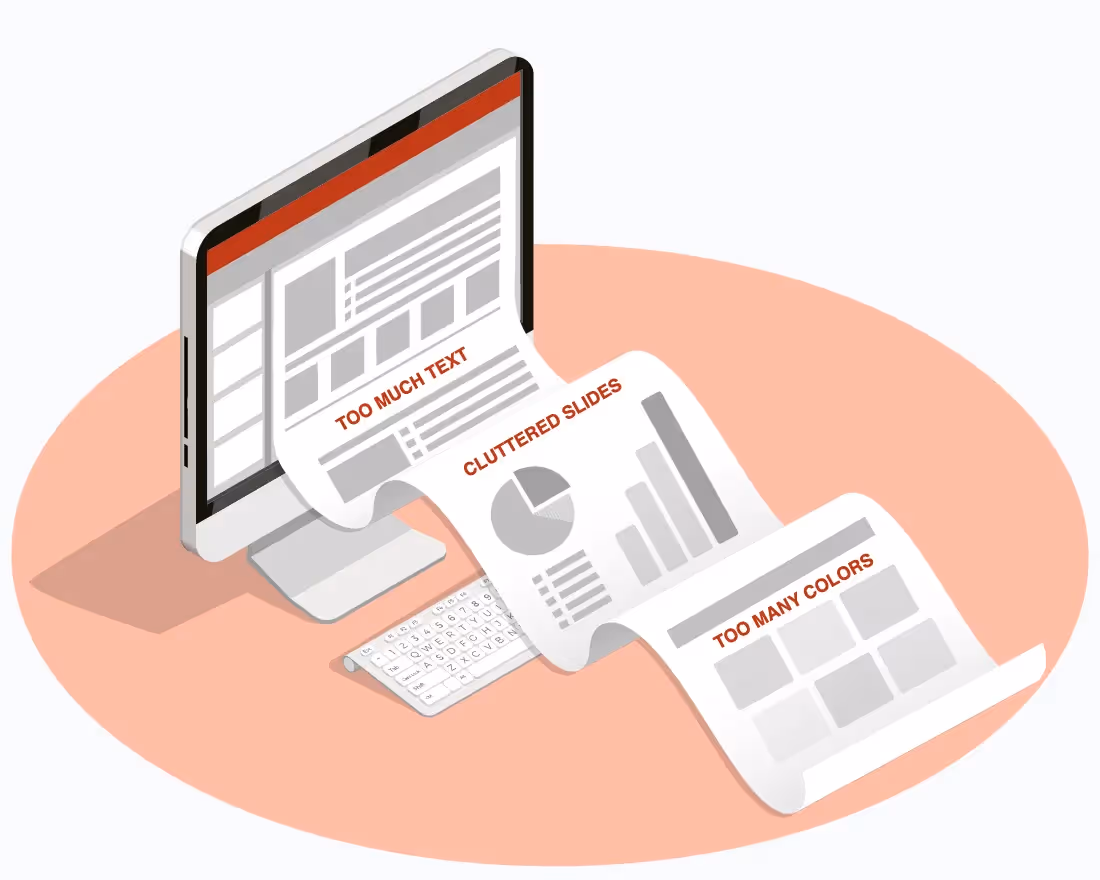
We’ve all seen some pretty lousy slide decks. After all, PowerPoint has been around for more than 30 years, and many of today’s presentations aren’t strikingly different from their earlier counterparts. Microsoft’s presentation software isn’t just responsible for millions upon millions of sub-par frankendecks, either. Simply using PowerPoint can be a huge endeavor, with countless hours spent trying to align textboxes and format margins, as well as all the other design details that can make or break a presentation.
In the past, people didn’t have a whole lot of choice of presentation design software, but we don’t live in those times anymore. Yet the old standby still boasts more than 500 million users— users who don’t know what they are missing! There are so many cloud-based PowerPoint alternatives available now, even the most amateur of presenters can create top-notch, professional-level presentation designs in no time flat.
Beautiful.ai slide decks are designed especially well, thanks to artificial intelligence. The AI is our special sauce that automatically applies principles of good design to smart slide templates, ensuring professional quality presentations every time. In order to stay relevant, it might be time to update your presentation software.
2. Your design lacks focus
Speaking of PowerPoint… we’ve all seen some lousy slide presentations, including those that are either cluttered or contain far too much information—or both. The reason it’s called presentation design is because you’re actually supposed to design the slides, not just throw elements together on your screen.
Beautiful.ai users, however, have the benefit of more than 60 different smart slide templates. Just add your content, and watch our AI automatically adjust the layout based on professionally recommended principles of good design. You don’t have to have any experience in graphic design to create presentations that are engaging, impactful and “beautiful.”
3. Your colors are too busy
Amateur presentation designers often believe that their color palette is merely a matter of personal choice… and they couldn’t be more wrong. Colors inspire emotions, and their use can change the entire message of a presentation. Think about it: would you use a red-based color palette for a presentation about ice and snow, or would you use blue for a presentation about the sun?
At the same time, color palettes should remain simple, based on no more than three or four coordinated hues. Too many colors— or colors that don’t mesh— and your entire presentation design looks like a group of random junk stacked together on a page. Beautiful.ai users can create their own customized color schemes, or they can choose from a variety of preset presentation themes, created by our lead designer and based upon industry trends.
4. You’re talking too fast
It’s not uncommon for presenters to speak too quickly— after all, public speaking in general can provoke its fair share of anxiety. Unfortunately, the result is a presentation that audiences can’t follow or understand. It’s vital then for presenters to avoid rushing through their presentations and instead speak more slowly.
While some people counter their speed speech by anxiety-reducing exercises, others slow down by designing simple slides to accompany their speech. While they wouldn’t want to just read their slides, they can discuss each point individually, pausing to transition slides in between talking points.
5. Your message is getting lost in translation
One surefire way to lose an audience is for your message to get lost in translation. If too much data or too many details are thrown at audiences in short order, viewers are going to have a hard time following along and understanding how it all fits together or what it means to them. One way presenters more clearly communicate their messages is through storytelling. People have been telling stories for millennia, thus we are hard wired to tell tales and follow along.
Relatable and moving stories continue to be an effective way to connect people with ideas and make presentations meaningful and memorable. Storytelling can be even more effective when visual aids are added. After all, isn’t a picture worth a thousand words?
Visual storytelling combines our love of stories with our inclination toward graphics, and it is sure to transform a blah presentation into a source of inspiration. Many Beautiful.ai presentation templates are already designed to showcase stories, so let your inspiration shine!
6. Your presentation is too long
If you’ve given many lengthy presentations, you are well aware that the average person can only pay attention for about 18 minutes before falling asleep… er, we mean before getting bored and stop paying attention. You were just resting your eyes, right? Yeah, us too.
It is true that the attention span the average audience can comfortably hold during an engaging presentation ranges from 18 to 20 minutes. If it’s a boring presentation, that time is probably closer to about 5 minutes. It’s important to keep your presentation short and sweet, just long enough to cover your talking points and not a single slide longer. A good rule of thumb is to stick to Guy Kawasaki’s 10/20/30 rule— a presentation should have about 10 slides, last no more than 20 minutes, and contain no font smaller than 30 points.
Presentation designers who are unsure of the optimal length can also take a look at Beautiful.ai’s presentation templates for inspiration.
7. Your slides are dull and boring
People easily grow bored with slides full of text and figures. Humans are visual creatures. When our eyes aren’t attracted to what they see, they tend to wander. Visual storytelling is an effective way to hold an audience’s focus. Just consider that online articles featuring images attract 94 percent more views than those with text alone.
Beautiful.ai users can include all sorts of visual aids in their presentations. Not only does the platform offer a free image library with hundreds of thousands of quality images, icons, and logos, but users also can include video and add infographics or animation to their presentations to optimize engagement.
When animating slides, users can control the speed, the order, and whether the animations build automatically or advance with a click. Many smart slides featuring infographics also can be animated to capture an audience’s attention.
8. Your design isn’t cohesive
Not only must presentation designers ensure each slide is balanced, focused and uncluttered, but they also must give their presentation a cohesive design. Audiences aren’t going to follow along and connect one idea to the next nearly as well if the slides don’t look like they belong together.
Beautiful.ai users can set a custom theme for their design, which automatically applies the same fonts, colors and other basic characteristics to each slide. Those who aren’t even sure where to begin can rely on one of our preset themes or presentation templates.
9. Your data isn’t meaningful
Numbers can tell a story, but they rarely do it alone. Audiences are going to have a harder time comprehending what all your data means if you just rattle off a list of facts and figures. Visual aids like infographics, charts and graphs give all of that data meaning.
Beautiful.ai users can not only choose from a variety of smart slides with charts and infographics, but our AI will ensure that each visual aid is simple and attractive yet plenty informative. Presentation designers can even add some extra flair by controlling the animation of the infographics.
10. Your presentation lacks a thesis
We’ve discussed how each slide, as well as an entire presentation, needs a cohesive design, but it also needs a cohesive thesis. What ties the whole presentation together? What overall message do you want your audience to receive? Every slide in a presentation should serve the purpose of supporting that thesis.
Presentation designers can check out Beautiful.ai’s presentation templates for further ideas and inspiration on delivering a unified and cohesive message.


.gif)