
.gif)
.gif)

In a highly-saturated digital world, the pressure behind visual assets is skyrocketing. Unless you’ve been living under a rock, you’ve likely perused a seemingly-perfect Instagram feed that housed hundreds of cohesive, beautiful images. Whether it was a business, or an individual, branding and aesthetics are critical when building out a successful Instagram. Why? Instagram is centered around storytelling, and images tell a story. Presentations are no different.
Storytelling and branding go hand-in-hand. Branding is how you want to be perceived by the outside world, and how you package up your story and deliver it to audiences can single handedly affect your brand image. It’s no wonder why marketers put so much effort into company branding. It’s the essence of what they do. Every piece of content, digital design, sales collateral, and client-facing communication is crafted to tell their story in a way that supports the overarching brand of the company. It extends from social media to sales pitch decks, and encompasses everything in between.
The constant in branding and storytelling is imagery. When people look at an image associated with your brand it should be recognizable and familiar. We’re visual learners after all. But each image should also have a deeper meaning.
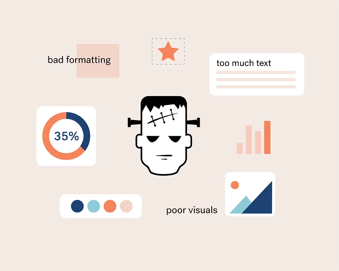
Images say what words can’t. Your audience should be able to tell within seconds what message you’re trying to convey with the image you chose. Specifically in presentations where you are trying to keep the text to a minimum, an image can be the difference between a message that hits home or one that falls short.
They’re important, so how do you choose the right image for your story? Consider these seven things when browsing for an image to include in your next presentation.
Consider the overarching message
First and foremost, make sure it makes sense. If your presentation is about the solar system, a picture of your favorite food has no business being included in your deck. Consider the overall message of your presentation before you select images. Any image you include will likely help your audience retain the information more easily, so it should be relevant and meaningful to your story.
Evoke the right emotion
Just like colors can evoke emotion, images can affect the mood of your audience. Something dark and moody might have a more serious denotation, while something bright and colorful might trigger serotonin. Depending on the tone of your message, your image should follow suit. Adding images with people adds a human element to your slide that will help your audience resonate with your message, but you should consider the mood of the subjects in the photos.
Keep it on brand
Branding includes everything from fonts and colors to photography styles. Your images should be consistent with photos used in other marketing campaigns and sales collateral. There are many different types of photography styles from light and airy to moody and trendy, and it’s important to pick a side to keep things cohesive and on brand.
Ditch the pixelated pictures
Low-quality images are so 2009. You can never be certain what size screen people will view your presentation on so the quality of your image matters. In Beautiful.ai we have a free image library with hundreds of thousands of high quality images to choose from. Simply browse the free library, select your photo, and resize it to fit your slide. There’s something for every story, and every one— and it’s always high quality.
Avoid stale stock images
In any free image library you’ll see a mix of cheesy stock images and beautiful lifestyle shots. Every image has a purpose, but for the sake of your business we recommend avoiding stiff stock images. You know the ones: a staged photo of a smiley guy sitting at his desk with a coffee mug in one hand that says “have a great day” plastered on the front, while he gives a thumbs up with his other hand. If you want to catch the eye of your audience, opt for something more meaningful with more dimension instead.
Leave room for text
If you need to add a title, or subtitle, to your image slide you might want to choose an image with more white space. In a busier photo, it will be hard to make text overlay legible which will only frustrate your audience.
Of course, our Smart Slide templates can help you when you’re stuck. Templates like our headline slide or image grid makes it easy to add both an image and text to a slide without compromising the impact of the photo.
Don’t be afraid to use more than one
We preach that less is more on a daily basis. And while that’s true for presentation design, sometimes two images are better than one. Using a series of images can support your story in ways that text might not be able to. Our image grid slide template is great for making a collage on your slide without jeopardizing the professionalism of it. Gone are the days of copy-and-paste collages that look cluttered and messy.


.gif)

.gif)
