

Think back to the social media landscape of 2009. Myspace was on its way out (sorry, Tom!), Twitter was just beginning to dominate, and Facebook had made its move toward the mainstream. The first Android smartphone had been on the market for only a few short months, and the iPhone had launched about a year before that.
With new devices came new ways for users to interact with social media, and smartphones’ built-in GPS technology inspired an emergence of location-based social networks. As buzz grew around apps like Gowalla and Foursquare, the ability to “check in” to locations and see who else had visited venues was expected to trend well beyond 2009.
Most of those early proximity-based social media platforms soon fizzled out of existence, however, but Foursquare impressed users by gamifying the entire process with points, badges and even location mayorships. The platform continues to dominate its niche in 2020.
Foursquare debuted at the 2009 South by Southwest conference, launching without a single event. Founders Dennis Crowley and Naveen Selvadurai had recently completed the earliest iteration of the platform, and they headed to Austin to generate some noise. SXSW attendees were transformed into instant Foursquare users as they used the app to check into venues and share their locations throughout their time at the convention.
“We knew there’d be a critical mass of people there. People that we knew and people that were interested in building cool stuff on the internet,” Crowley told Fast Company. “We didn’t give a talk. There was no launch party. There was no event. It was just us running around saying, ‘Hey, look at this thing that we made.’”
By the end of the festival, Foursquare had torpedoed from about 100 to between 4,000 and 5,000 users. Today, Foursquare boasts more than 55 million active users and 3 billion global visits each month, while its accompanying app Swarm averages 9 million check-ins each day.
Even with a strong launch and positive press, Crowley and Selvadurai needed capital to secure and expand the fledgling company. They found it in the form of a $1.35 million seed round, led by Union Square Ventures. In the decade that followed, Foursquare ultimately raised a total of $390.4 million in funding over nine rounds. The company now reports more than $100 million in annual revenue, and it’s well on its way to a fruitful public offering.
Like so many other success stories, Foursquare’s rise to the top all boiled down to a pitch. The company needed to impress potential investors with a stellar presentation showcasing its business model. Foursquare’s 2009 pitch deck is plenty informative, and it obviously did the trick when it counted. Still, we can’t help but wonder if that pivotal pitch could have been even more effective with a presentation that incorporated the best principles of design recommended by the pros.
Could the startup have raised even more capital in 2009 with a dash of Beautiful.ai’s flavor, including vivid images, eye-catching data visualizations and attention-grabbing animations— all set against the backdrop of a branded theme? Could the original Foursquare pitch deck have been even more effective if it was, “beautiful?”
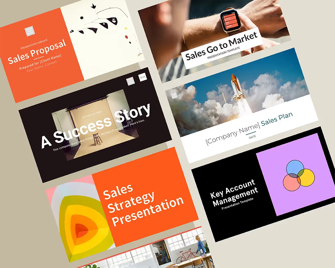
We tested the theory by redesigning Foursquare’s original pitch deck using Beautiful.ai’s free PowerPoint alternative software. The resulting pitch deck template utilizes those best design practices, and it was a cinch to create thanks to automated design — so slides automatically adapt as new content is added.
Download the free, customizable template here.
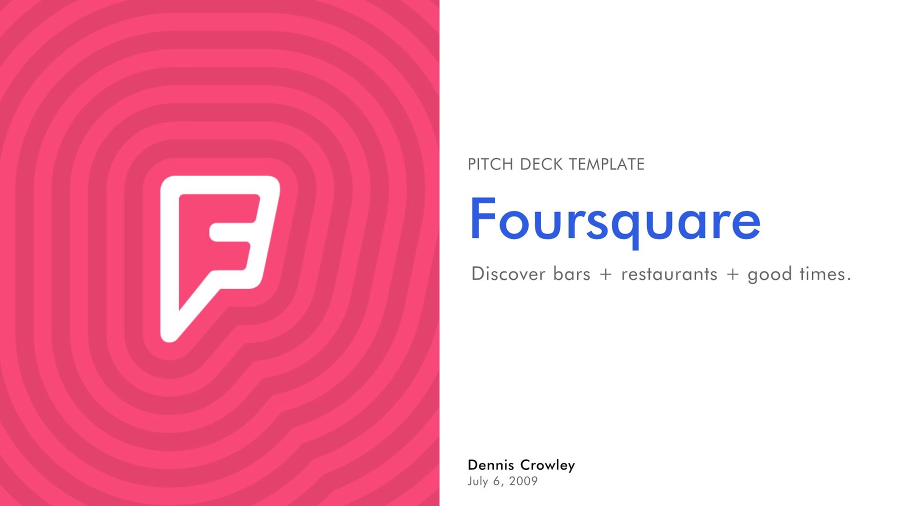
Slide 1: Foursquare Introduction
Just like every book needs a cover, every pitch deck needs an introductory slide. We transformed the introduction slide from the original Foursquare pitch deck into this stylish number using our Title slide template, and we incorporated Foursqare’s logo, found in Beautiful.ai’s vast library of logos and free stock images.
We also created a theme for the whole presentation, customizing the color scheme and typography to correlate with Foursquare’s brand. Once selected, the free presentation design software automatically applied those same settings to the entire presentation. It even allowed us to have the Foursquare logo automatically placed on a bottom corner of each slide.
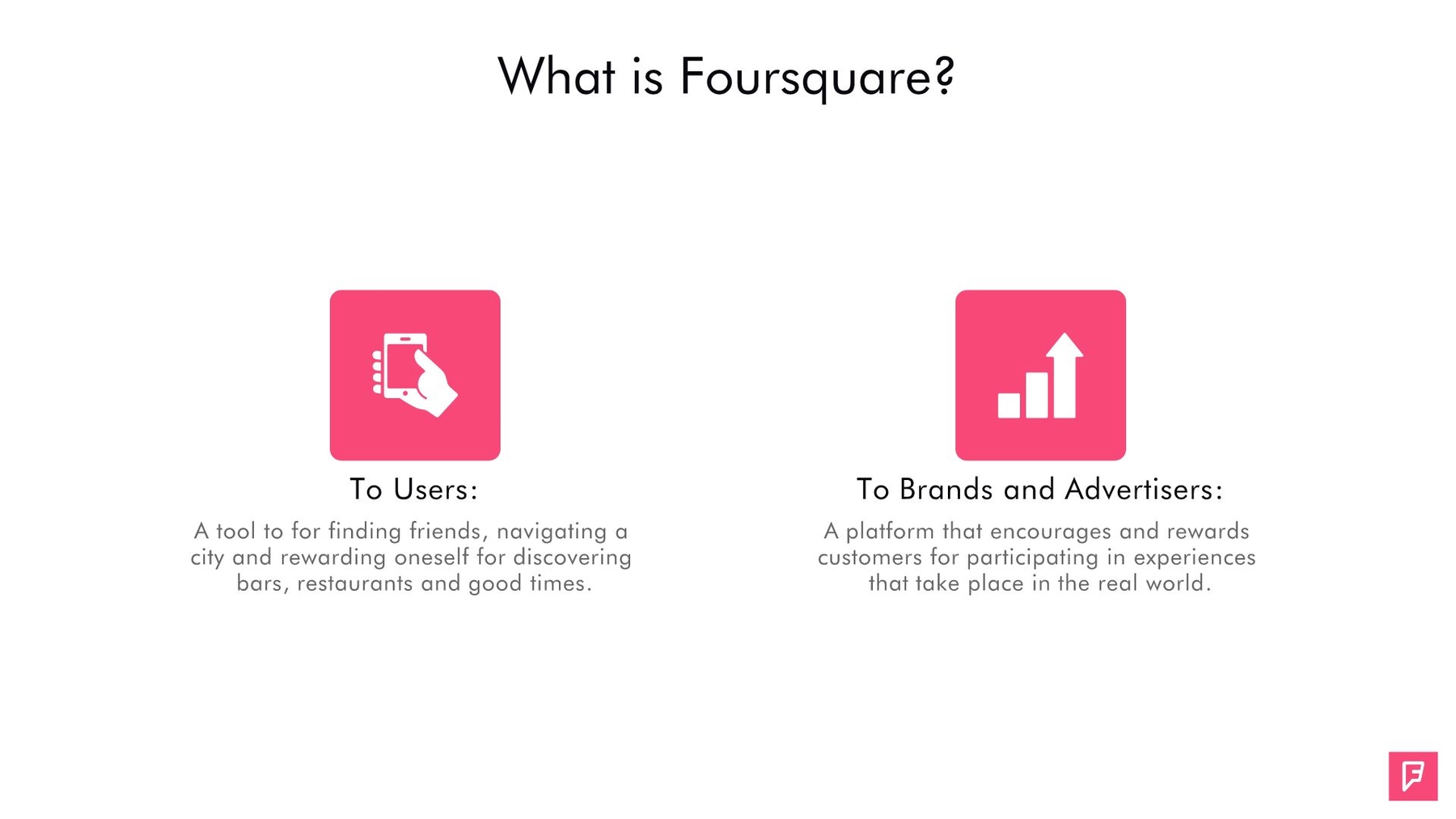
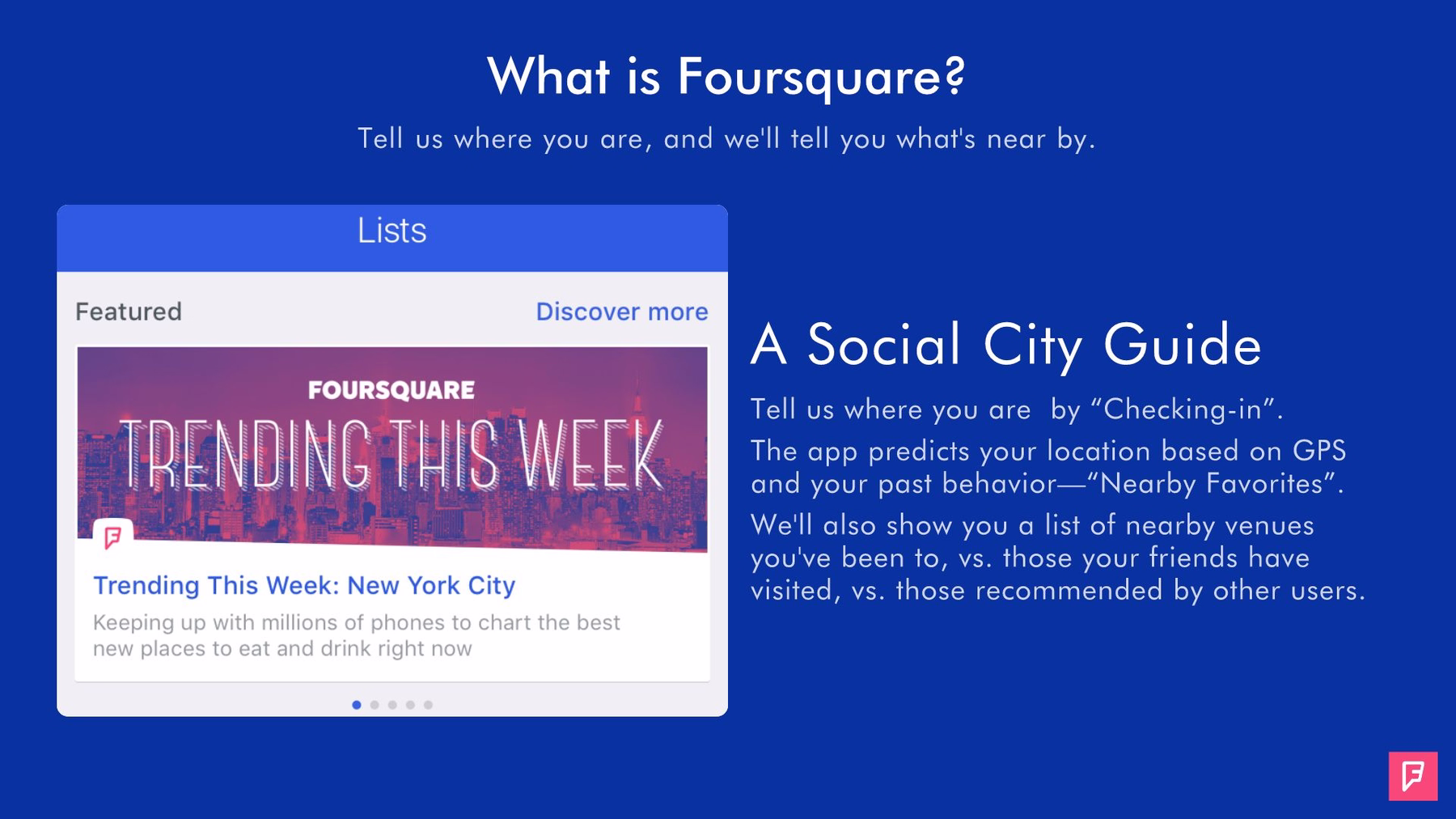
Slides 2-3: What is Foursquare?
Potential investors are most interested in the meat and potatoes of a presentation. Foursquare’s original pitch deck got straight to the point by answering the question, “What is Foursquare?” We used the next two slides in our redesigned presentation to answer the same question.
We created our second slide using the Icons with Text slide template, and we gave two answers to that pivotal question, each accompanied by a corresponding icon found in Beautiful.ai’s library featuring millions of free images. Because the theme was preselected and the smart slide automatically adjusted its design based on the two icons, we created this slide in a snap. We even jazzed it up by adding animation so each section appears in quick but consecutive order.
The rest of the answer defining Foursquare was originally featured across several slides in the original pitch deck. We consolidated them into a single slide using our Message Carousel smart slide template. We added a common heading and background to a series of three separate explanations, each with its own corresponding image.
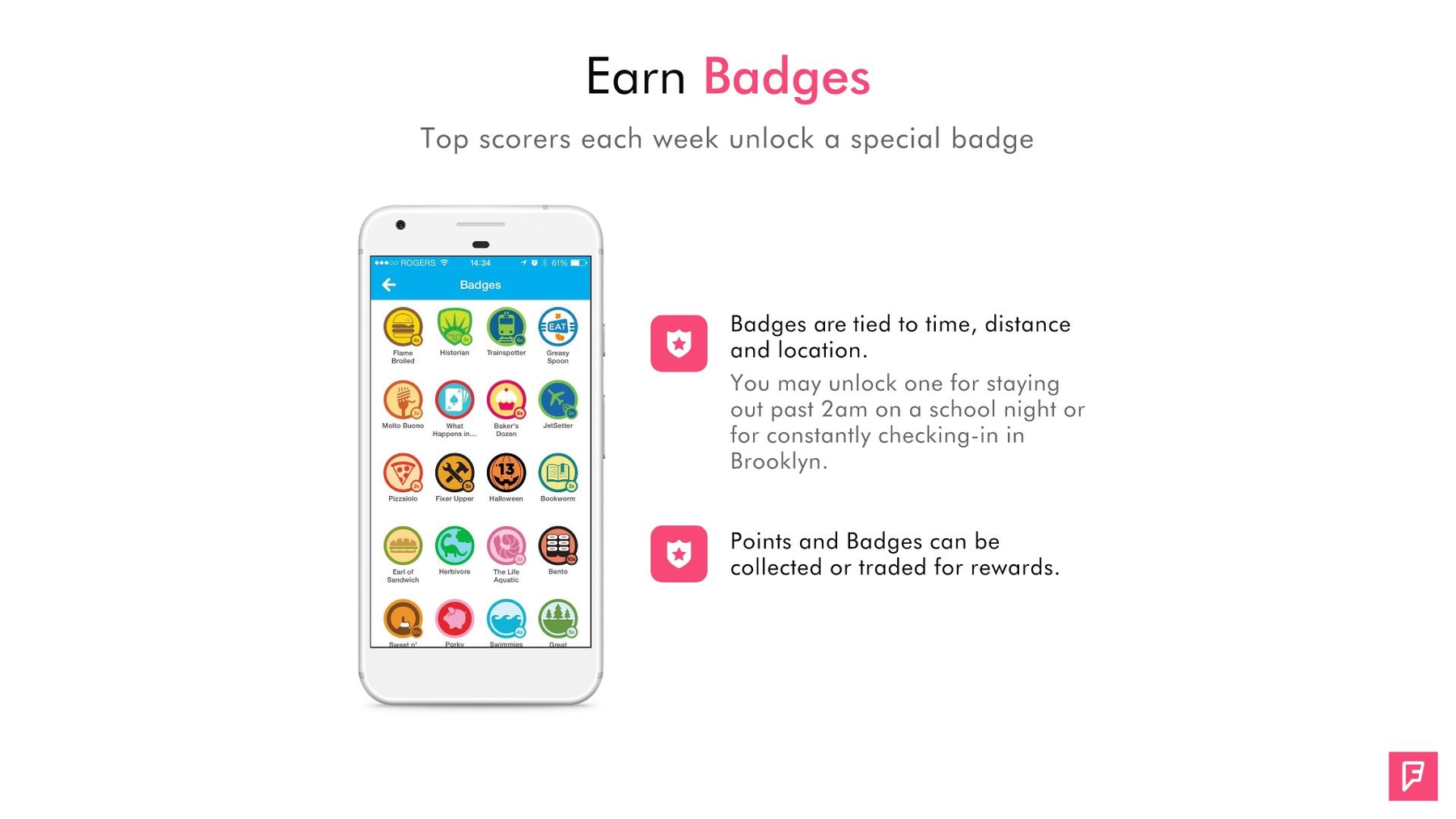
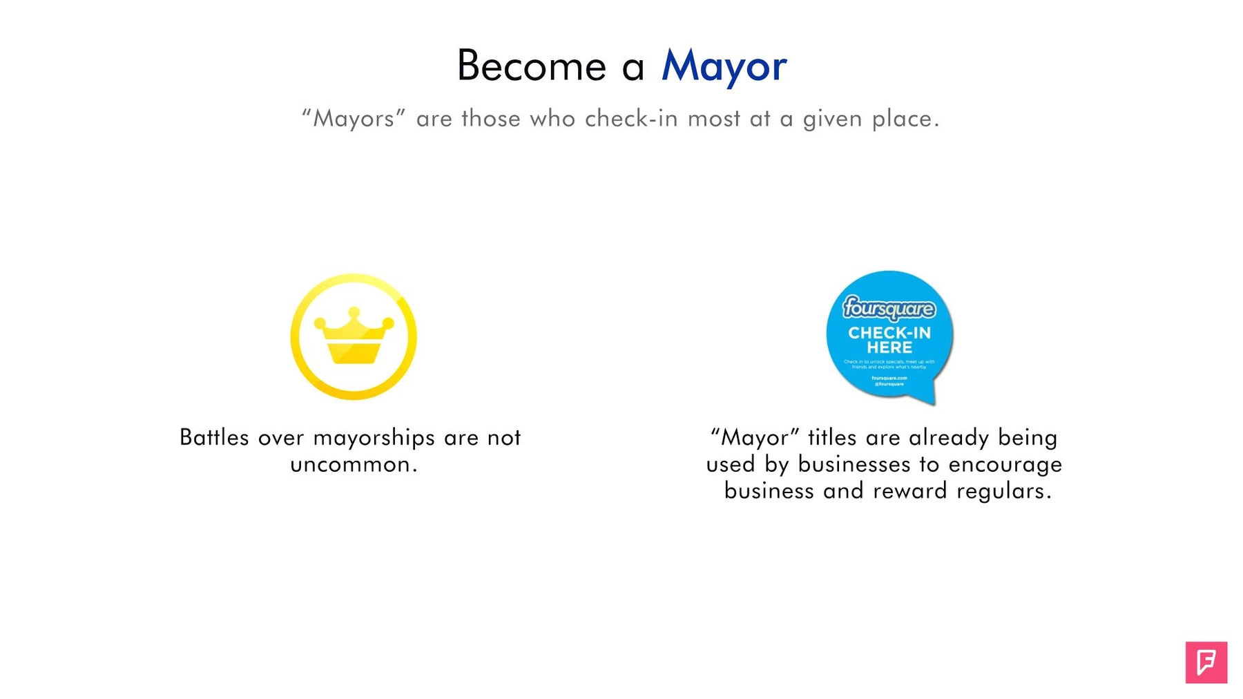
Slides 4-5: Gamified Check-ins
Our next two slides explain Foursquare’s original gamification model. We used our Mobile Screenshot smart slide to illustrate how users earn badges. The template features the outline of a smartphone, and we inserted a screenshot of Foursquare’s various badges. Then we again chose the Icons with Text slide template to explain how a user can become the “mayor” of a location. We added animation to each slide in order to recapture any waning audience attention.
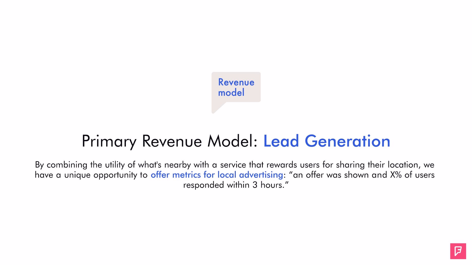
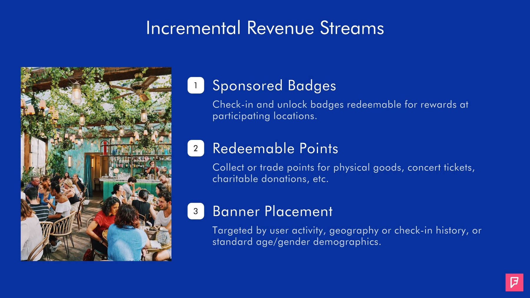
Slides 6-7: Revenue Model
Of course, practically all potential investors ask themselves how they will recoup their money. Foursquare did not disappoint with its original pitch deck, and it dedicated two slides to its revenue model. When we recreated the presentation, we kept the slide illustrating Foursquare’s primary revenue model short and sweet using our Headline smart template. Then, we showcased three additional revenue streams using Beautiful.ai’s Bullet Points slide.
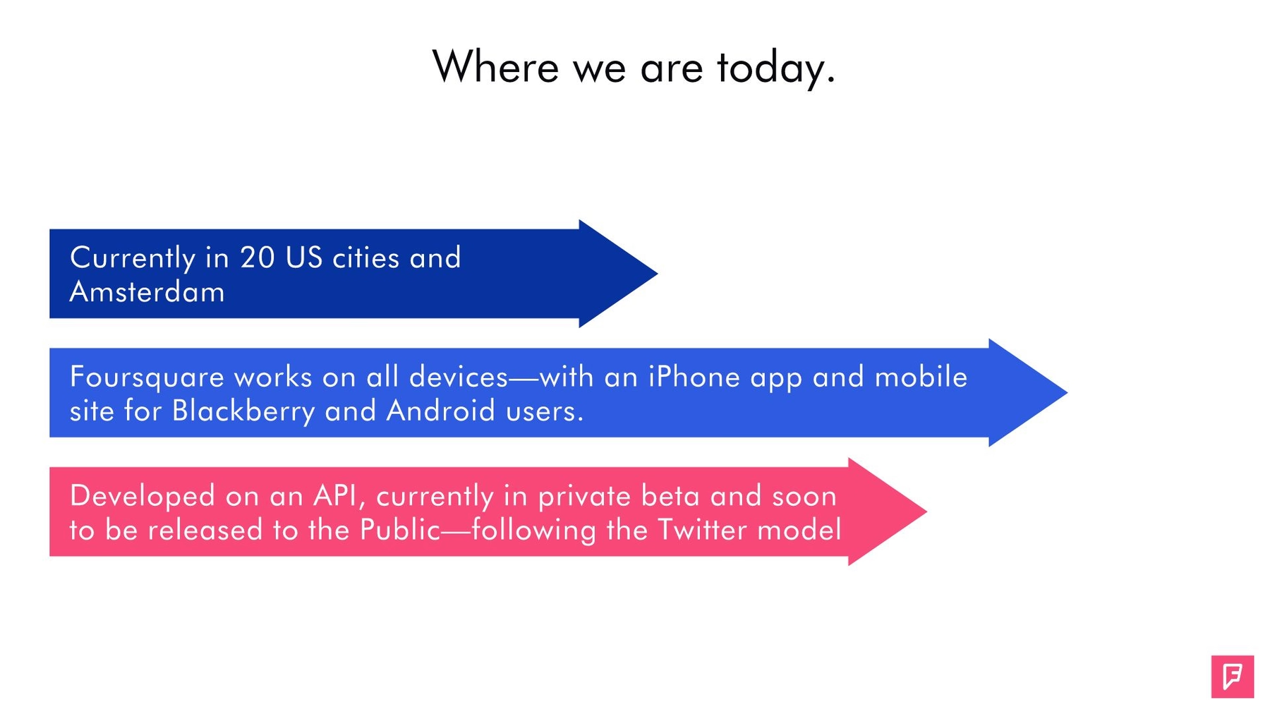
Slide 8: Foursquare Current (2009) State:
In its original pitch deck, Foursquare illustrated the company by the numbers, and it featured a slide with its then-recent statistics. We have to admit, however, that slide left room for improvement. There was no title, and the infographics weren’t clearly defined.
We took some of the most basic data and transferred it to our redesigned presentation using Beautiful.ai’s Arrow Bars smart slide. The illustration automatically adjusted as we added text inside each arrow, already perfectly branded for Foursquare using our preset color scheme. By animating the appearance of the arrows, we added some eye candy to refocus any lost attention.
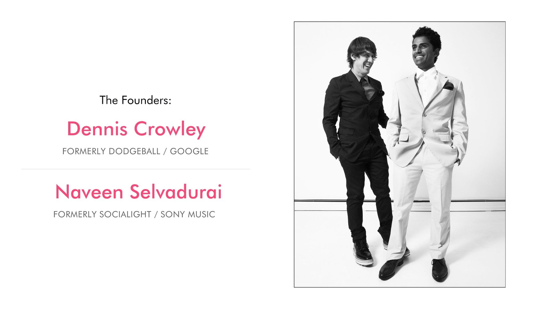
Slide 9: Meet the Foursquare Team
We always recommend introducing potential investors to a company’s key players. Foursquare failed to do so in its original pitch deck, but Beautiful.ai’s About Us slide template allowed us to quickly and easily highlight Crowley’s and Selvadurai’s roles in the company. We even were able to add some pizzazz to the slide by including a captivating image of the founders.
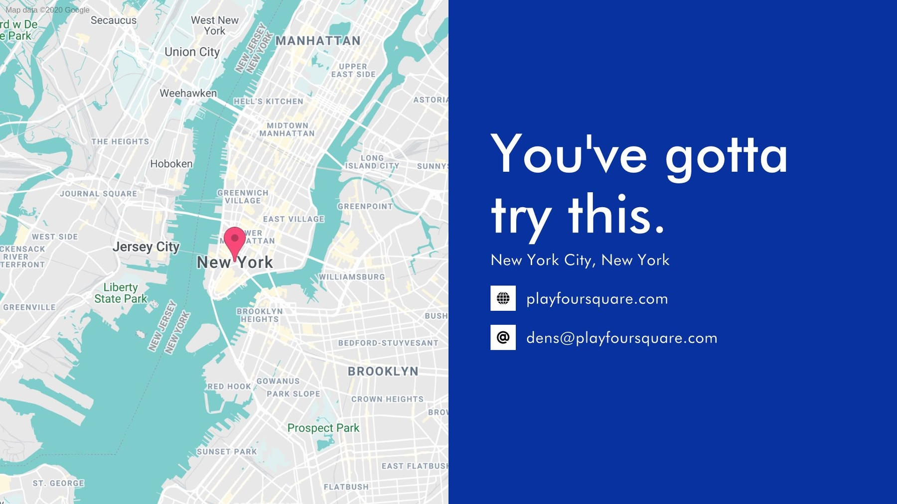
Slide 10: Contact Foursquare
An effective pitch deck should also provide potential investors with the company’s contact information. Fortunately, Beautiful.ai offers a slide template for that specific purpose. Amazingly, our AI technology even let us insert a map, and it automatically pinpointed a location based on whatever address entered. The smart slide even lets designers add social links complete with corresponding icons.
Slide 11: Conclusion
We always say every good presentation needs a solid conclusion, so the speaker has a final chance to engage audiences and leave a lasting impression. We created a final slide that allows time for concluding statements without overloading audiences with too much visual information. Beautiful.ai’s Image slide template did just the trick, and we were able to find the perfect image thanks to the millions of free photos and icons in our image library.
Of course, there’s no question if Foursquare’s original pitch deck brought the success the startup needed to launch a multi-million-dollar brand. But what do you think of our redesigned presentation? Would you say this PowerPoint redesign is beautiful?