


Historically speaking, presentation design is a dreaded task. Why? If you’re not a designer by trade, figuring out how to structure your story and make your slides look good can be a big undertaking. Thankfully, there are presentation softwares— like Beautiful.ai— that give you design guardrails to make the process faster and easier. But even with a presentation maker, things can still get messy if you don’t know what you’re doing.
To help ensure your next presentation will be your best presentation, we compiled a guide with everything you need to know for better deck design.
Visual hierarchy in presentations
When you think about the principles of good design in presentations, visual hierarchy should be top of mind. Visual hierarchy refers to the arrangement and organization of visual elements in a design. It helps guide the viewer's attention, communicate information more effectively, and create a positive visual experience.
Before you dive in to make design decisions, it’s important to understand the elements of visual hierarchy as it relates to your presentation.
Size: The size of your font on a slide determines readability. By using larger fonts for the key takeaways, and smaller fonts to provide more context, you’re telling the audience exactly what you need them to focus on.
Color: We’ve all heard of death by PowerPoint, which is the unfortunate event of losing your audience to boredom. Using the right colors in a presentation can help engage your audience and keep them interested in the content in front of them.
Contrast: Similar to font size, contrasting colors can help increase the legibility on each slide. Using bolder colors for important call-outs can help direct the audiences’ eyes where you need them.
Typography: In Beautiful.ai’s custom theme, you can set fonts for headings and subheadings to distinguish them from body text. This helps bring attention to the headline of each slide.
Alignment: There’s nothing more frustrating in presentation design than tinkering with text boxes, but proper alignment is important. Thankfully, in Beautiful.ai the Smart Slides auto-align and adjust as you add content so your design always looks clean, symmetrical and professional.
White Space: Less is more in presentations, which is why we favor white space. By avoiding clutter on each slide, you’re letting the most important information shine.
Visual Flow: A presentation is a platform for you to tell your story, and every story needs to flow. When you’re arranging the information on each slide, it’s important that it flows in a way that makes sense to the viewer so they can easily follow along.
Presentation structure
Now that you understand the hierarchy of design, it’s time to transition your ideas into a deck.
With Beautiful.ai’s inspiration gallery, the design informs the idea which helps you craft your story in a more thoughtful way. Our Smart Slides have guardrails to help prevent non-designers from making a mess of their slides. While those limitations might push some people outside of their comfort zone, we put those restrictions in place for a reason. It encourages more avid designers to be more creative and think outside the box. Our inspiration gallery might help users think of a certain chart or infographic in a new way, and as a result that might help them structure their story in a way that flows better for their audience.
While playing around with different layouts can be fun, and unlock your creativity, it comes with responsibility. It’s important to remember that less is more in the world of presentations, and things can get messy fast. When you’re laying out your presentation, lean into clean, modern design to keep things digestible, visually appealing and professional. A good rule of thumb is to keep it to one key takeaway per slide.
Diversity in slides can help keep the audience engaged longer. If you have an inevitably text-heavy slide, break it up by following with an image or infographic afterwards. Part of nailing your presentation layout includes knowing which slides to use, and when to use them. Does it have to be two bulleted slides, or can you say the same thing in one slide with an image and text, or with a simple chart? Do you have to use two chart slides back-to-back, or can you mix it up? These are all things to consider in the presentation layout.
Colors & fonts
Once you’ve settled on a presentation structure, it’s time to choose a theme— colors and typography. In Beautiful.ai, once you set a theme it is automatically applied to each slide within the deck so your font and color scheme stays consistent from start to finish.
Fonts
Fonts are more important than you might think. For starters, it can be the difference between a legible presentation and one that your audience is having to squint to follow along with. But it’s more than that. Typefaces can evoke different emotions just like colors do. Is your font cheeky and fun, or serious and professional? The fonts you choose for your presentation can impact how it is received by your audience.
Deciding which are the best presentation fonts for your company will vary depending on your industry, offerings, and overarching brand message. Your fonts in any client-facing deck should reflect one of two things; 1) your company’s branding, and/or 2) the story you’re trying to convey.
Color evokes emotion
Different colors evoke different emotions and pull different reactions from people. How individuals perceive color can vary, but there are some basic color-emotion connections to keep in mind. Below are some attributes— both positive and negative— associated with primary colors that can sway people’s emotions.
Red
Positive aspects: Courage, excitement, leadership, love, confidence, strength, warmth, energy, willpower, stimulation, masculinity
Negative aspects: Defiance, aggression, danger, rage, malice, visual impact, strain
Blue
Positive aspects: Confidence, communication, trust, efficiency, serenity, duty, logic, coolness, reflection, calm
Negative aspects: Coldness, aloofness, lack of emotion, unfriendliness
Yellow
Positive aspects: Optimism, confidence, self-esteem, extraversion, emotional strength, friendliness, creativity
Negative aspects: Irrationality, fear, emotional fragility, depression, anxiety
Each color comes with its own set of pros and cons. One company might opt for calming and trustworthy blues, while the other uses a bold red to represent courage and a sense of urgency with their product or service. While you should choose the colors that best fit with your brand and overarching message, you should absolutely consider what emotions said colors might evoke from your audience, especially when using them in a presentation.
Color represents branding
Nearly 80% of brand recognition comes from color. Take Coca-Cola for example. When you see that iconic red can of soda you immediately know that it’s a Coke. Imagine if Coca-Cola rebranded to blue. Would you still recognize them in the vending machine, or would you mistake them for Pepsi (another distinct brand color)? Color is everything in branding. It creates awareness, and loyalty among consumers.
All that to say, we’d be willing to bet a lot of thought went into your company branding decisions. We’re talking fonts, logo design, and colors. Your branding is how you want to be perceived out in the wild. And believe it or not, presentations are an extension of your brand. As such, they should mirror all other branding efforts like marketing assets, sales collateral, and customer communications. The colors you use in your presentations should be very similar— if not the same— to the colors you would use in a marketing campaign or advertisement. Not only does this help your audience recognize your brand right out of the gate, it also shows that your brand is consistent which translates to reliability in the consumers’ eyes.
Color improves legibility (and retention)
Of course, there’s the most obvious way that color impacts your presentation: readability. The background and text colors you choose for your presentation directly affect how legible your slides are. Is your audience straining their eyes to read what’s on the screen, or is the message obvious and easy to see? By making your presentation more legible, you’re controlling the focus of your audience and improving chances of retention. If they can easily read, and digest, your content they’re a lot more likely to remember what they saw.
We recommend optimizing your slide design with a contrast between the background and text colors. You might choose a bold background, but that should be countered with a lighter, or softer, font color. The goal here is to make your key points pop.
Beautiful.ai’s presentation themes allow you to customize your slides so that the presentation color scheme compliments both your company and your story. Simply choose— or upload— your brand’s logo, font(s), and colors and set the theme to your presentation. From there, it will be automatically applied to each slide throughout the deck so you don’t have to worry about manually updating it as you go. Every slide will be consistent, and on brand, for a more cohesive experience.
Why do backgrounds matter in presentation design?
The background of your presentation is the canvas upon which you display your message. It sets the tone, creates a mood, and establishes context for your audience. A good background should complement your overarching message and make it easier to understand and remember. For example, if you're giving a presentation about a new product, a background that features the product's logo or colors can help create a brand identity. On the other hand, if you're presenting serious data, a plain and simple background that doesn't compete with the complex metrics can make it more digestible and easier to interpret. Choosing the right background in presentation design can be the difference between a presentation that lands well with your audience, and one that falls short.
Simple backgrounds that make a big impact
When it comes to choosing the right background for your presentation, less is more. Here are some simple, yet effective, backgrounds that will level up your content.
Solid color
A solid color background is a safe choice that will still make your presentation stand out. You can opt for a bright or contrasting color that complements your content or matches your branding guidelines. Don’t be afraid to mix-and-match. One slide might be white, while the next one warrants a bolder, darker color to emphasize the information on the screen.
Gradient colors
A gradient color background can add depth and dimension to your slides without overwhelming the content. You can choose from a wide range of gradients, such as shades of a single color, warm or cool color palettes, or even a custom color scheme that matches your brand’s theme. A gradient background looks put together and professional, without looking like you tried too hard.
Textured Backgrounds
A subtle or textured background, such as watercolor, geometric shapes, or patterns, can give your presentation an elevated touch. Choose a texture that matches the tone and context of your presentation.
Background images
Using a relevant image as a background can make your presentation more engaging and visually appealing. However, things can quickly take a turn to cluttered and distracting if you don’t choose the right photo. To ensure that the background image doesn’t overpower the content of your slide, you might choose one with one with ample negative space or lower the opacity for better legibility.
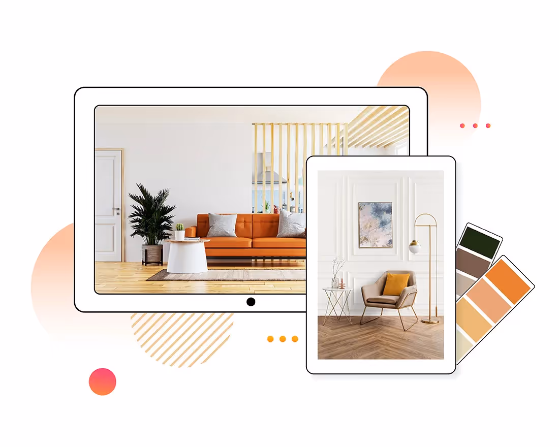
Choosing the right visual assets for your presentation
We’re visual learners, and sometimes a photo or video can say something that words can’t. Including visual assets is important for keeping your audience engaged and interested, and helps improve retention of the information. Keep these things in mind to ensure you’re using the right visuals for your story and brand.
Consider the overarching message
First and foremost, make sure it makes sense. If your presentation is about the solar system, a picture of your favorite food has no business being included in your deck. Consider the overall message of your presentation before you select images. Any image you include will likely help your audience retain the information more easily, so it should be relevant and meaningful to your story.
Evoke the right emotion
Just like colors can evoke emotion, images can affect the mood of your audience. Something dark and moody might have a more serious denotation, while something bright and colorful might trigger serotonin. Depending on the tone of your message, your image should follow suit. Adding images with people adds a human element to your slide that will help your audience resonate with your message, but you should consider the mood of the subjects in the photos.
Keep it on brand
Branding includes everything from fonts and colors to photography styles. Your images should be consistent with photos used in other marketing campaigns and sales collateral. There are many different types of photography styles from light and airy to moody and trendy, and it’s important to pick a side to keep things cohesive and on brand.
Ditch the pixelated pictures
Low-quality images are so 2009. You can never be certain what size screen people will view your presentation on so the quality of your image matters. In Beautiful.ai we have a free image library with hundreds of thousands of high quality images to choose from. Simply browse the free library, select your photo, and resize it to fit your slide. There’s something for every story, and every one— and it’s always high quality.
Avoid stale stock images
In any free image library you’ll see a mix of cheesy stock images and beautiful lifestyle shots. Every image has a purpose, but for the sake of your business we recommend avoiding stiff stock images. You know the ones: a staged photo of a smiley guy sitting at his desk with a coffee mug in one hand that says “have a great day” plastered on the front, while he gives a thumbs up with his other hand. If you want to catch the eye of your audience, opt for something more meaningful with more dimension instead.
Leave room for text
If you need to add a title, or subtitle, to your image slide you might want to choose an image with more white space. In a busier photo, it will be hard to make text overlay legible which will only frustrate your audience.
Of course, our Smart Slide templates can help you when you’re stuck. Templates like our headline slide or image grid makes it easy to add both an image and text to a slide without compromising the impact of the photo.
Don’t be afraid to use more than one
We preach that less is more on a daily basis. And while that’s true for presentation design, sometimes two images are better than one. Using a series of images can support your story in ways that text might not be able to. Our image grid slide template is great for making a collage on your slide without jeopardizing the professionalism of it. Gone are the days of copy-and-paste collages that look cluttered and messy.


.gif)
.avif)

