.webp)
.webp)

Strong presentation skills are no longer reserved for keynote speakers and sales teams. Today, engineers present roadmaps, marketers present campaign results, founders pitch investors, and managers present strategy. No matter your role, your ability to communicate clearly often determines whether your ideas move forward.
The good news? You don’t need to be a designer or seasoned public speaker to improve. A handful of simple, practical presentation tips can dramatically elevate your impact.
Below are 10 essential presentation best practices. Each one builds on the next, helping you move from scattered slides to a clear, persuasive narrative.
1. Start with one clear message
Every strong presentation begins with clarity.
Before opening a blank slide, define the single most important idea you want your audience to remember. Not three ideas. Not a general theme. One clear message.
When that core message is defined, every slide becomes easier to evaluate. Does it support the main point? Does it move the story forward? If not, it doesn’t belong. This is one of the most powerful presentation tips for professionals because it forces focus. Audiences rarely remember everything—but they almost always remember one strong idea.
Takeaway: If you can’t summarize your presentation in one sentence, it isn’t focused enough.
2. Design for scanning, not reading
Slides are not documents. They are visual aids.
When your audience is reading dense paragraphs, they aren’t listening to you. And when they’re trying to listen and read at the same time, they retain less of both.
Effective business presentation tips almost always include simplification. Replace paragraphs with short phrases. Surface key points instead of full explanations. Let your spoken words carry the nuance.
Modern presentation tools—and especially AI-assisted ones—can help condense long text into tighter, more scannable content. But the principle remains the same: slides should support the speaker, not compete with them.
Takeaway: If your slide reads like a script, it’s too heavy.
3. Use larger fonts than you think
One of the simplest ways to improve your slides is also the most overlooked: increase the font size.
Large text forces clarity. It prevents overcrowding. It ensures readability from the back of the room—or across a screen.
When you feel tempted to shrink text to “make everything fit,” that’s usually a sign you need to cut content, not compress it. Prioritizing readability over density is one of the most practical presentation best practices you can adopt immediately.
Well-designed templates and modern slide platforms often default to larger typography for this exact reason: it improves comprehension.
Takeaway: If you have to shrink the font, you need fewer words.
4. Limit each slide to one focus
Clarity isn’t just about words—it’s about attention.
When a slide contains multiple charts, competing messages, or unrelated points, your audience has to decide what matters most. That mental effort creates friction.
Instead, give each slide a single focus. One insight. One chart. One key statement.
Breaking a complex slide into two or three simpler slides often strengthens your presentation. It creates rhythm. It reduces cognitive load. It gives your audience space to process. This is especially important in professional presentation settings where decisions are being made quickly.
Takeaway: One slide, one idea.
5. Use visuals to clarify ideas
Whenever possible, show instead of tell.
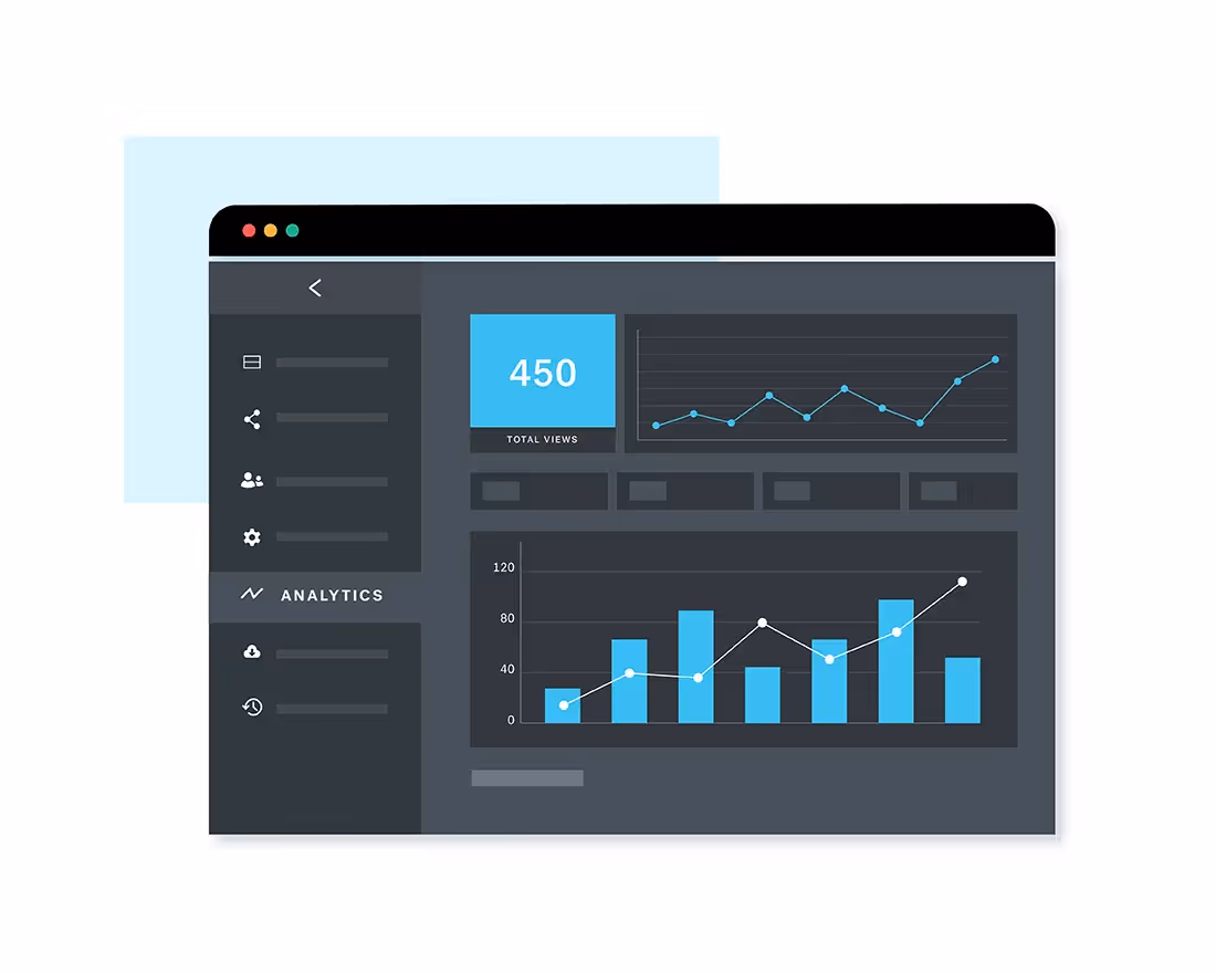
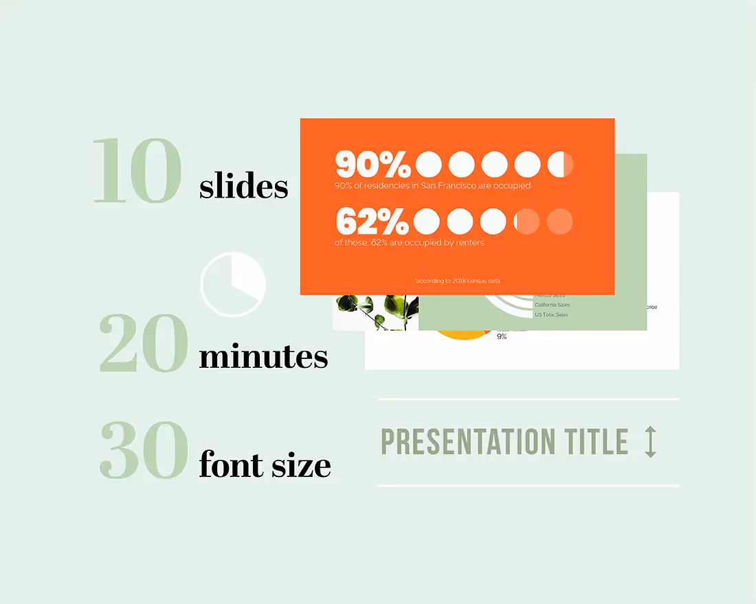
A well-designed chart can communicate a trend faster than a paragraph. A simple diagram can explain a process more clearly than bullet points. Visuals reduce explanation time and increase understanding. But the key word is clarify. Visuals should make your message easier to grasp—not just decorate the slide.
Modern tools can automatically generate charts, infographics, and structured layouts from raw data. This lowers the barrier to strong visual communication, even for non-designers.
Takeaway: Use visuals to simplify—not to impress.
6. Create strong visual hierarchy
When someone looks at your slide, their eyes should know exactly where to go first.
That’s visual hierarchy. It’s the intentional use of size, contrast, and spacing to guide attention.
Your main message should stand out immediately, supporting details should feel secondary, and white space should give content room to breathe. Without hierarchy, everything feels equally important—and when everything feels important, nothing stands out.
Professional presentation tips often focus on advanced storytelling or persuasion techniques. But strong hierarchy alone can dramatically improve clarity and credibility.
Takeaway: Make the most important thing visually dominant.
7. Be consistent with design
Consistency builds trust—even if your audience can’t explain why.
When fonts change randomly, layouts shift unpredictably, or colors feel disconnected, your presentation appears less polished. In contrast, consistent design feels intentional and professional.
Stick to a small set of fonts. Use a defined color palette. Reuse layouts for similar types of content.
Modern presentation platforms simplify this by applying design systems automatically. Instead of manually aligning elements and adjusting spacing, you can rely on structured templates that maintain visual consistency throughout.
Takeaway: Consistency makes your presentation feel credible.
8. Tell a story, not a collection of slides
Many presentations fail not because the slides are poorly designed, but because they lack flow.
A strong presentation has a narrative arc. It sets context, introduces a challenge or opportunity, explores insights, and arrives at a clear conclusion or next step. When slides are disconnected points, your audience works harder to connect them. When slides follow a story, understanding feels effortless.
If you’re wondering how to make a good presentation, start by asking: What journey am I taking my audience on?
Takeaway: Flow turns information into impact.
9. Cut ruthlessly
Most presentations are too long—not just in time, but in density.
There’s often an urge to include every detail to appear thorough. But excess content weakens clarity. The most effective presentation tips for professionals involve restraint. Remove slides that don’t directly support your core message. Move deep detail into an appendix. Shorten explanations.
Many AI-powered tools can suggest simplifications or summarize content, helping you trim without losing meaning. Your goal isn’t to say everything, it’s to make your key point impossible to miss.
Takeaway: Clarity increases when you subtract.
10. Practice with the slides you’ll present
Even the best-designed slides need strong delivery.
Practicing reveals awkward transitions, overloaded slides, and unclear explanations. It also builds confidence and improves timing. Run through your presentation out loud. Notice where you hesitate or over-explain. Those moments often signal where your slides need simplification.
Design and delivery are partners. When they work together, your message lands.
Takeaway: Slides support you, but practice makes them pack a bigger punch.
Bringing it all together
The next time you build a presentation, don’t start with slides. Start with a solid story.
Write down your one core message. Outline the story you need to tell. Then build slides that support that message—one focused idea at a time. As you go, simplify. Enlarge the text. Replace paragraphs with visuals. Cut anything that doesn’t directly move your audience toward understanding or action. Finally, rehearse once all the pieces are in place so design and delivery work together.
If you want to make this process easier, use tools that reinforce these habits instead of fighting them.
Beautiful.ai is built around presentation best practices. Smart Slide layouts guide you toward one clear idea per slide. Automatic layout and spacing create a strong visual hierarchy. Design rules keep fonts, colors, and alignment consistent across your deck. AI features help you condense text, generate structured content, and create clean visuals without manual formatting.
Instead of wrestling with design details, you can focus on the message and the story.
Before your next presentation, challenge yourself to apply just three of these presentation tips: clarify your core message, simplify your slides, and cut one-third of your content. Then let a presentation maker—like Beautiful.ai— handle the design structure.
That’s how you make a good presentation. Not by adding more, but by focusing on what matters and using modern tools to amplify it.


.png)