

In the world of big data, people are constantly having numbers thrown at them. And complex numbers at that. Big data simply means larger, more complicated data sets at a more frequent rate from revolving sources. It’s increasingly common in businesses. But if you’re not a left-side-of-the-brain kind of person, it can be overwhelming to try to make sense of the figures, metrics, and statistics. After all, we can’t all be logic-driven mathematicians.
Thankfully there’s data visualization.
"Due to the increasingly enormous amount of data available, analytics must be represented visually and be immediately comprehensible,” Data Impact Co-founder, Ludovic Gallen, once said. He isn’t wrong.
Nearly every profession can benefit from data being broken down in simpler terms. Data visualization takes complex data and makes it easier to understand for those on the receiving end through the use of infographics, pictographs, and other charts. By presenting data in bite-size chunks, those complex numbers become more easily digestible. With a strong presentation software— like Beautiful.ai— it’s easy for non-designers, and non-analytical people, to make sense of data for themselves and their audiences.
Data guru and owner of BEAST Analytics says, “Data visualization helps to bridge the gap between numbers and words."
Sure, Beautiful.ai allows you to explore different ways to visualize data and bridge that gap. But still, there are a few data visualization best practices to keep in mind before you get started.
Tap into data storytelling
"Data visualization is powerful. Still, data storytelling is the thing driving decision-makers. People take action when they interact with a data-evidenced proof of the story." — Monika Piekarska
Believe it or not, data tells a story. We know that most people are more likely to engage with your presentation if there’s a strong narrative to back it up, so tapping into data storytelling when presenting your information and statistics can help it land better with your audience. Data storytelling is how you choose to communicate your insights to make them more meaningful and relevant to your audience, and can be used to support your overarching message. What do your reports tell you about your customer, proof of your company’s success, or your missed opportunities? By making your data more relatable, you’re making it easier for your audience to comprehend.
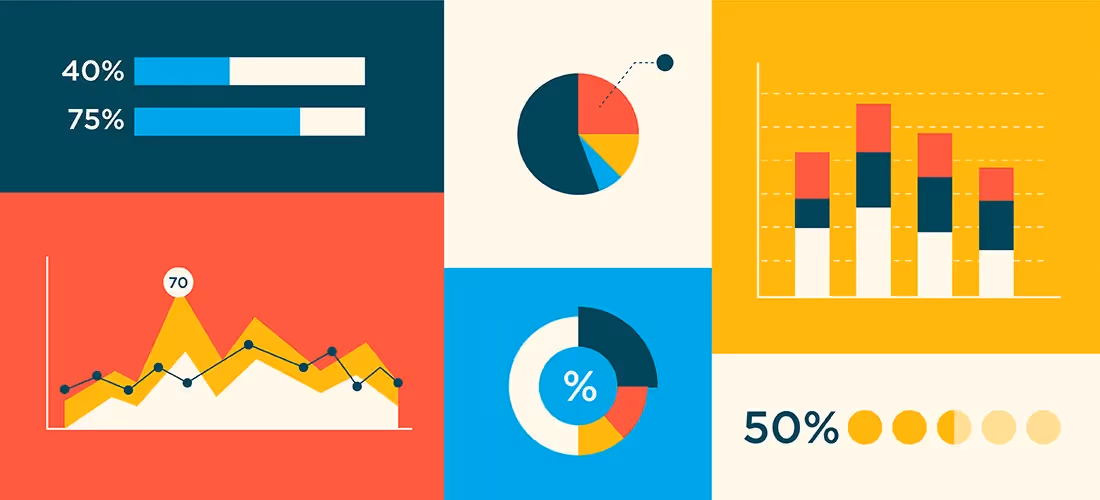
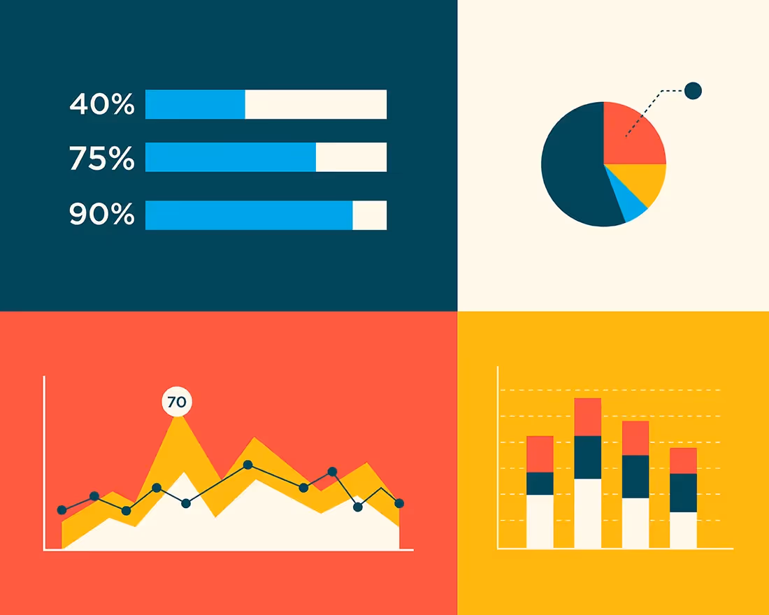
Know when to use the right charts
Charts and infographics are the essence of data visualization. They take your most meaningful data sets and display them in more digestible ways. However, if you don’t use the right charts, it can have the opposite effect and make your data even more confusing. Understanding your data means understanding which charts will help drive your point home. Don’t panic, our Smart Slides can help inform your decision.
If you don’t know where to start, you can dip your toes in by perusing our inspiration gallery of pre-built presentation and slide templates curated by expert designers. This allows you to explore some of the different use cases for each of the different types of charts and graphs, and get inspired to create your own. If you see something you like, you can customize it with your own content and then toggle between different layouts to see which format fits best. Not only does this give non-designers the tools they need to get started, it also helps presenters structure their data in new and interesting ways.
Keep it clean
“You can achieve simplicity in the design of effective charts, graphs and tables by remembering three fundamental principles: restrain, reduce, emphasize.” — Garr Reynolds
Just because your data is complex doesn’t mean your slides should be. Read that again. Keeping your slides clean and simplistic is key for data visualization if you want your audience to retain any of the information you’re presenting to them. Each slide should feature one key takeaway, and it should be obvious to your audience— don’t send them on an easter egg hunt to figure it out.
Use colors to highlight key points
Colors are your friend. They can help you convey things within your slide more effectively. We suggest using different colors to provide contrast between data sets. Use your boldest colors to represent the more important pieces of information, and more subtle hues to indicate the rest. While your colors should be on-brand and consistent with the rest of your presentation, it’s okay to play around with different hues here. Colors are an easy way to tell the audience exactly what you want them to pay attention to, and how it should make them feel.
Include supporting visuals
Images, icons, and shapes can help provide additional context for your data. In fact, if some members of your audience find themselves more creative than logical, including the right supporting visuals can help paint a picture for them. While data should be the star of the show in data visualization, certain visual assets can put things into perspective and make them more relatable.
You might also use Beautiful.ai’s Elements for special annotations. You can add additional icons, arrows, or text to call out important pieces of information to craft your message in a more meaningful way.
Be intentional with text
Data visualization is all about painting a picture with strong visual elements, so be intentional with your use of text. You want your audience to focus on the graphs, charts, or percentages on the screen, so don’t distract them with a lengthy paragraph to read. You might need to use bullet points to add context to the metrics, or to call out important aspects of a report, but limit it where you can.
Bring your data to life with animations
Last, but certainly not least, bring your data to life with dynamic animations. Even despite your best efforts to jazz up your data, you might still lose your audience to boredom (it happens). Don’t worry, we have the secret sauce to rein their focus back in. Dynamic animations are subtle movements for when each slide advances, and they’re a surefire way to catch the eye of your audience and pull their attention back to your presentation. You can select the animation style, and speed, so that the data in your graphs and charts build with your story.


.avif)
.avif)
.gif)
