Regardless of whether you're presenting a sales pitch or a human resources onboarding deck, visuals matter. In fact, most seasoned presenters would agree that incorporating images in a slide is far better than lengthy blocks of text. We’re visual learners. In fact, 65% of people comprehend information better when it’s presented in a more visually appealing way. But why limit your presentation to static photos? You may also want to incorporate videos, or use animations to bring your slides to life. The use of images, videos, or animations alone can evoke more emotion from your audience, which can help with a more successful call to action. It can be the difference between making a lasting impact or putting your audience to sleep.
We’ve all been there: the end of a presentation when you start to notice that your audience has lost interest. Luckily, it’s avoidable. Animations can help you keep your audience engaged throughout the entire presentation. You don’t have to use animations on every slide, but they’re an effective way to direct your audience’s eyes to the information on the screen. While blocks of text may overwhelm the audience, using animations makes even the most complex information easier to view and digest. Whether it’s flashy transitions, audio, or choosing the speed of your slides, animations add dimension and breath to your presentation. The movement will demand your audience’s attention so that they’re focused on your message, instead of daydreaming about what’s left on their to-do list.
Bring remote presentations to life
In our new remote environment, it can be hard to prepare a presentation. What will resonate with your audience from behind their computer screens? How do you know your audience is engaged and following along when you can’t be in the same room with them? If you’re preparing a deck for the team to review on their own time, you may want to include more information than you would if you were talking through the slides live. That said, you want to ensure that they’re actually making it to the last slide without mindlessly skimming the deck. Similarly, if you are presenting via video conferencing you want to make sure your audience is paying attention and not staring at their cat in the next room.
Ditch the bullet points and create inspiring content that will engage your remote teams. Using tools like animations, videos, and rich icons will help you better illustrate your story and engage your remote audience. Think of it as another way to narrate your presentation when you can’t be there in person. Your key points will come to life by building on your slide, which will motivate your team to pay closer attention to the content in front of them.
Animations in Beautiful.ai
In Beautiful.ai, we give you the power to decide how your animations will build on each slide. You control the speed, the order, and whether they build automatically or advance with a click. You can create a custom timeline, which is a manual control of your animation build. And you can also customize the animation timing and style to choose overlapping, simultaneous, sequential, or no animation at all. Depending on your content, and talking points, you may select a slow, normal, or fast animation speed. For example, if you want to elaborate on each point before the next one appears, you might consider a slower build so that you have time to narrate as the slide progresses.
Dynamic slide templates
We have a handful of presentation slide templates with customizable, dynamic animation options to help bring your story to life. Choose one of the following slide templates for your next remote presentation to help engage your team.
Arrow bars
Our arrow bars graph is one of our most common infographics. The arrows in the graph can imply relationships or movement between data points, explain steps to achieve a goal, map out project timelines, or make any list in your presentation look more visually appealing. The animations allow each arrow to build on the screen, one after another, which inspires your audience to pay attention so that they know what comes next.
Percentage with icons
A percentage comparison template, or a pictograph, uses repeating rows or a grid of icons to represent data. You may choose a percentage comparison to report progress to a goal, add variety and visual interest to your presentation, or make statistics more memorable and impactful. Using animations with this template helps to make your otherwise stale numbers more interesting and easier to digest. The animations on this slide show the growing percentages, along with a build of the number of icons, so your data can pack a punch.

Word cloud
A word cloud is a collection, or cluster, of keywords shown in varying sizes and directions. The bigger and bolder words represent the most important takeaways, while the smaller words tend to be supporting terms. Some use cases for a word cloud template would be displaying survey results, showing the level of interest in a topic or idea, or calling out key ideas or themes from large amounts of data. Using a word cloud presentation template, with custom animations, helps bring attention to the words on your screen.

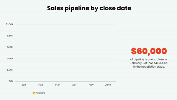
Bar charts
Animations can help bring data comparison charts to life. Our different variations of bar charts can help track data changes, compare different sets of data, point out trends or patterns, or show data in percentages. We'll be the first to admit that historically speaking data isn't sexy— but we're here to change that. With our custom animations you can bring your numbers and statistics to life so that they're more engaging. We especially love how animation builds look when used with our radial bar chart or stacked bar charts.