


At this point, it’s safe to say that we’ve reached peak data.
If you believe the hype, we’re all data analysts, data hackers, and data scientists working at data-driven data companies. And if we want to protect our jobs from the robots, then we better get really good at data storytelling.
Actually, we think there might be something to that last one. According a 2017 LinkedIn study, "data storytelling" is the 8th most in-demand skill among employers, just below mobile development and ahead of online marketing. This was the first year that this skill made the list, and we doubt it will be the last.
So it's true, then: We're all data storytellers now.
For most of us, data storytelling means one thing—producing and talking about charts. And that means working with PowerPoint, either by building charts natively in Excel or dropping screenshots from other tools into your existing template. (This is a topic for another day.)
These charts, more often than not, look terrible. But, more importantly, they rarely tell a story. Which means that neither do you. Data is incredibly difficult for audiences to process, and simply exposing it to them does little to help them understand it. But if you can frame your data as a story, you not only make your slide simpler—you also make it more persuasive.
So what is a “data story”? Well, we just made up the term, so we don't really have a good definition. But we do have a few examples of simple data stories and how you can use charts to bring them to life. (BTW, all of these charts were built with Beautiful.AI in a matter of minutes.)
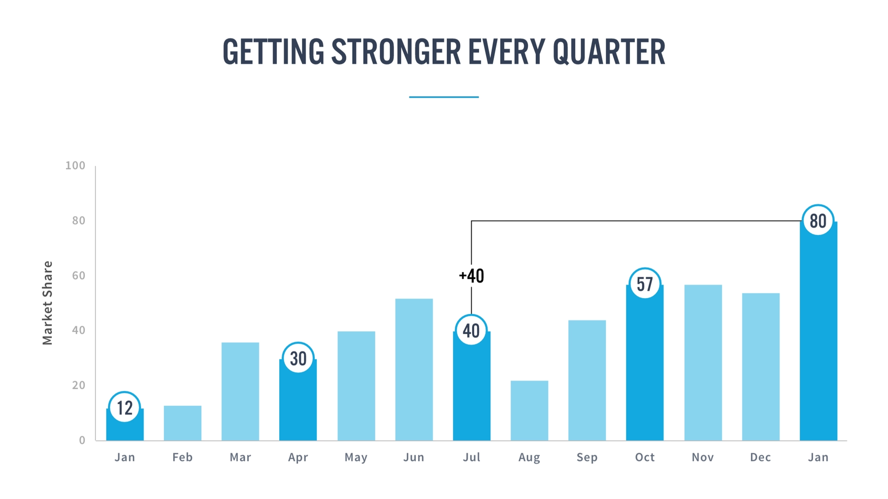
"We started from the bottom now we’re here.” In many cases, the only thing that matters in a data set is the overall growth from the beginning of the time series to the end, or perhaps from one quarter to the next. The peaks and valleys in between are decidedly less important, but your audience will “read” your chart from left to right—and write a story of their own—unless you give them a reason not to. One simple solution is to emphasize the key data points in your bar chart, either by changing the color of the bars or adding the data values to points of interest. You can also illustrate the percent change between points to demonstrate the "right" way to evaluate growth. With these simple moves, you’ve now told your audience what to care about and what to ignore—and helped ensure that they draw the same conclusion as you.
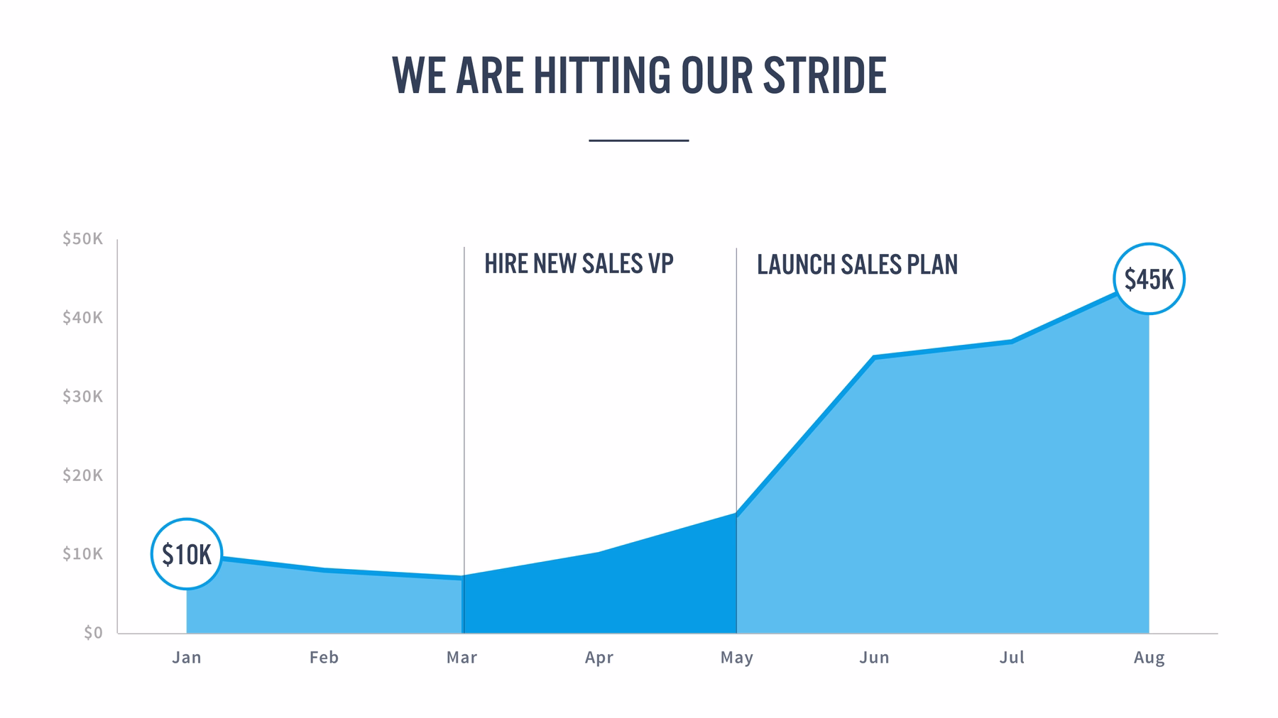
“And then everything changed.” In many data sets, there’s an “inciting incident” that sends the data on a trajectory, either for good or for a limited amount of time. This incident might be the introduction of a new sales strategy, an unexpected market event, or an act of nature. And when an incident like this happens, chances are that it dictates the “story” your data is telling. So rather than let your audience speculate, turn your x-axis into a timeline and annotate the beginning, middle, or end of your story. You can also try emphasizing the impact of the inciting event with a highlighted range to show that the incident caused only a temporary change.

"Whatever, whatever, whatever, bam!" Sometimes its worth considering whether a chart is even necessary. How many times have you seen someone present a busy graph only to tell you that one or two of the numbers actually matters. When that's the case, why not feature just that data? (You can always keep the comprehensive chart in your appendix if someone wants to see it.)
The next time you prepare a chart for a presentation, try summarizing it as a story. (Or a Drake lyric, as the case may be.) Once you’ve done this, we think you’ll find that there are plenty of ways to emphasize, annotate, and animate your charts to help your audience understand the numbers as a narrative.
Now try implementing these ideas in PowerPoint. (We’ll wait.)
With the traditional presentation software, even the simplest stories are incredibly hard to tell, regardless of how skilled you are with the tools.
For example, let’s say you’ve built an area chart that shows your monthly revenue to date, along with projections for the next three months. You might want to indicate that those three months are in the future, so you'd want that section of the line to look different from the months before. With PowerPoint, you'd need to create a second chart that starts at today and goes into the future, and then line up that second chart perfectly with the first one so it feels like they’re one in the same. (If this sounds complicated, that’s because it is.) And now, what if you want to highlight the first and last data points to emphasize overall growth? How would you even do that?

One of the biggest problems with today’s presentation software is that it’s so focused on how to do things that it doesn’t stop to consider why you’d want to do it in the first place. Dotting the second half of your line and creating data point highlights shouldn’t be your job. You should be able to tell the software the why (e.g. “I want to emphasize this range” or “I want to show that things changed after this point”) and let it figure out the what for you.
That’s how you would communicate with a presentation designer, so it should also be how you communicate with your presentation software. With Beautiful.ai, we wanted to give users the ability to turn charts into stories, and stories into results. We've made it incredibly easy to add annotations, highlight ranges, project into the future, emphasize key points, and simplify your charts to ensure that they don't get in the way of your data.
Our charts are still a work in progress, but we think you’ll find that they give you data storytelling tools that you’ve never had before. And we’re excited to see what you can do with them.


.gif)
.gif)
