


If you aren't sure what good design is, just ask Dieter Rams. The iconic German designer published his list of 10 Design Principles in a famous manifesto in the late 1970s, and it has since served as widely-accepted guidelines for design that any object, artwork, product, or other artistic medium must incorporate in order to be considered "good design." We covered the first 5 in this post, and are continuing with the last 5 below. We also give examples of good design for each principle—using our new Beautiful.ai brand identity to reflect each principle.
#6: Good design is honest.
At Beautiful.ai, we believe that less is more. And what does honesty in design mean, if not "simple and straightforward"?
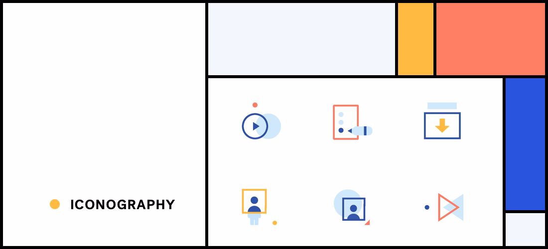
The new branded iconographical system at Beautiful.ai starts with fundamental shapes and then applies our brand colors for more interest. By using branded icons everywhere—in our product, on our website or in the presentation editor—we are able to communicate in a consistent and visually-appealing format. Thus, turning something basic into something beautiful.
Look for all the fun new icons across all our channels, including social media platforms like Facebook, Instagram, LinkedIn and Twitter.
#7: Good design is long-lasting.
We often admire timeless classic architecture, or marvel at how an everyday object can make a task that much easier.
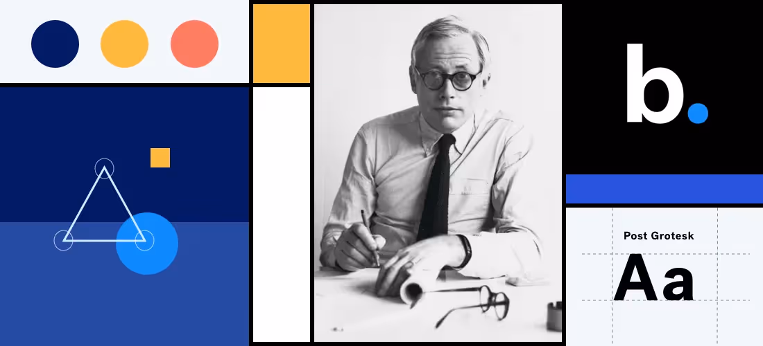
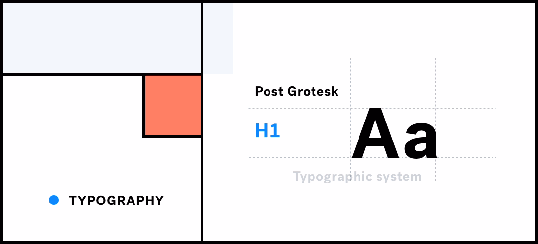
Typography (the unique shape and style of the lettering) is one of the key pillars of good design, and should support this idea of timelessness (if done right). Typography can really change the perception of a brand. Subtle changes like altering the curve of a letter can make a huge difference. Google, for example, was so passionate about it that they decided to build out their own font library.
For our rebrand, we knew we wanted our main typography to be current, relevant and future-thinking, so we chose the Post Grotesk font family. This typography style encompasses all of those things without sacrificing timelessness. (Fun Fact: It was first designed in the early 1800s!)
We liked Post Grotesk so much, we designed our logo to match, and applied classic "type hierarchy" throughout our website and marketing materials.
#8: Good design is thorough down to the last detail.
Dieter Rams follows up this design principle by saying “care and accuracy in the design process shows respect towards the user.” This, as opposed to a slap-dash sloppy job ... see Exhibits A-Z).
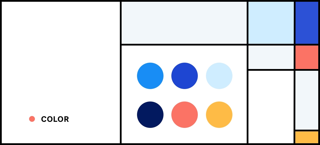
One of the last details we focused on for our rebrand of Beautiful.ai was our color palette. Whether you realize it or not, certain colors evoke specific emotions, and good brands (and designers) are mindful of that. Colors like red, orange, and yellow set us into action with passion, while shades of green and blue promote harmony, security, and reliability. Certain color combinations can either skew warmer or colder; uplifting or depressing.
We chose Beautiful.ai’s colors based on the three primary colors (again, timeless), but altered the classic red, blue, and yellow tones to give it a modern, more youthful twist.
#9: Good design is environmentally friendly.
Obviously, Dieter Ram wrote this in the 1970s with physical products in mind, with no knowledge of the forthcoming digital age that was upon us all.
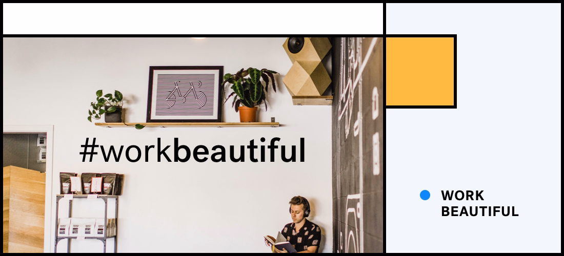
But we’d like to think that this principle of good design can be interpreted a bit differently now. We'd like to apply it to our new brand slogan, #workbeautiful, and what that means.
"Work Beautiful" was inspired by a conversation with our founder, Mitch Grasso, about what the future of work looked like to him. It was working smarter, not harder. It was communicating more effectively in less time. It was being more efficient with your work day instead of wasting precious energy on tasks that don't fit your skill set (like tinkering with PowerPoint text boxes).
Why? So you can focus on those things that you're truly passionate about: Your story, your family, your cause, or your sailboat. That may be a stretch, but in the end, you're spending less time indoors hunched over a laptop designing a presentation, and more time in the great outdoors. Just go with it :)
#10: Good design involves as little design as possible.
Sometimes, minimal design or ‘less design’ is interpreted by non-designers as laziness or lack of skill. However, the true professionals in the design world know that the focus should be on the essentials. Everything else should be examined for its value, and how that improves the actual user experience of the product.
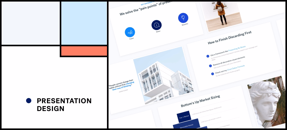
As you’ll notice, our presentation templates (Business Plan, Company Overview, HR Onboarding etc) are pretty understated. In other words, they’re not overly complicated or intricate in terms of design. On purpose.
Our Chief Marketing Officer, Jill Callan explains: "I wanted to bring the same design restraint that is built into the product into the branding and marketing," she says. "I didn’t want to over-brand Beautiful.ai, but rather lean into simplicity and let the product design principles shine through."
In other words, both our product interface (the Beautiful.ai Editor) and the product output (your finished presentation) promote this idea of “little design.” The Editor interface has very little clutter, and everything is neatly tucked in the left nav bar so you can focus on the task at hand. Our templates are simple and minimal, so you can’t crowd the slides with too much content.
In the words of Dieter, it’s about “Less, but better.”

Conclusion
With a little practice, these good design principles will help you get a strong design foundation, and help you experiment with your visual projects like an expert.
We followed these key design principles and best practices to launch an updated visual identity and brand — to better our user experience, connect emotionally with our audience, and establish Beautiful.ai as an authority on design. How do you think we did? We’d love to hear your feedback.


.gif)
