There’s a lot that goes into the psychology of color and how different shades and combinations can impact the emotions of your audience. If you’re saying one thing in a presentation and your color combination is saying something different, your audience will feel conflicted. Your color palette speaks before you do. That’s why picking your presentation theme is just as important as how you structure your slides.
Picking colors that complement each other is key for various reasons. Color impacts the readability of your slide and can dictate whether or not your audience will retain the information you’re presenting to them. It’s a good rule of thumb to opt for contrasting colors that complement each other and make the text on your slide pop. Many designers will tell you to pick two colors that sit opposite from each other on the color wheel in order to achieve the right balance of harmony and contrast.
Normally we would recommend leading with your company’s colors to maintain branding throughout a presentation. But it’s okay to have fun with trends and seasonality, too. As we wrap up the year, you might be creating more internal presentations— year end updates, holiday party invites, or thank you messages with holiday bonuses or gifts attached— which allow for more creative freedom to play around with colors.
We’re sharing three festive color combinations for your holiday presentations, and how to apply them to your theme in Beautiful.ai.
Choosing a custom theme
A custom color palette can be applied to your deck by selecting a theme for your blank presentation. You can customize fonts and colors by clicking the color wheel on the left hand side of the screen and selecting edit theme. From there you can choose from various palette options on the drop down menu or upload your own colors via HEX codes before applying it to your deck. Once you update your theme, set it and forget it. It will automatically be applied to each slide in your presentation so you don’t have to manually tinker with colors moving forward.
If you do choose to customize any of our pre-built themes, it’s important to keep the rules of color in mind so that your presentation remains legible and professional. For example, it can be hard to read text on backgrounds with really brash colors, and you can easily make a mess of your slides by combining the wrong shades. When in doubt, we recommend keeping your palette simple.
Festive color combinations
Spread the holiday cheer with one of these three festive color combinations in your next presentation.
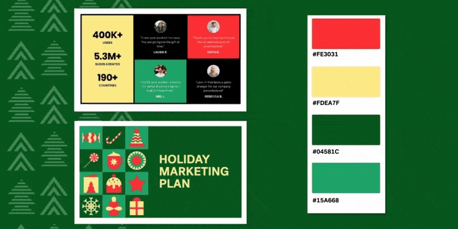
Bold
Go bold with a modern take on a classic red and green palette. We selected two shades of green (#15A668 and #04581C), a light yellow (#FDEA7F), and a softer red (#FE3031) to give a retro-classic holiday feel.
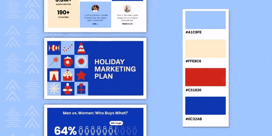
Cool
If you’re not big on Christmas-esque colors, this cool combination is for you. We used a dark (#0C32AB) and light blue (A1C8FE), a bold red (#C51820), and a muted cream (#FFE8C6) to create a winter wonderland palette.
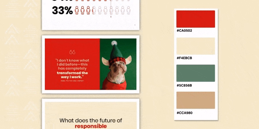
Muted
Sometimes less is more, which is why we love a more muted color palette. Try combining tans (#CCA980 and #F4EBCB), a forest green (#CA0502), and a classic red (#CA0502) for a subtle, festive look.


.gif)