

There’s a lot that can ride on a presentation. From funding to a final grade, your presentation serves a purpose and you want it to be successful. But that doesn’t make it easy. In fact, the pressure to nail a presentation can make it all the more daunting.
Presentations have a bad reputation for one of two reasons; 1) people are deathly afraid of public speaking, or 2) the presentation ends up being a total Frankendeck. Neither are great, but fixing one can help eliminate the other. Research shows that 91% of presenters would feel more confident getting in front of an audience if they knew their presentation was beautifully designed. This is the one time where looks actually do matter. Having a beautiful presentation can help boost your confidence, ease your nerves, and deliver a more successful story.
Here are 6 surefire ways to nail beautiful presentation design with little-to-no design experience.
Dodge the bullets
You know the saying, “you dodged a bullet”? Well we’re here to apply it to presentations. One of the key components of a Frankendeck is a slide covered in bulleted text. To make your presentation more beautiful, the first step is to skip the bullet points where you can. And while you’re at it, limit your text altogether. Instead, stick to one main point per slide and use clear and concise language to emphasize the key takeaways.
If a bullet point was your go-to slide before reading this article, you’re not alone. Many people opt for bullet points when they don’t have the design skills to lay out their content in a better, more visually appealing way. It’s the safe choice for non-designer. But instead, try an icon slide, an infographic, or a data comparison chart template to jumpstart your ideas and showcase your information more beautifully.
Size matters
Here’s something you might not hear often: size matters. Specifically in beautiful presentation design, font size matters. As a general rule of thumb, you should keep your text to a minimum with no more than 30 words per slide, and no font-size smaller than 24. Not only will a bigger font be more legible so your audience isn’t squinting in their chairs, it will look better.
Even if you stick to our suggested rule of thumb, we recommend taking your slides for a trial run before the big day. What looks good on a slide on your laptop, might look differently on a bigger screen or projector.
Show your true colors
When color is transmitted from the eye to the brain, the brain discharges a hormone that impacts one’s emotions, mental clarity, and energy levels. Both negative and positive psychological effects of colors have been analyzed in humans based on the combinations in which they were presented with. Picking the right colors can have a direct effect on how your audience receives the message. All that to say, you don’t have to include all of your favorite colors in the same deck but you should be intentional with what colors you do choose. Read that again. Pick 1-3 colors that complement one another and stick to that color palette throughout your entire deck. Make sure those colors are evoking the right emotion that you want your audience to feel.
Make it pop
We cannot emphasize the importance of color in beautiful presentation design enough. Above we share how different colors can evoke different emotions. Once you select your color palette, it’s just as important to decide how you will utilize those colors. Your font color and background colors should be a nice contrast so that your key message pops. For example, your background color might be lighter while your text is dark, or vice versa. By creating that contrast, you’re telling your audience what to pay attention to, what to read, and what to retain. Not to mention it will look clean and modern, too.
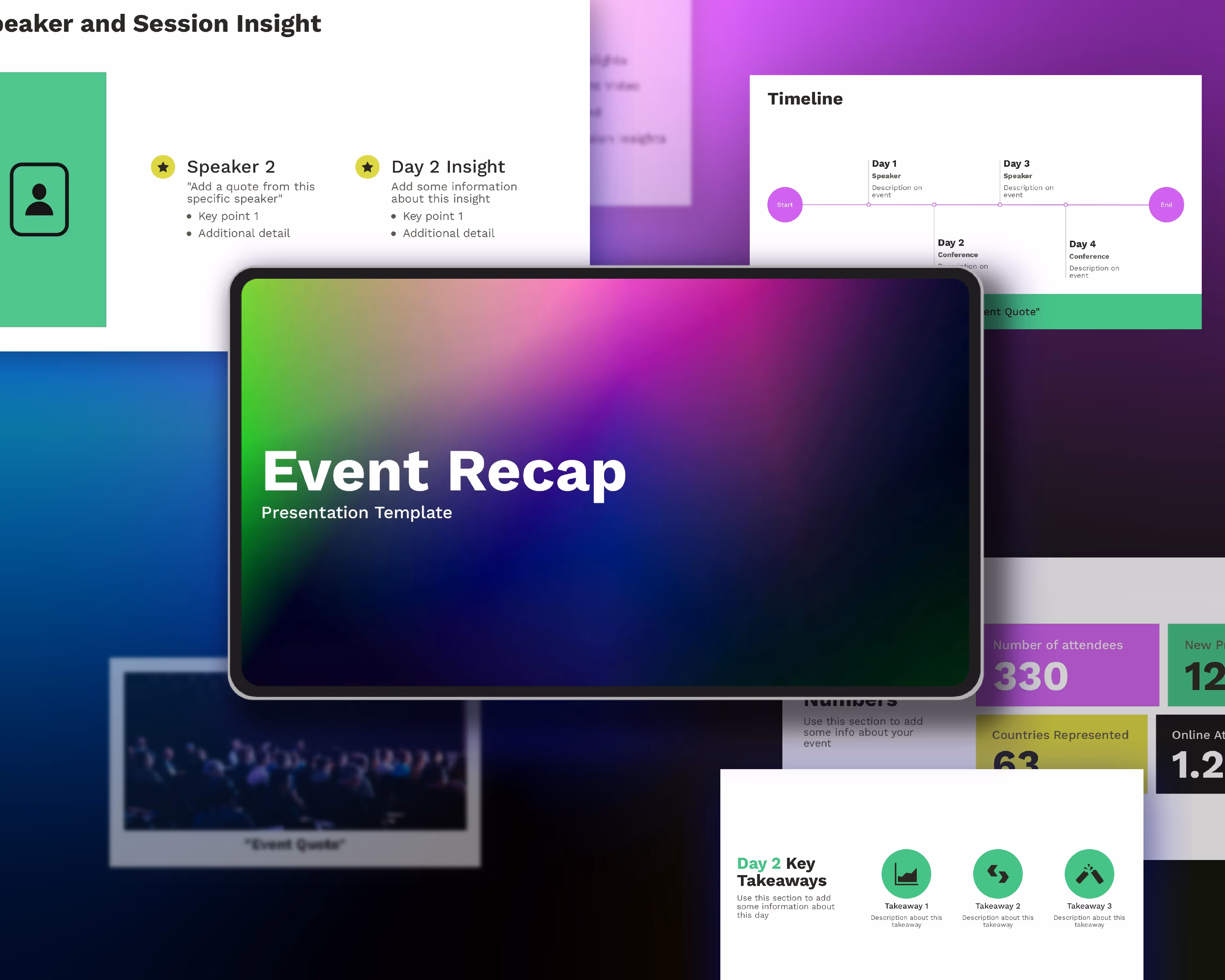
Try setting a custom theme in Beautiful.ai. You can select your own background, foreground, chart, and font colors so that every slide pops and is consistent with the one before and after. Once you create your theme, it’s automatically applied to each slide throughout the entire deck.
Avoid motion sickness
Plenty of presentation softwares abuse animations. So much so that it makes your audience dizzy. No, we’re not going to name names. But here’s what we will tell you: to make your presentation beautiful, use animations responsibly. Animations don’t need to be the star of the show, but instead should be the spotlight that brings attention to your story. When used correctly, animations will bring your story to life and grab the focus of your audience.
In Beautiful.ai, we give you the power to decide how your animations will build on each slide. You control the speed, the order, and whether they build automatically or advance with a click. And you can also customize the animation timing and style to choose overlapping, simultaneous, sequential, or no animation at all. No matter what you choose, your animations will always be dynamic, and never detrimental to your overarching message.
A picture’s worth 1,000 words
Visual assets are your (best) friend. And in presentations, pictures pull the weight so that you can say more, with less. It’s no secret that more than half of people are visual learners. As such, many avid presenters will include supporting visuals on most— if not all— of their slides. In fact, 84.3% of presenters said they crafted presentation slides that were highly-visually focused. We’re going to state the obvious, adding beautiful visuals to your deck is one of the easiest ways to make a beautiful presentation.
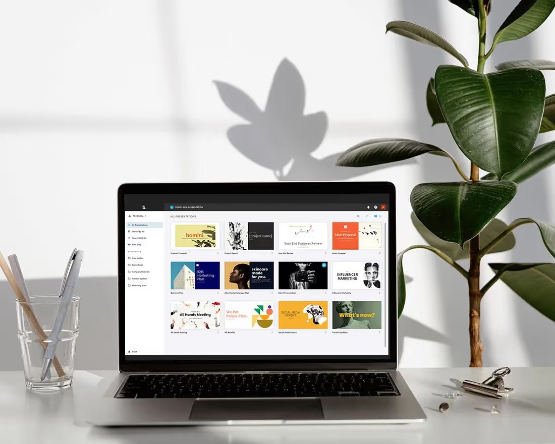
Beautiful.ai’s free asset library has hundreds of thousands of logos, icons, and high-quality images so that you can find the right visual to complement your presentation.


.avif)