

“Many people think that color is just a matter of how things look and is often dismissed as being purely cosmetic. However, the truth is that color is light—it’s the source of life itself; there is nowhere that color does not exist and our instinctive, unconscious response to it is a vital element in our survival.” — Angela Wright, Color Psychology Expert
Let's get right to it: Color psychology, simply put, is the study of how specific hues affect human behavior or mood.
When color is transmitted from the eye to the brain, the brain discharges a hormone that impacts one’s emotions, mental clarity, and energy levels. Both negative and positive psychological effects of colors have been analyzed in humans based on the combinations in which they were presented with.
You may not think about it, color psychology is a part of your daily life. It’s why you chose to paint your bedroom a soothing shade of blue, the majority of the clothing in your closet is black, and you typically opt for candy that is red. Artists, designers, retailers, and brands use color psychology to entice customers, so the same concept should be embraced if you want to capture an audience with your presentation. In fact, studies indicate that people decide whether or not they like an object within 90 seconds, and 62-90% of their decision is based on color.

An Introduction to Color Psychology
Color in Ancient Times
Color psychology is not a modern-day concept to help businesses make more money. It actually dates back to the Egyptians who studied the effect of color and mood for holistic purposes—yellow purified the body and calms frazzled nerves, blue soothed pain, purple helped with skin conditions, and so on. But it was Sir Isaac Newton who discovered how the color spectrum is organized in the late 1660’s. Later on down the road when modern psychology came into the picture, color took on a new meaning.
Swiss psychiatrist Carl Jung dedicated much of his practice researching the meaning of color, which eventually led him to develop the concept of art therapy. Often quoted for saying, “colors are the mother tongue of the subconscious,” Jung believed that expressing one’s feelings through colors and imagery could help patients recover from a traumatic or stressful experience.
Today, one of the most prominent experts in the field of color psychology is Angela Wright, who is known for creating “the Colour Affects System,” an academically approved method that made it possible for color psychology to be used objectively, rationally, and accurately. While Wright’s hypothesis challenges the idea that color choice is subjective, she explains, “When the study of color harmony is combined with the science of psychology, reactions can be predicted with startling accuracy.”
Color Psychology And Your Presentation
When creating a presentation, the visual aspect is just as critical as the information you’re placing on each slide. Even the most compelling, grammatically correct content can be muddled if it’s not appealing to the eye. But we’re not talking about making the mistake of using tasteless graphics or a mix of dizzy fonts (that’s a whole other conversation), rather the importance of choosing the correct colors.
This is where color psychology meets presentation design.
Now that you have a better understanding about what color psychology actually is, let’s explore some "best practices" in action so you can better understand why certain combinations work and why others don't. Since Beautiful.ai is a software tool that designs your presentation for you in real-time, let's take a look at how color plays out in marketing materials, specifically presentations.
Below, we'll take a closer look at which primary and main colors are best suited for your presentation—and which you should reserve for your wardrobe. Remember, just because you’re partial to certain hues doesn’t mean they are they best choices.
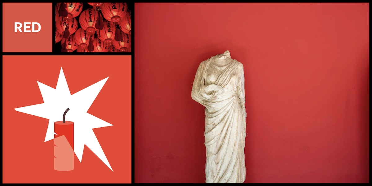
RED
Positive aspects: Courage, excitement leadership, love, confidence, strength, warmth, energy, willpower, stimulation, masculinity
Negative aspects: Defiance, aggression, danger, rage, malice, visual impact, strain
When used correctly, red can easily get those you are presenting to excited about your idea—it can also prompt them to make quick decisions. As it’s an attention grabber, reserve red for those specific phrases or points you want people to remember. Just keep in mind that it’s best to use red in moderation so that you don’t come across as aggressive or authoritative and/or turn off a potential client.

BLUE
Positive aspects: Confidence, communication, trust, efficiency, serenity, duty, logic, coolness, reflection, calm
Negative aspects: Coldness, aloofness, lack of emotion, unfriendliness
Many brands choose to use blue because it gives the consumer a sense of loyalty and trust. It’s also a great color choice for imparting a sense of calm and safety, so a new hire company orientation is just one of many examples where this hue could be effective. Keep in mind that it’s not a good choice if you’re presenting something related to food, as blue tends to impart an unappetizing feeling—it’s why many dieticians suggest eating off of blue plates so that you eat less.
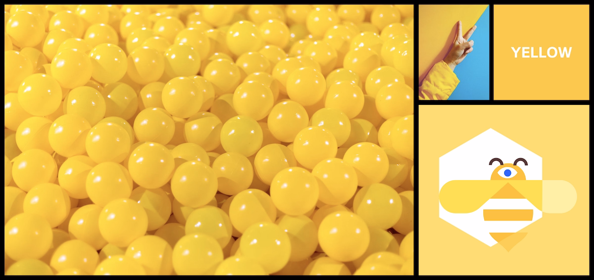
YELLOW
Positive aspects: Optimism, confidence, self-esteem, extraversion, emotional strength, friendliness, creativity
Negative aspects: Irrationality, fear, emotional fragility, depression, anxiety
Yellow stands out from the crowd because it’s the most intense color of the visible spectrum, thus making it the most noticeable to the human eye. It’s a great attention-grabber as long as it’s not overused as it come off as harsh. Not to mention, it’s also the most exhausting to the eye because of the immense amount of light that’s reflected. In terms of a presentation, use yellow in small doses to draw attention to important facts, data, dates, etc. Consider the shade of yellow based on what message you’re trying to convey. For example: cream yellow encourages new ideas, pale yellow lacks confidence, golden yellow symbolizes curiosity, citrine yellow represents deception and emotional instability, dark yellow draws cynicism, and bright yellow clears the mind.

GREEN
Positive aspects: Harmony, balance, refreshment, universal love, rest, restoration, reassurance, environmental awareness, equilibrium, peace
Negative aspects: Boredom, stagnation, blandness, enervations
Green is the color of life. It symbolizes harmony, stability, and balance as it’s the center of the spectrum. As people are drawn to balance, it’s a good color choice for a presentation. Green also stimulates interaction, so it’s great for a presentation where you want to encourage participation—it’s precisely why many trainers use it. As it’s a hue that is prevalent in nature, it can also signify the environment, growth, renewal, and health. Watch which shade you’re using as extremely light greens can come across as bland and boring.
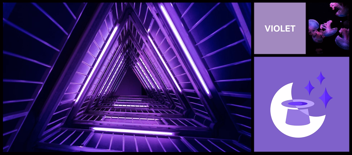
VIOLET
Positive aspects: Spiritual awareness, bravery, inspiration, loyalty, dignity, wisdom, containment, vision, luxury, authenticity, truth, quality
Negative aspects: Introversion, decadence, suppression, inferiority
Violet—or purple, as it is more commonly called—is the shortest wavelength (around 380 nanometers), so visually, it has the power to encourage creativity, calm nerves, and uplift. It’s great for any presentation where you are trying to convey exclusivity, luxury, and class. Even though these are all good reasons to choose such as hue, there are actually few brands that use violet—but the ones that do are biggies. It’s quite possible the reason it’s not overused is because it's the shortest wavelength, it can be difficult for people to read.
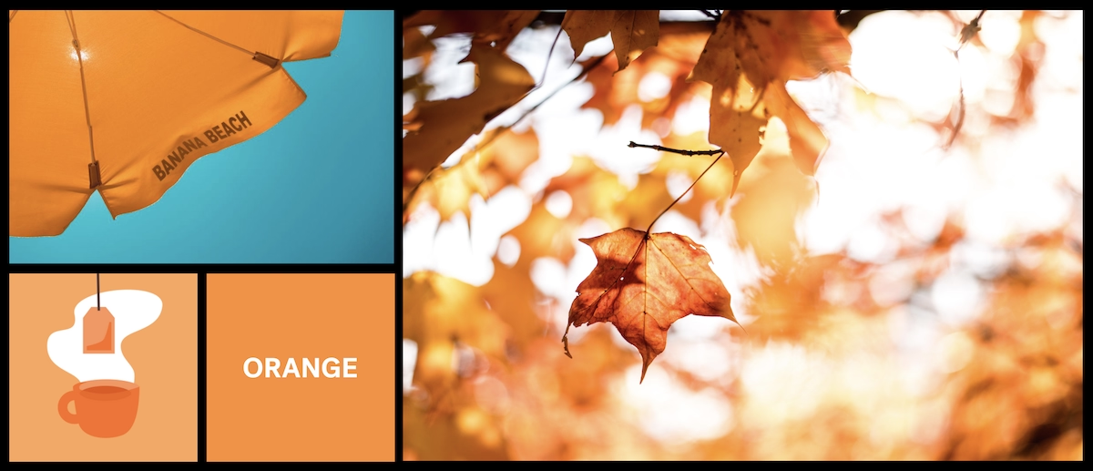
ORANGE
Positive aspects: Physical comfort, food, warmth, security, sensuality, passion, abundance, fun
Negative aspects: Deprivation, frustration, flamboyance, frivolity, immaturity
If one of your goals is to get people to accept or try something new, incorporate orange into your presentation. This vibrant hue is often associated with creativity and enthusiasm, perfect for getting your team amped. Just be careful not to overdo orange as it can suggest flightiness and lack of cerebral principals.
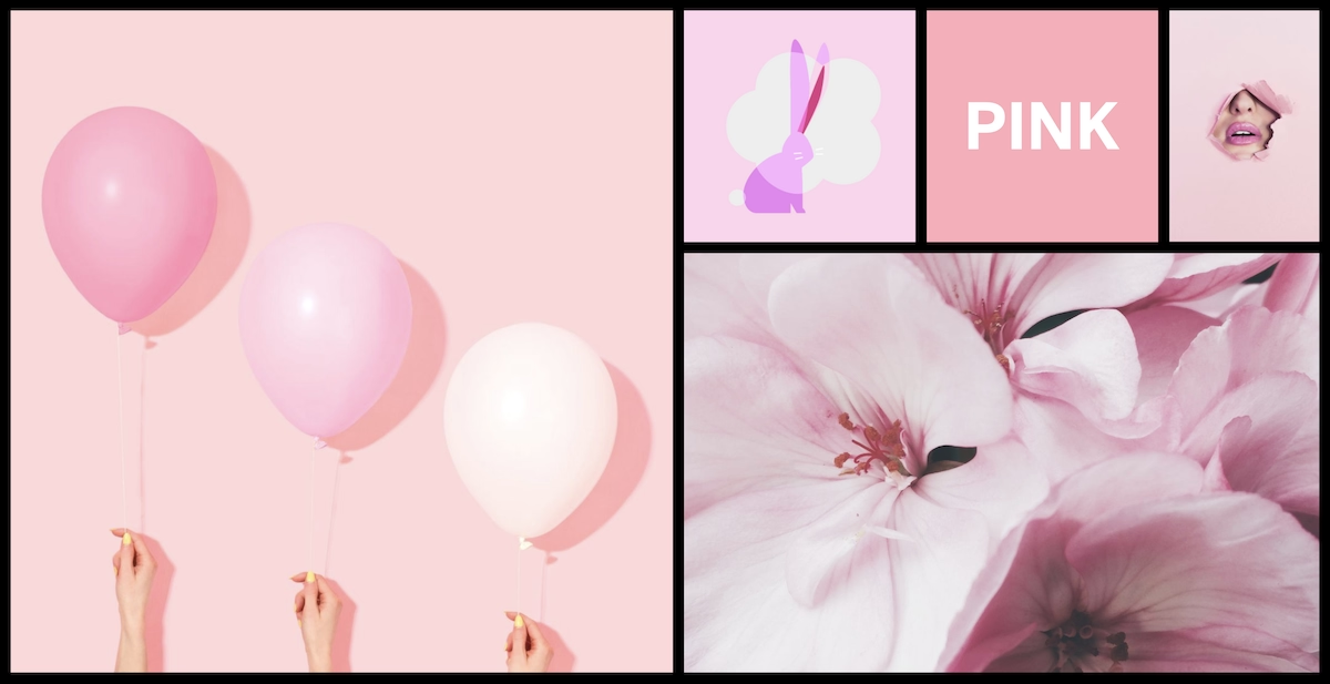
PINK
Positive aspects: Physical tranquillity, nurture, warmth, femininity, love, sexuality
Negative aspects: Emotional claustrophobia, emasculation, physical weakness
Since pink is a tint of red, it affects one physically—but in a soothing, not stimulating manner. A representation of femininity, pink is often used in cosmetic, beauty, fashion, and confection industries to convey a message. The rosy hue is also associated with hope and compassion, which is why it’s a go-to color for many charities. Keep in mind that if you’re presenting to both men and women, you may want to tone down the pink a bit as it can come across as emasculating.

GREY
Positive aspects: Psychologically neutral
Negative aspects: Lack of confidence, dampness, depression, hibernation, lack of energy
Grey is the only color in the spectrum that has forthright psychological attributes. In other words, it’s completely neutral. When used alone, grey can conjure up feelings of depression and introversion, but when used in combination with other colors (like vibrant red, yellow, and orange), it can make a presentation pop. In fact, grey (or silver as it’s commonly called) is a softer background color than white and it fitting for almost any presentation. Opt for a dark grey background with light text, or the reversal for reading ease.

BLACK
Positive aspects: Sophistication, glamour, security, emotional safety, efficiency, substance
Negative aspects: Oppression, coldness, menace, fear, heaviness
As black is a color that has an absence of light, making it impossible for wavelengths to be reflected, it’s regarded as a menacing hue—so it’s no surprise why some people are afraid of the dark. But since we’re talking about presentations versus haunted houses and childhood memories, it can be an effective color, too. Basic black can be great for a “fade to black” transition in a presentation because it evokes a feeling of starting fresh. It also illustrates sophistication and works well when paired with white to get a point across.

WHITE
Positive aspects: Hygiene, sterility, clarity, purity, cleanness, simplicity, sophistication, efficiency
Negative aspects: Sterility, coldness, barriers, unfriendliness, elitism
While black absorbs, white reflects—which can be completely straining to the eyes. When used correctly (with a balance of other colors, for example), white is a good color choice for presenting a positive message that’s not competing with the image of the brand. While it’s clean and pure, it can also be perceived as dull and cheap—this is why grey is often used as an alternative background color.

BROWN
Positive aspects: Seriousness, warmth, nature, earthiness, reliability, support
Negative aspects: Lack of humour, heaviness, lack of sophistication
Brown embodies the same solemnity as black, but in a warmer and more subdued way. As it’s a color associated with nature and the earth, brown is a good choice if you’re giving a presentation where you want to convey a message of honesty, stability, healing, and home. It also stimulates the appetite, so keep that in mind if you’re giving a food-related presentation.
In Conclusion
When creating a presentation for your company, it’s important to consider both brand identity and color psychology. While you want to stay true to company identity, don’t disregard the power of color with regard to human emotions—both physically and mentally. In order to determine color choice, ask yourself some important questions: What’s the goal of the presentation? What message am I trying to convey? Who is my audience? How can I use colors that work harmoniously with my brand? Don’t make the mistake of choosing hues simply because you like them. The most successful brand presentations are strategic ones.


.avif)
.gif)


