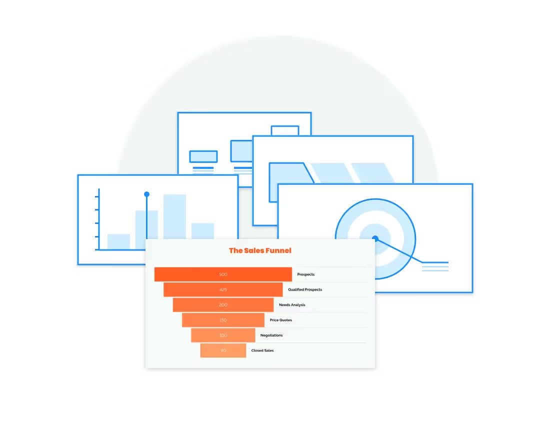
As its name implies, a comparison chart or comparison graph draws a comparison between two or more items across different parameters. You might use a comparison chart to look at similarities and differences between items, weigh multiple products or services in order to choose one, or present a lot of data in an easy-to-read format.
If you need help choosing which to use for your presentation, read about the different comparison charts Beautiful.ai offers for your presentation below.
Venn Diagram
A Venn diagram is one of the most well-known diagrams used to compare and contrast data. It’s made up of multiple overlapping circles, each representing a set of data. The common elements between each set of data are represented by the areas of overlap within the circles.
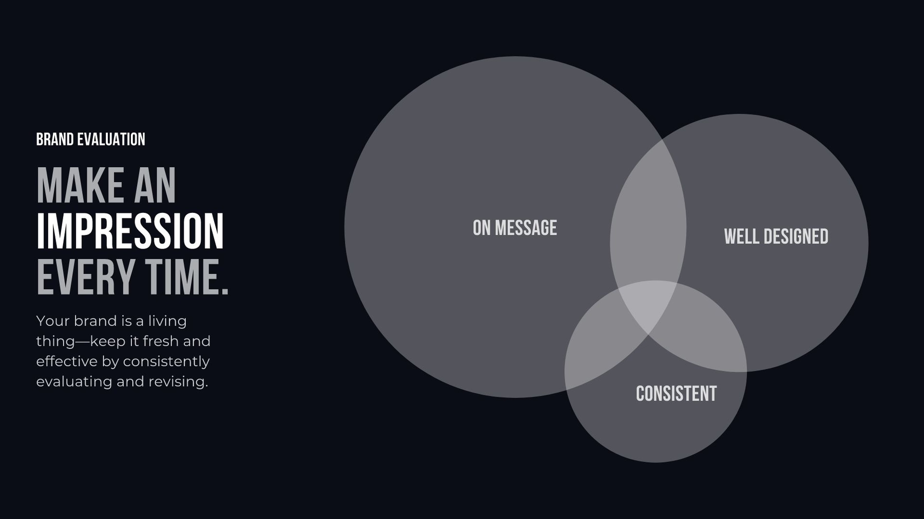
Venn diagrams make it easy for the viewer to understand how multiple things are alike and different at the same time. It can also show a specific relationship between sets of data. For example, if you want to explain that your ideal client for your arts and crafts business is 25 to 34 years old, creative, and lives in the United States, you might use a Venn diagram template in your presentation to show that easily.
XY Plot
Also called a scatter plot or scatter graph, an XY plot uses dots to display values for two variables.
An XY plot shows one of three types of relationships (typically called correlation):
- positive correlation: as one variable increases, so does the other
- negative correlation: as one variable increases, the other decreases
- no correlation: there is no apparent relationship between the variables
Use an XY plot if you need to find a pattern or relationship within a set of multiple data points.
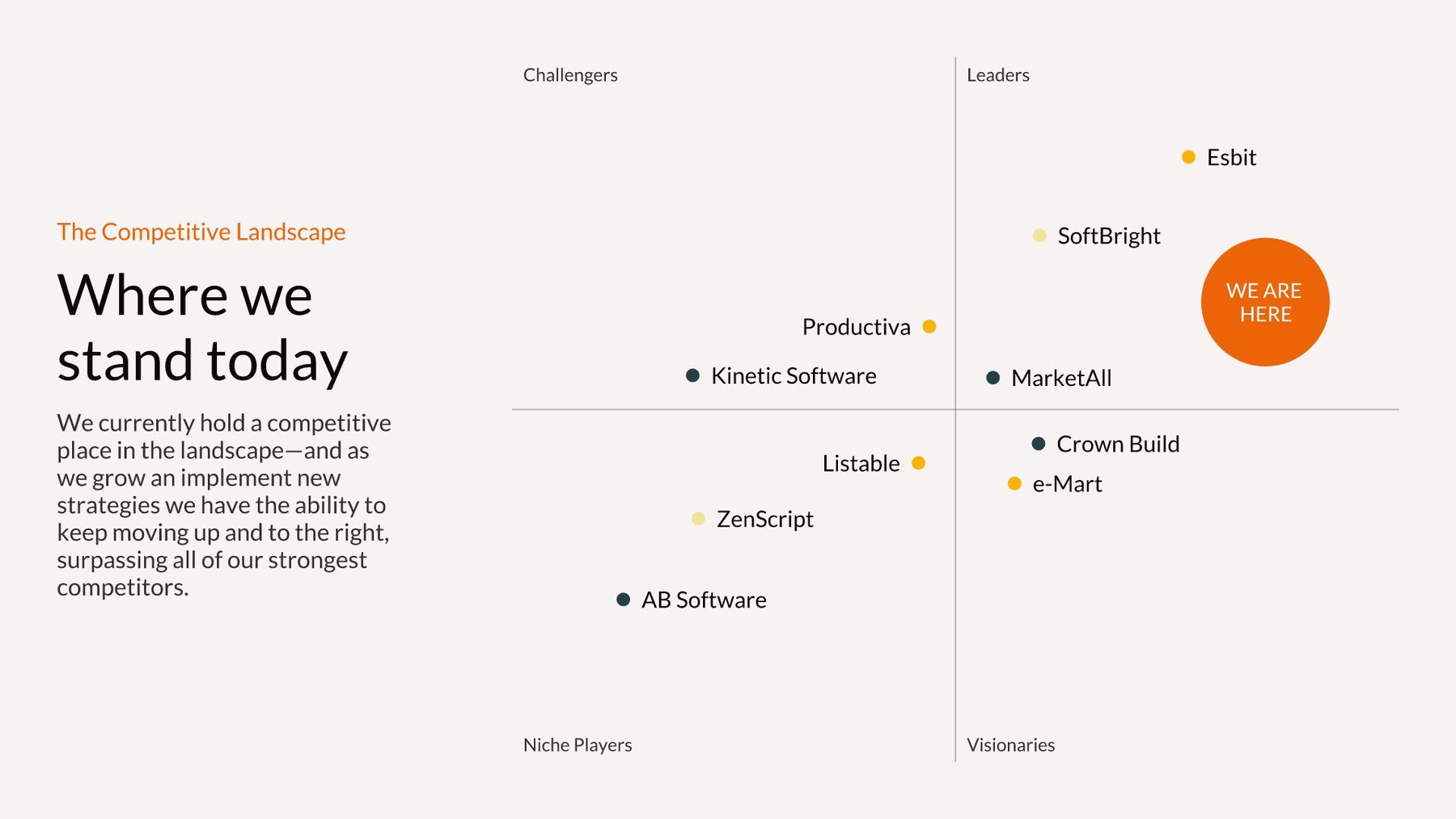
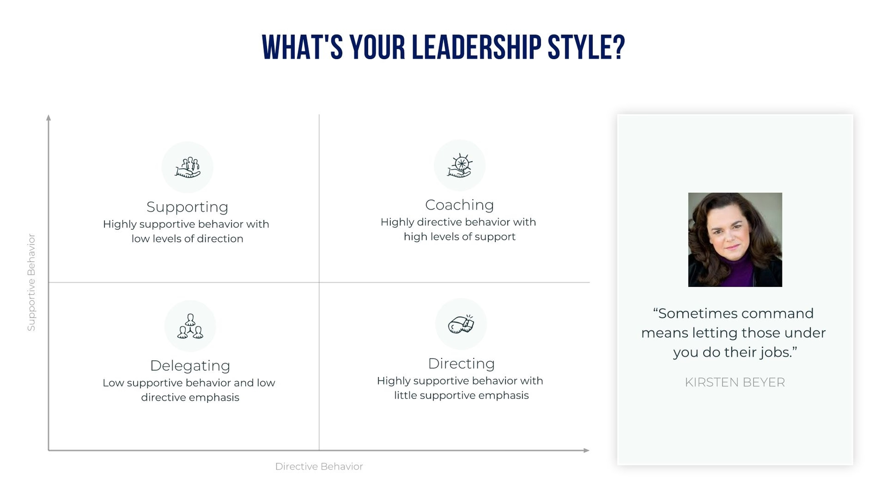
Quadrant
A quadrant chart is visually similar to an XY plot. However, instead of a horizontal x-axis and a vertical y-axis, a quadrant chart is divided into four quarters (quadrants). Quadrant charts are also sometimes called matrix models or bubble charts. You can use a quadrant chart to plot data categorized into these quadrants, and use the dot size to indicate quantity.
Quadrant charts are often used for an Eisenhower Matrix for time management, a PEST analysis, or a SWOT analysis.
SWOT Analysis
“SWOT” stands for strengths, weaknesses, opportunities, and threats. It’s often displayed in a quadrant chart format to analyze a person or an organization. A SWOT analysis helps you figure out what you do well, what could be improved, which opportunities you can take advantage of, and what threats you need to be aware of.
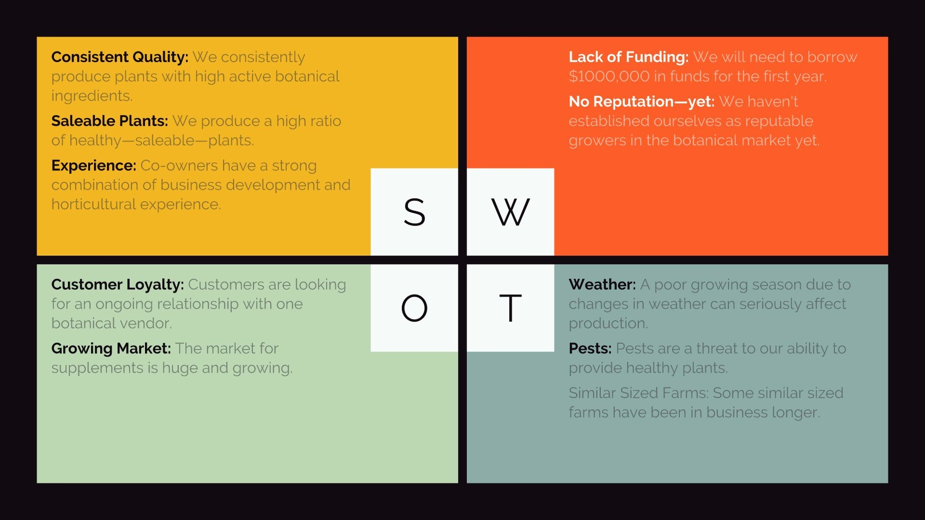
A SWOT analysis slide might be used in a company-wide annual meeting to get all employees on the same page. It might also be used in an employee performance review to discuss progress so far and goals for the future.
Pictograph/Percentage Comparison
If you want to give a more engaging view of small sets of data, you can use a percentage comparison or pictograph template in your presentation. Instead of plotting number data on a graph or quadrant, a pictograph chart uses rows of icons to represent data subjects or categories. You can also use it to represent data in percentages.
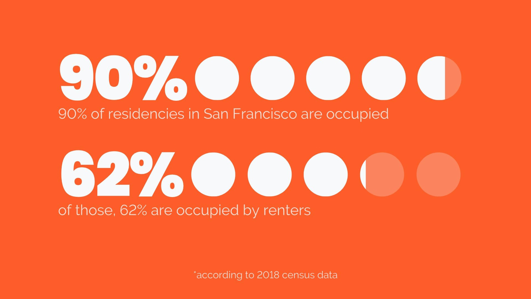
Let’s say you want to display the number of people in the United States who bought a new car last year, which was 40%. You could create a row of ten icons and make four of them a different color or fill. It’s a more compelling, interesting way to display a data fact.
Radial Bar Chart and Compare Bars
Looking for a different way to display percentages, or an interesting twist on a regular bar chart? Try a radial bar chart. You might use one radial bar chart with multiple bars to compare and contrast different data sets. In this kind of bar chart, each bar is plotted along a circular grid instead of an XY-axis.
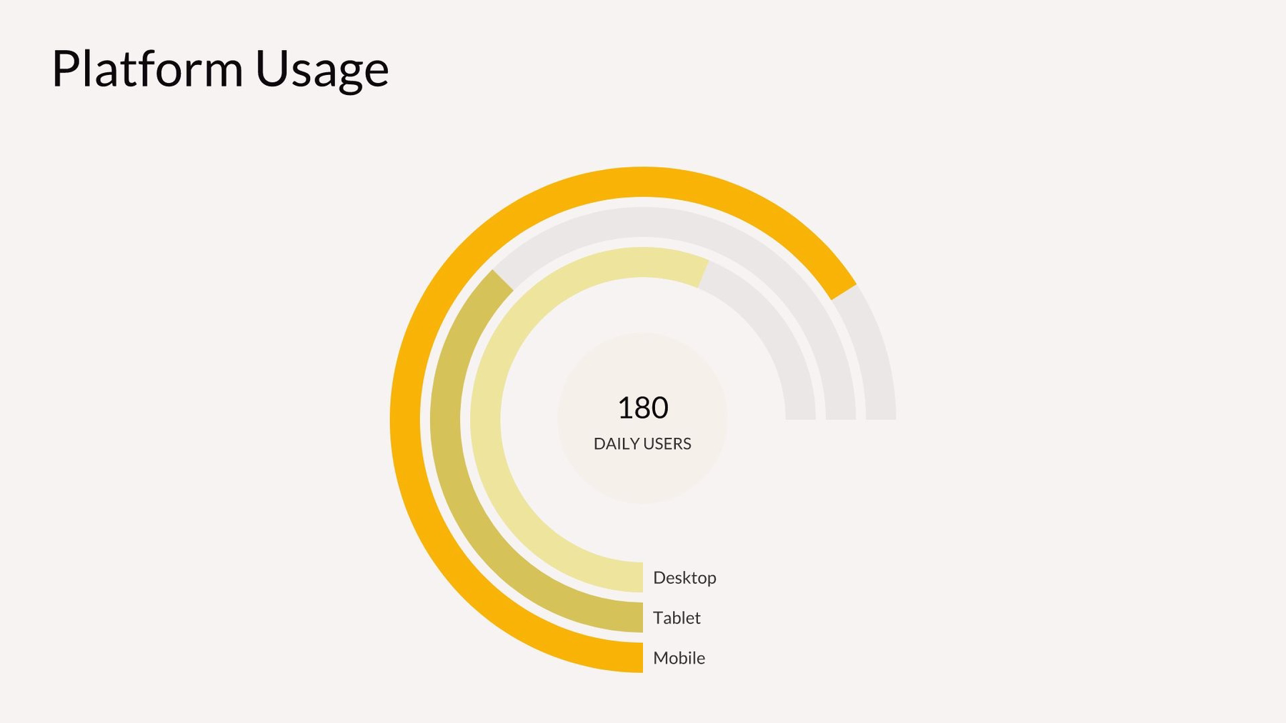
Or, you can create one radial chart (one circle) for each data set and compare them side by side to display different percentages. A compare bars chart displays information in a similar way to a radial bar chart. One bar represents the percentage of a whole, and is displayed next to other bars representing different percentages.
Compare Slices and Compare Columns
A compare slice chart is another way to display percentages. A compare slice chart is visually similar to a pie chart. Instead of cutting a circle into “pie” slices, a compare slice chart partitions a bar into smaller blocks. In a compare slice chart, you can show how multiple blocks make up part of the whole bar.
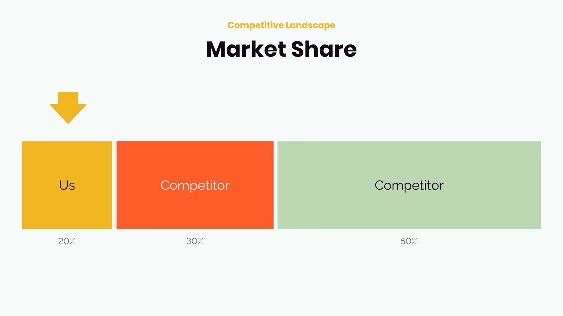
Compare columns are handy for comparing or contrasting related statistics. Similar to a bar graph but not requiring a grid, compare columns can easily provide visual representation of your data. For example, you might create multiple columns to express how many customers your company has reached compared to your competitors.
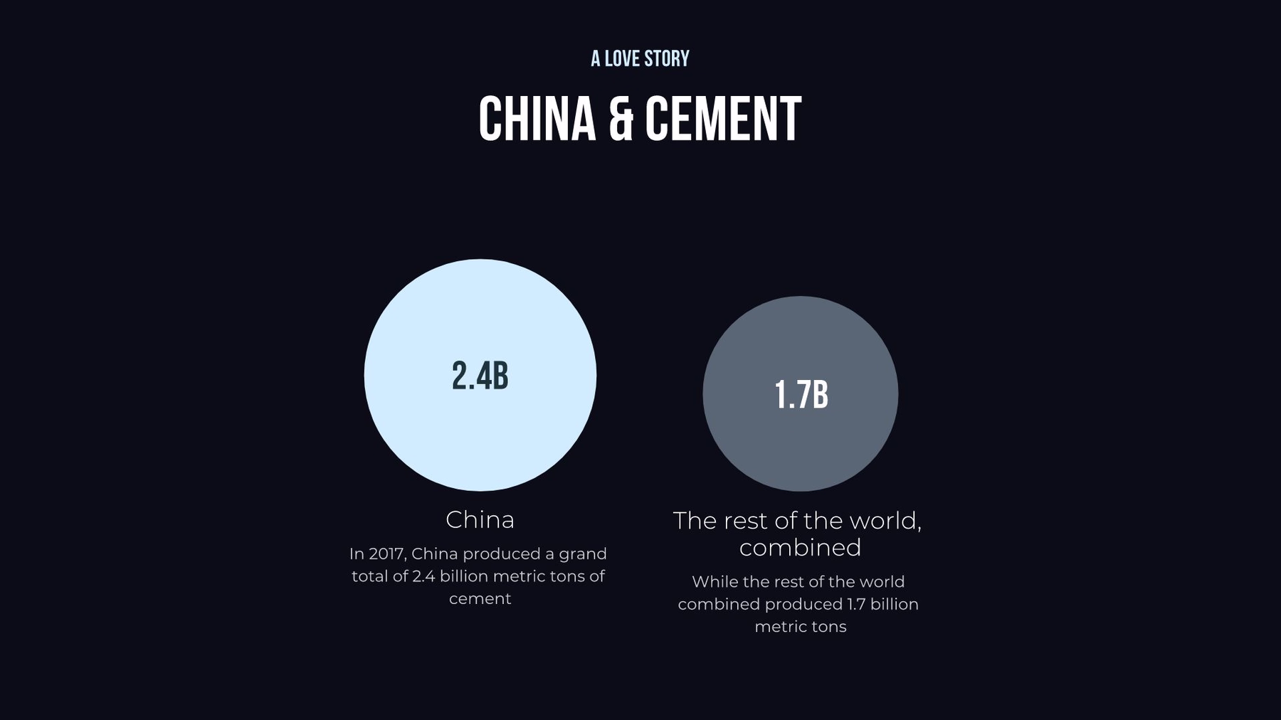
Compare Circles and Floating Circles
Prefer a different visual layout? Try compare circles. Compare circles provide a clear snapshot of how data relates to one another using differently sized circles. The viewer can see at a glance the relationship between circles and their respective statistics.
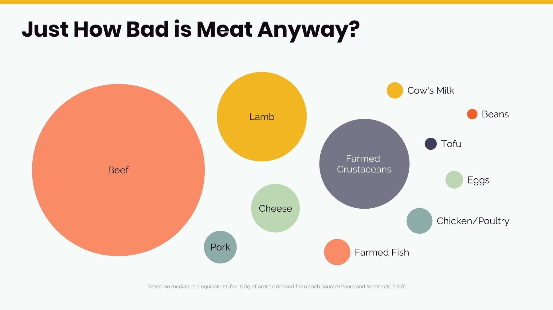
If you have multiple data points and you need to give a broad overview of their impact, a floating circle chart might be more appropriate for your presentation.
Arrow Bars
When you need a minimalist yet slightly dressed up list, try arrow bars to add some impact to your presentation. Arrow bars can be used to list steps in a process, share statistics, or explain relationships between items. Rather than plain black dots in a bullet list, arrow bars imply change, movement, and direction. They can make the data in your list more compelling and dynamic.

Compare your data with Beautiful.ai
When you’re ready to display your data in a compelling and easy to read comparison chart, choose one of Beautiful.ai’s customizable slide templates. From comparison graphs to diagrams to lists and more, Beautiful.ai has everything you need to build an effective, memorable presentation.


.webp)