

Presentations are the glue of team workflow, from internal updates to client pitches. Yet, without clear guidelines, collaborative efforts can turn into design chaos. Beautiful.ai’s Team plan streamlines this with robust content management and branding controls, ensuring your decks stay polished and professional. But sometimes, teams need more than just tools for a good presentation—they need rules. Enter Guy Kawasaki’s 10/20/30 rule for slideshows.
What is the 10/20/30 rule of PowerPoint?
Silicon Valley guru Guy Kawasaki coined the 10/20/30 rule to banish boring presentations. Despite often being associated with PowerPoint, the rule is universal and can be applied to any presentation platform you’re working in. This simple, powerful guideline dictates: ten slides, twenty minutes, and no font smaller than thirty points. With Kawasaki’s expertise as a venture capitalist and evangelist, he’s seen his share of dreadful pitches and knows how to keep an audience engaged.
Stick to the 10/20/30 rule, and you’ll transform your presentations from snooze-fests to showstoppers.
Why is the 10/20/30 rule important?
Guy Kawasaki, a Silicon-Valley based author, speaker, entrepreneur, and marketing evangelist, coined this presentation rule. Kawasaki suffers from Ménière’s disease which results in occasional hearing loss, tinnitus (a constant ringing sound), and vertigo—something that he suspects can be triggered by boring presentations (among other medically-proven things). While he may have been kidding about presentations affecting his Ménière’s, it inspired him to end snooze-worthy pitches once and for all. As the former Apple employee who marketed the Macintosh computer line in the 80s and a venture capitalist, he’s no stranger to entrepreneurship, startup pitches, keynotes and everything in between. We’d be willing to bet that he’s heard his fair share of pitches that have fallen on deaf ears (almost literally, in his case).
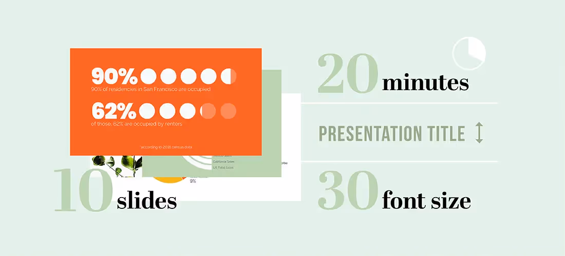
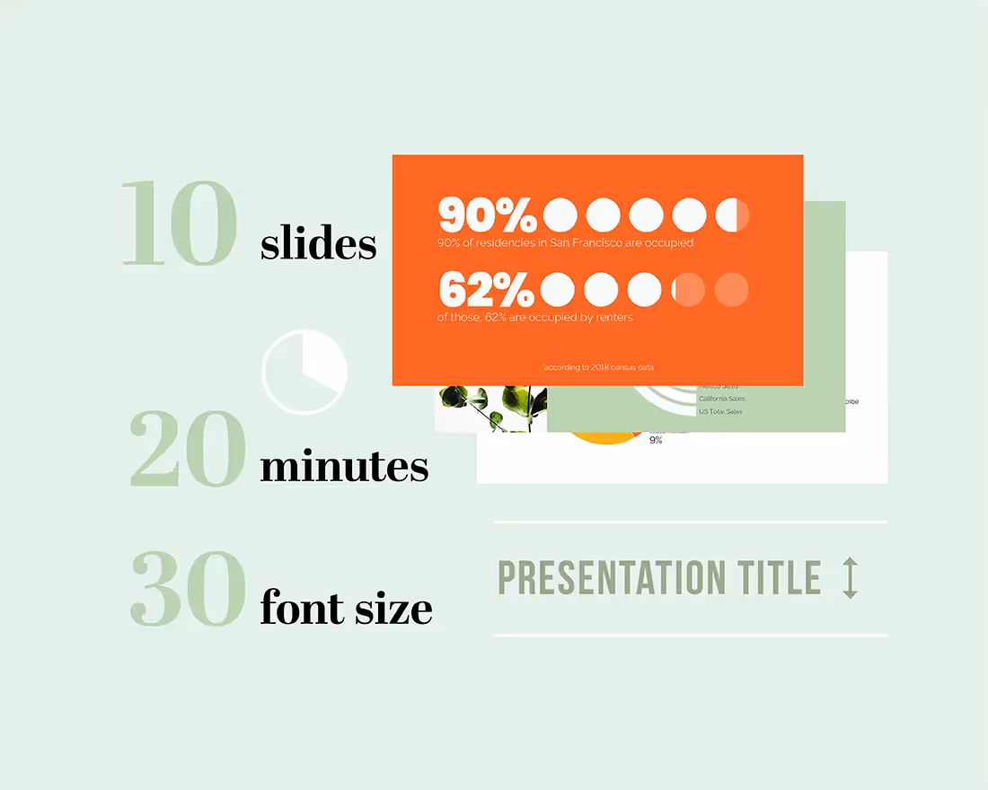
To save the venture capital community from death-by-PowerPoint presentation, he evangelized the 10/20/30 rule for presentations which states that “a presentation should have ten slides, last no more than twenty minutes, and contain no font smaller than thirty points.”
We’re all passionate about our stories and hope our audience shares that enthusiasm. But even the most groundbreaking topics can lose the audience's attention to distractions or boredom.
The 10/20/30 rule for presentations ensures your slides are concise, legible, and memorable, driving bigger wins for your team.
Let’s break down each of these presentation rules:
10 Slides
Less is more. Kawasaki’s rule emphasizes this beautifully.
Audiences can’t digest more than 10 concepts in one sitting. Each slide should highlight a key message or takeaway, clarifying what you want your audience to learn. Whether it’s a pitch, internal meeting, or sales deck, keeping the number of slides to 10 ensures your message remains focused and impactful.
While Kawasaki applied this to the venture capitalist world—and the 10 slides you absolutely need in your pitch—this is a good rule of thumb for internal meetings, proposals, and sales decks, too.
20 Minutes
Remember the last 90-minute presentation you actually remembered? Exactly. Attention spans are short, and it's not personal—it’s human nature.
Aim to deliver your presentation in 20 minutes or less. This timeframe keeps your audience engaged and leaves room for discussion, questions, and driving your points home. Regardless of the time you have blocked out for the meeting, your team should aim to keep their presentation short. If there’s time left over, use that for discussion to answer questions and drive your point home.
30 Point Font
If your audience has to strain their eyes to read your slides, they probably won’t bother to read them at all. Regardless of the age of your audience, no one wants to squint their way through a 20-minute presentation. Kawasaki’s rule of thumb is to keep all text to 30 point font or bigger. Of course, larger font means less text you’ll be able to fit even in bullet points. This is a good exercise to decide what information you really need on the slide, and pushes you to be succinct in explaining complex topics like pitching a business idea or explaining a business model.
By making your slides more legible for your audience, you’re encouraging them to follow along. Additionally, being intentional about what your team includes on each slide helps the audience know exactly what you want them to pay attention to in the presentation.
Kawasaki’s 10/20/30 rule transforms presentation design from tedious to terrific. Embrace it, and watch your team’s presentations shine.
Real world impact
Imagine you’re pitching a groundbreaking product to potential investors. With only ten slides, you cut the fluff and deliver a powerful, focused message. In twenty minutes, you keep their attention, leaving them eager to learn more. Your pitch deck, with 30-point font, is clear and impactful, ensuring no one misses your key points.
Or consider a team meeting where you’re presenting quarterly results. By adhering to the 10/20/30 rule, your colleagues stay engaged, and the concise format makes your data memorable and actionable.
Even in a sales pitch, the rule ensures you highlight the most compelling benefits without overwhelming your prospects. Across all these scenarios, the 10/20/30 rule transforms ordinary presentations into compelling narratives that drive results.
Applying the 10/20/30 presentation rule in Beautiful.ai
Now that you know Guy Kawasaki’s 10/20/30 rule, let’s apply it to your next team presentation.
In Beautiful.ai, our pre-built presentation templates make it easy for you to stay inspired. Simply browse our inspiration gallery, curated by industry experts, pick the template that speaks to you, and customize it with your own content. Most of our deck templates are well within the 10-count, so you’ll be on the right track to a great presentation.
Once you’re in the deck, our Smart Slides handle the nitty gritty design work so you don’t have to. Changing the font size is easy, and our design AI will let you know if the size is too big or too long for the space on the slide. You can choose your favorite (legible) font when customizing your presentation theme, and that font will be applied to each slide throughout the deck for a cohesive and consistent look.
Of course, it’s all for naught if you don’t practice. We recommend doing a few dry runs in the mirror, or in front of your dog, to get the timing of your presentation right. Remember, 20 minutes is the magic number here.


.webp)
