
.gif)
.gif)

When you sit down to create a presentation, you have to organize your thoughts in a way that will make the most sense to your audience. Each slide helps tell your story whether that be through images, charts, or text. It’s important to add your content in the most effective, visually appealing way so that you can ensure it’s understood on the receiving end. Data can be a powerful way to back up your message, but only when it’s done right. Number heavy slides can be hard to digest, and can distract from your overarching narrative. Finding meaningful and relevant data to include can be stressful enough, and then you have to figure out how to present it in an interesting way. What charts should you use? Which chart displays your content in the most digestible, snack-size bites? And once you’ve selected a chart, where do you start? How do you make it beautiful? Charts can be overwhelming, especially if you don’t have the design skills to back up your work— until now.
Would you believe us if we said that charts don’t have to be a chore? Beautiful.ai’s easy-to-use presentation maker helps you create charts like never before. Data heavy slides look significantly better, and can be created significantly faster with our designer in your back pocket. Now you have unlimited, professional looking charts right at your fingertips. Anyone can create 3 powerful charts in under 3 minutes. Here’s how.
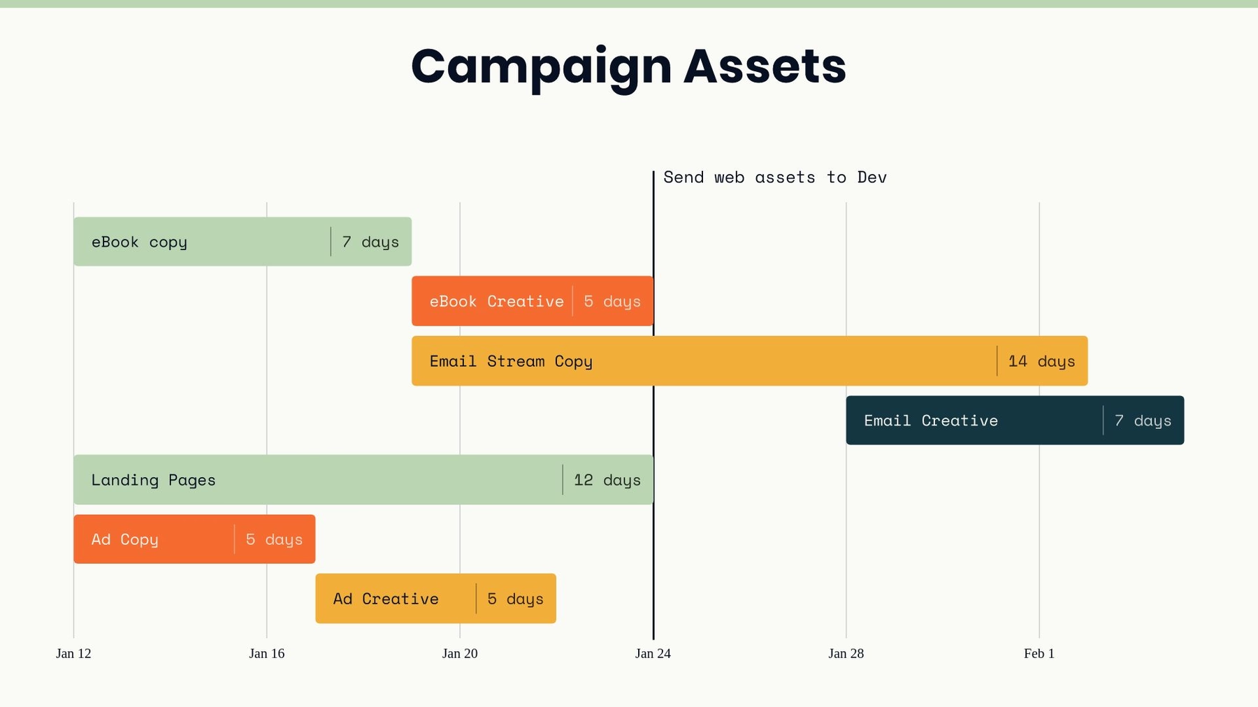
Gantt Chart
A Gantt chart is a visual view of tasks scheduled over time. It's a type of bar chart that you would use to show the start and finish dates of several elements of a project such as what the project tasks are, who is working on each task, how long each task will take, and how tasks group together, overlap, and link with each other. Creating a Gantt chart is easy in Beautiful.ai with our free, customizable Gantt chart template. Simply select the chart in our library of Smart Slide templates, plug in your content, and watch the slide adapt using design best practices. Gone are the days of adjusting chart bars, resizing text, and aligning images— we do that for you so you can focus on your story.
Project management can be complex, so it’s important to keep your chart simple by using a color scheme with cool colors like blues or greens. You can color code items thematically or by department or person, or even highlight a single task with a contrasting color to call attention to it. You can also choose to highlight important tasks using our vast library of icons. This will make your chart easier to read and more visually appealing. You might use photos or icons to denote the person or team responsible for each task, or to mark stages of completion in the project.
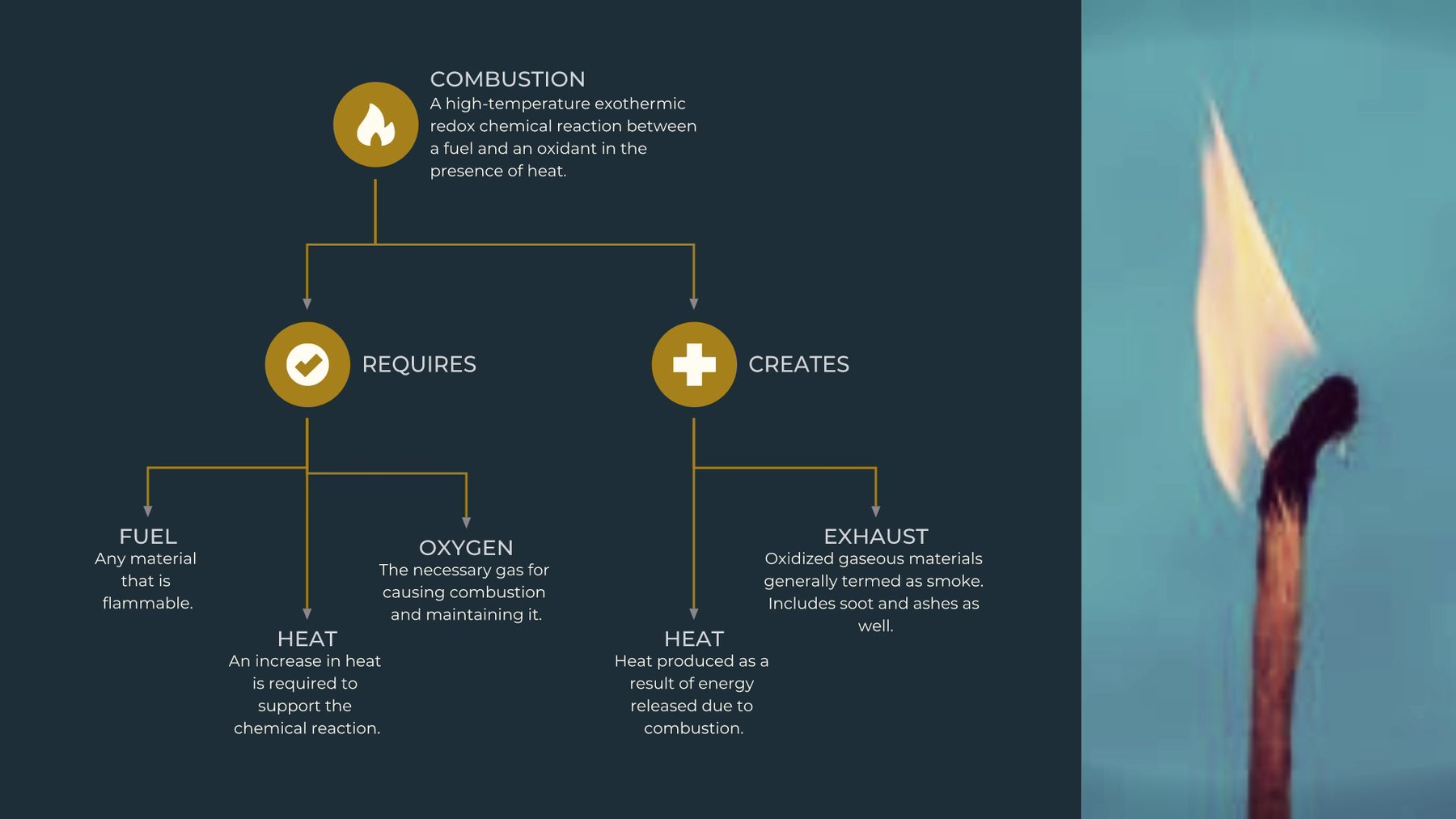
Flowchart
A flowchart is a diagram that shows the sequence of steps and decisions needed to perform a process. Each step in the sequence is noted within a diagram shape. Steps are linked by connecting lines and directional arrows. This allows anyone to easily and logically follow the process from beginning to end. Beautiful.ai’s flowchart template uses smart technology to make your design process a breeze. Instead of spending hours creating a flowchart from scratch, and dragging around countless boxes and arrows, our flowchart template gives you the bones to create something clean and structured in a fraction of the time.
Flowcharts can easily get jumbled and confusing, so it’s important to remember the flowchart rule of thumb: lines and arrows should move from top to bottom or left to right. You should also keep everything on one slide to avoid confusion. Shapes, lines, and texts within a flowchart diagram should be consistent to make the diagram simple to read, but you can make your start and end points slightly bigger for effect. To help you ensure each item is lined up correctly, you can turn on the “grid” to use as a guide and then turn it off when you’re done. (Pro tip: hold down on “shift” to drag items in a straight line). You can also get creative and experiment with different connector styles, shape styles, or colors to show different relationships or categories within the chart.
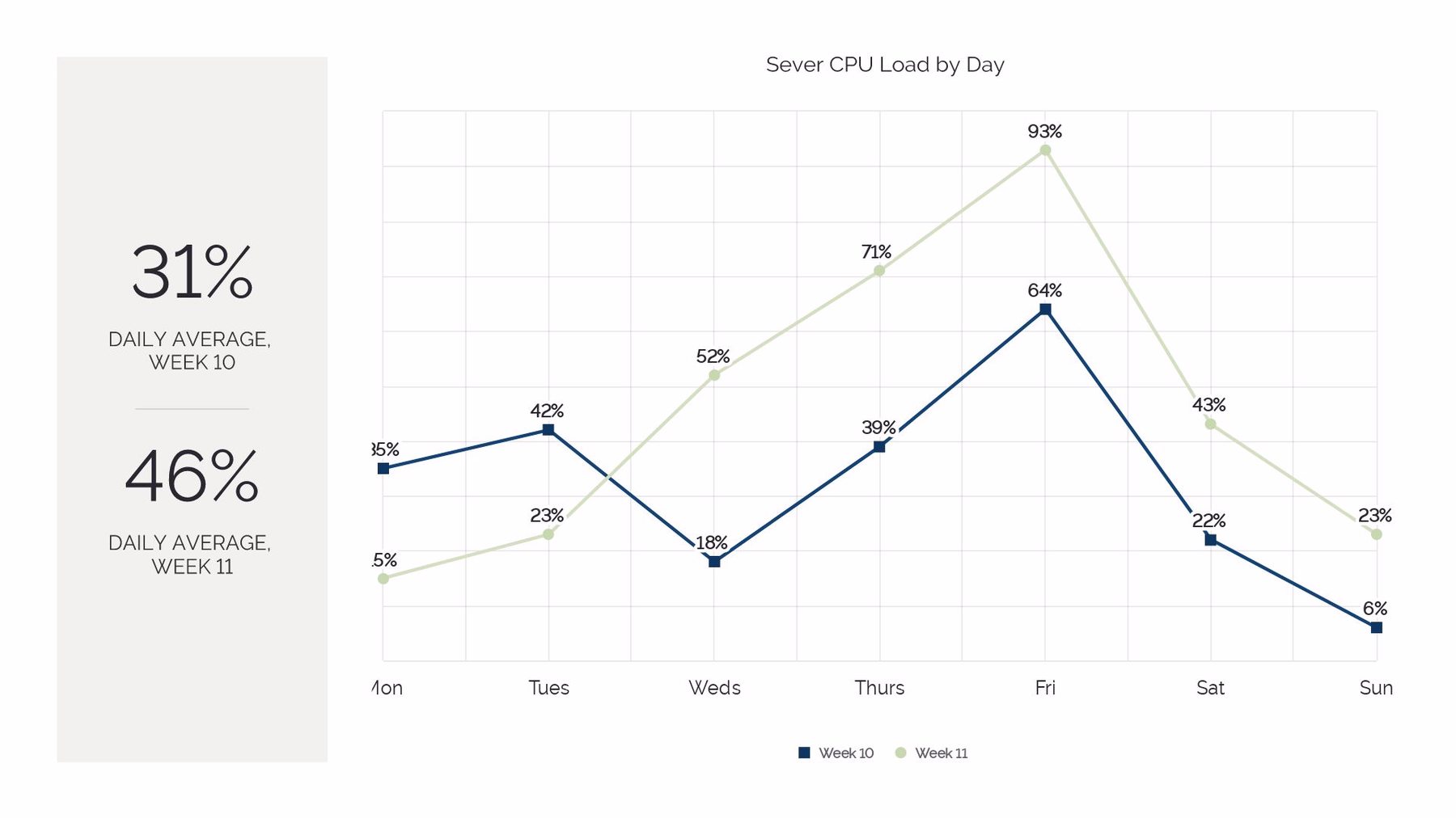
Line Chart
A line chart is a concise, visual way to show trends over time. The vertical y-axis on a line chart is usually the amount of something, such as dollars, number of sales, or number of customers. The horizontal x-axis typically uses time as a measurement. It could be years, months, weeks, days, or even hours. If you’ve never created a line chart before it can be overwhelming trying to get it right. Our line chart template is here to help. Simply plug in your pieces of data and we’ll create the chart for you with a few clicks.
If you’re comparing multiple items and using several lines on your chart, be sure to identify what each line represents by color. Label each axis with the numeric value or unit of measurement that you’ve used. You can add markers to each data point by clicking on the gear icon next to each data set, which can help to distinguish the separate metrics from each other. Because a line chart can be harder to digest, use color wisely. Make sure the color of the line is dark enough to be clearly legible. If you have multiple data sets make sure they are easily distinguishable from each other. For example, if there is a dominant set, reflect that with a contrasting color.
What information is your line chart displaying? If a line chart isn’t working for your story or data, you can easily toggle between other chart types with a single click. This allows you to see your content in different layouts without losing your work.


.gif)

.gif)
