


The presentation design process can be overwhelming, especially if you don’t come from a design background. And let’s face it, most of us don’t. Yet we’re still expected to create professional looking slides from scratch with little-to-no direction. Sounds impossible, right? That’s why many teams spend countless hours tinkering with their presentations only to end up with a mediocre deck at best. Here’s the good news: Beautiful.ai is like your own personal designer that you can keep in your back pocket.
We recognize the pain points in presentation design and created a solution for designers and non-designers alike. We handle the mechanics of designing the deck so that you can focus on nailing the content. With tools like customizable themes, Smart Slide templates, and a free image library, we take on the burden of the design to help save you time and money. Each slide has multiple variations, with design best practices in mind, so that you can easily choose which layout compliments your content best. The simple, intuitive controls make it easy to change fonts, colors, and themes instantly so that your presentation is always professional and on-brand. Even though our Smart Slide templates do a majority of the heavy lifting, there’s still a lot of room for creative license.
To help spark some creativity, our expert presentation designer is sharing a few tips— Beautiful.ai design unlocks, if you will— to help you achieve a unique, professional-grade presentation with just a few clicks. Things like using a tray next to a chart for emphasis, utilizing color, and exploring new “variations” are just a few things you can do to take your presentation to the next level.
Let us help you go from idea to design in minutes. These six design tips will help you create professional looking slides quickly and easily.
Cite data sources
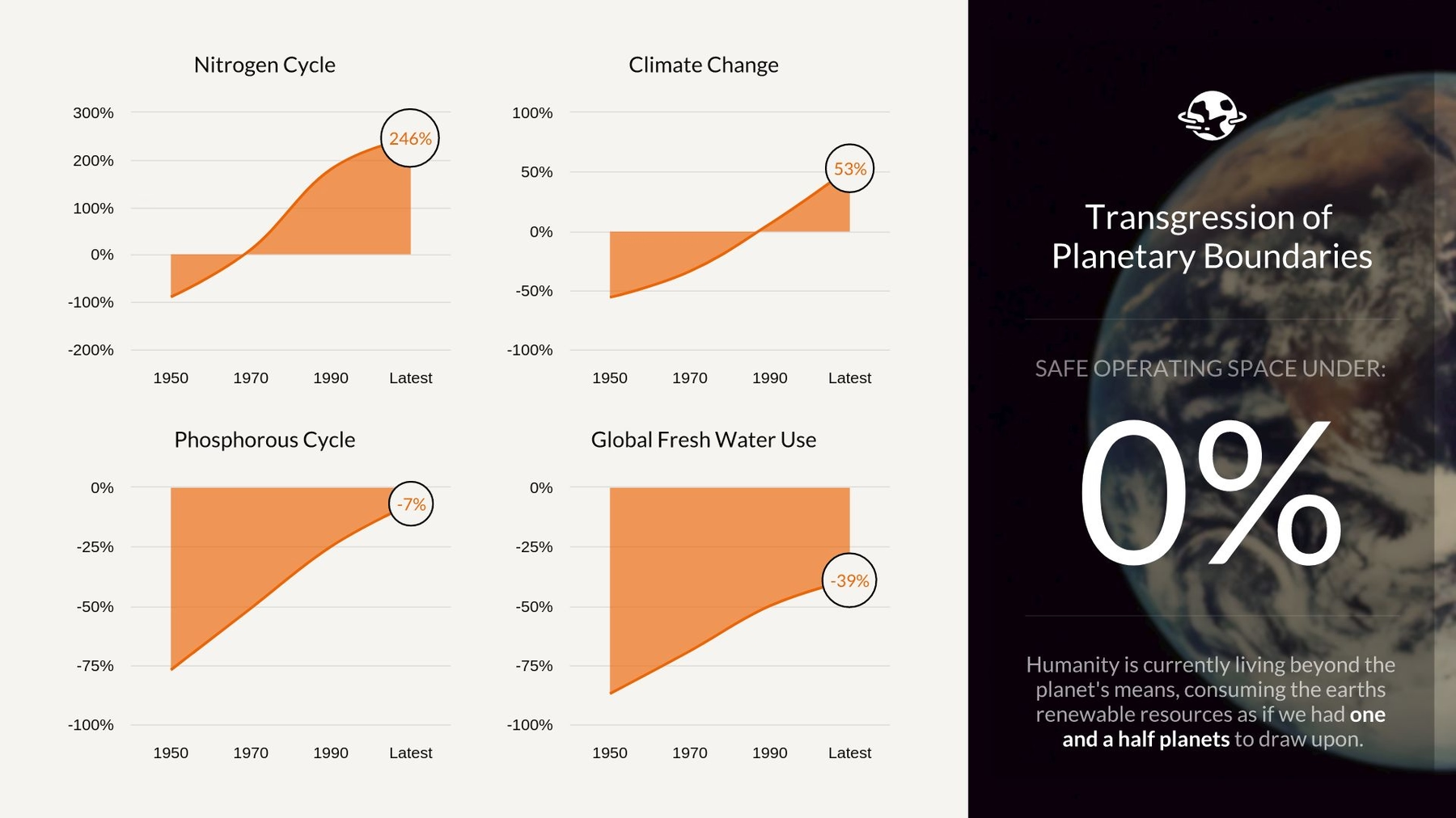
Add headers, footers, text, or images to any slide by clicking on the layouts menu in the bottom left corner. A “tray” can be used to cite or call-out data, share quick summaries, or to add complementary information and images. Bonus tip: you can also hyperlink to data sources within your presentation.
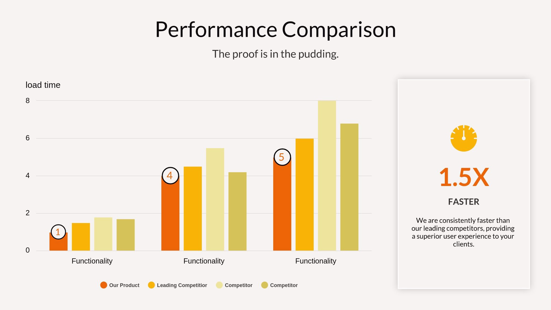
Highlight key points
If you’re feeling creative, exploring new ideas with Elements is a great starting point. Use Elements to create text boxes, shapes, and images to highlight key points or emphasize the most important section of a diagram or chart. The best part? You can move them wherever you want on your slide.

Change layouts in seconds
Click "variations" in the bottom right corner to easily switch between charts, diagrams, and slide types to tell your story beautifully. Play around with the different variations to see which layout fits best with your content. For example, you can turn your bulleted list into a photo list, or your bar chart to an area chart, and back again with a single click. This is a low-stakes way to experiment with new slide styles because you won’t lose your content and can always revert back to your original layout.
Explore chart styles
Within each chart or graph template you have the option to change the chart style or settings with a simple click. You can unlock adjustments such as “emphasized” sections, diagram size and shapes, or colors. A more specific example is that you can opt to change a section of your graph to "projection", which shows your growth up until that point and projected growth for the remainder of the year, on one slide.
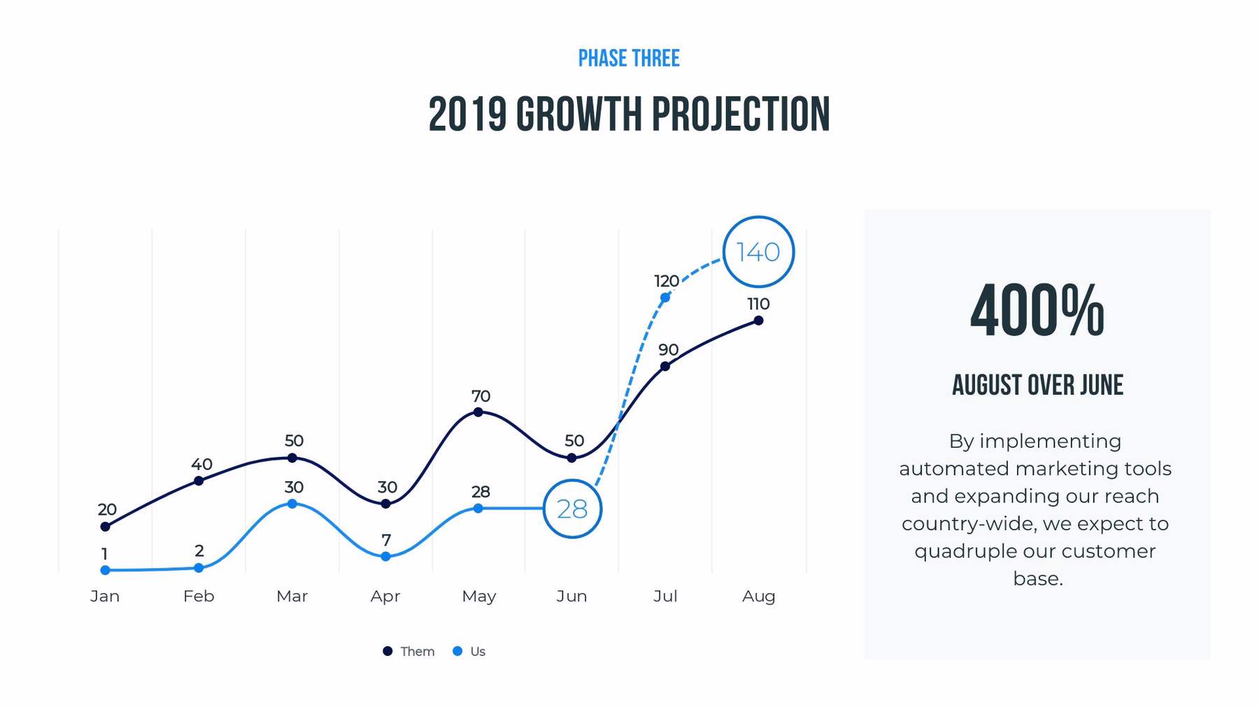
Use color to your advantage
When choosing colors for your graph or diagram, we suggest you choose a contrasting, bold color to show the most important data or key information. For example, you may want to use one color to represent your company’s growth and another (less bold) color to represent your competitors’.
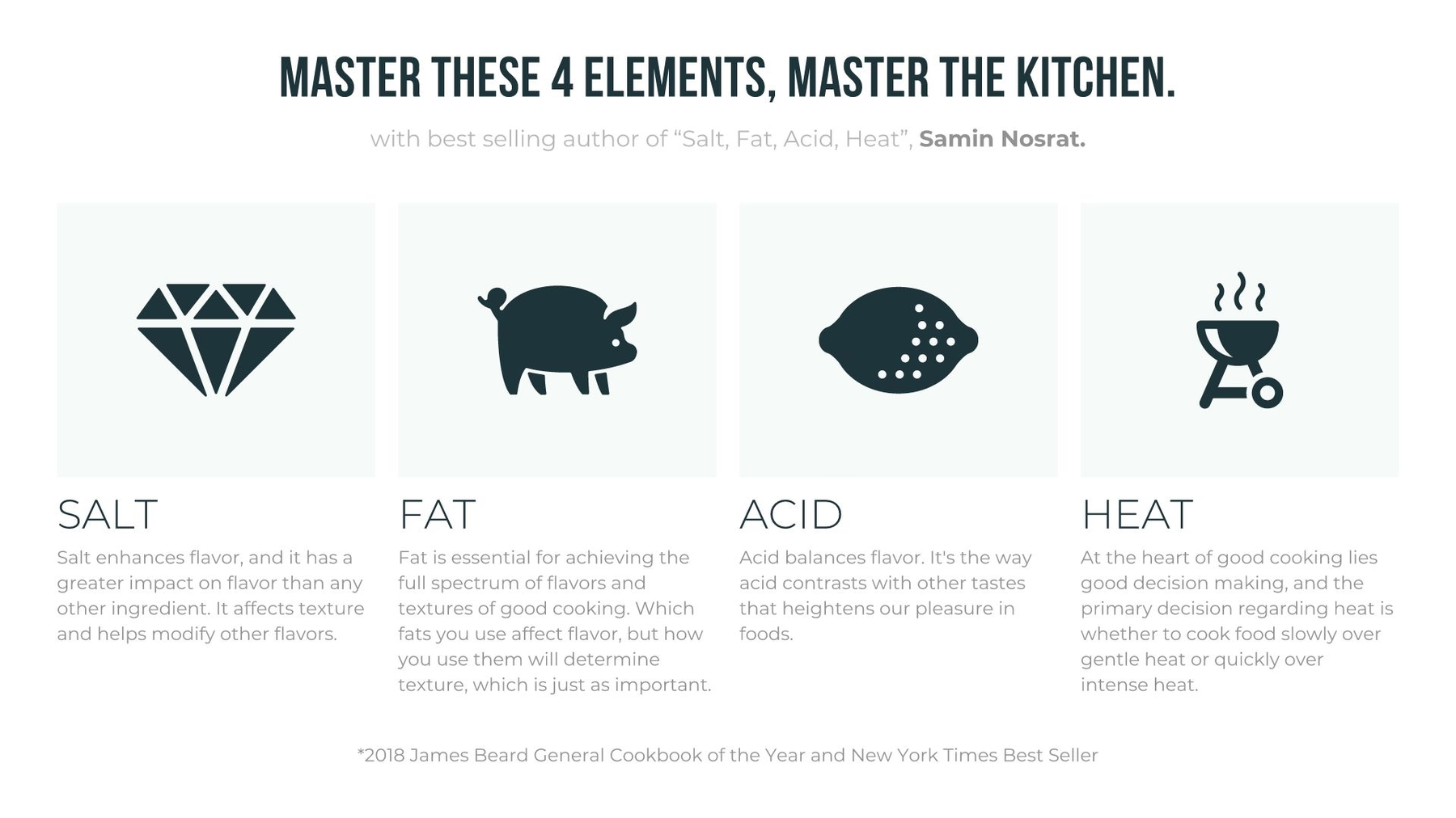
Make it visual
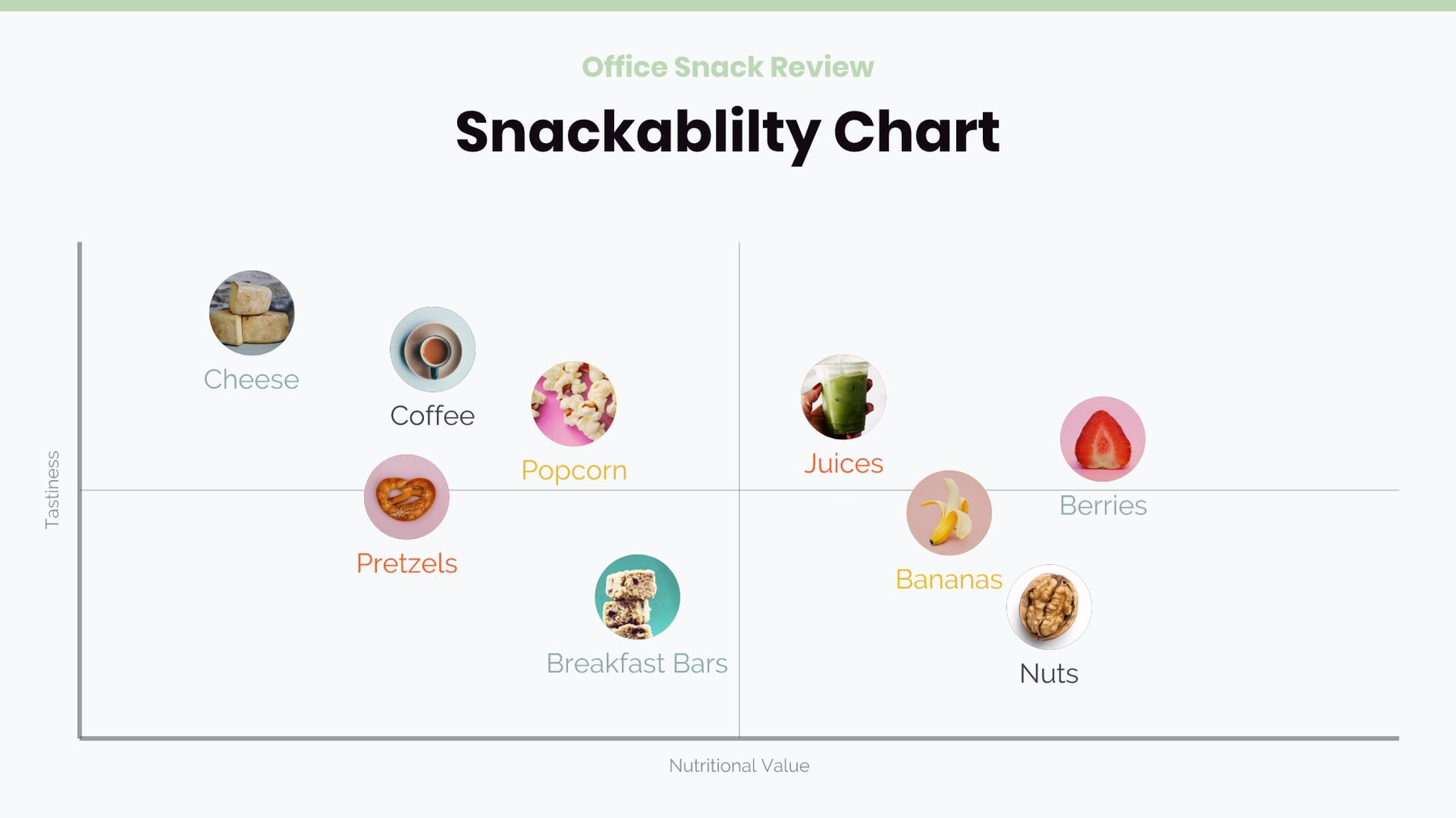
Humans are visual creatures. To add some pizzazz to your presentation, visualize your story with images and logos. For example, in the XY plot, quadrants, or floating circles templates, try replacing the circle with an image, logo or icon (with or without text). More specifically, you may want to add logos to a competitive landscape using the XY plot template. By using visuals, it makes the information easier to digest by your audience. Bonus tip: use a gif in place of a static image for a little more personality—or to show a snippet of a new product in action.


.avif)
.gif)
.avif)

