

Every presentation starts the same way. Blank slide, blinking cursor, a meeting on the calendar that is closer than you would like. The hard part is rarely the software. It is deciding what the thing should actually look like and what it should be about.
So here are 55 ideas you can use today. The first 25 are design moves that make any deck look considered. The next 30 are topics, grouped by who you are presenting to, for the times you have to present and have no idea on what. Take one, take ten. None of them require you to be a designer.
What makes a presentation idea work
A good presentation idea does one of two jobs. It either helps your audience follow you, or it gives them a reason to keep watching. Ideas that do neither are decoration. That holds even when you leave slides behind entirely, as in these creative presentation ideas without PowerPoint.
That distinction matters because most decks fail in a specific way. They are not ugly. They are crowded. Three points fighting for the same slide, a chart nobody can read from the back of the room, and a font that changed somewhere around slide twelve. Beautiful.ai calls that a Frankendeck, and once you have seen one you cannot unsee it.
The fix is usually subtraction. One idea per slide, one clear visual to carry it, and enough consistency that your audience stops noticing the design and starts hearing you.
There is a practical test for this. Put a slide on screen and look away after two seconds. If you cannot say what the slide was about, your audience cannot either, and they are hearing your voice on top of that confusion. Slides that pass the two-second test do the work of holding the thread while you talk. Slides that fail it compete with you.
The ideas below are organized around that principle. The design ideas make individual slides easier to read. The topic ideas give you something worth putting on them. Neither half requires design software you do not already have or a skill you need to go learn first.
25 creative presentation design ideas
1. Pick one font pair and commit
Two typefaces is plenty. One for headlines, one for body. Consistency reads as confidence. It also removes a decision from every slide you build after the first one, which is the real saving.
2. Size your type for the back row
If you would not read it on a phone at arm's length, it is too small for a projector. Headline type that feels slightly too big on your laptop is usually right in the room.
3. Let one word carry a slide
A single word in large type, alone on a slide, resets the room's attention. Use it to mark a section change or to land a number that matters.
4. Build your palette from your content
Pull two or three colors out of your product screenshot, your photography, or your logo. A palette derived from what is already on the slide always looks deliberate.
5. Use color to mark what matters
Grey out the context and color the point. When every element is bright, nothing is emphasized.
6. Try a two-tone deck
One background color, one accent, black or white type. When you have no time and no assets, this is the move that buys you the most credit.
7. Go black and white on purpose
Stripping color out forces the hierarchy to come from type size and spacing alone, which is a useful constraint. It photographs well too, on the day someone posts your slide.
8. Choose illustration when photography goes generic
Stock photos of people shaking hands say nothing. A simple illustration or icon set carries an abstract idea more honestly, and it will not date as badly.
9. Put text on a photo the readable way
Darken the image, or set your text on the quiet part of the frame. White type over a busy photo is the most common readability mistake in decks.
10. Give each idea its own image
One image per point. Two images on a slide compete, and the audience picks the wrong one.
11. Show the product instead of describing it
A screenshot with one thing circled beats three bullets about the feature. Let people see the thing.
12. Give every slide a margin
Pull your content in from the edges. Keep that margin identical across the deck. Nothing reads as amateur faster than text pressed against the frame.
13. Alternate your layouts
Six identical slides in a row flatten attention. Switch between full-bleed image, split screen, and text-only to give the eye a reason to re-engage.
14. Split the slide down the middle
Visual on one side, text on the other. It is the most reliable layout in presentation design because it gives the audience one thing to look at and one thing to read.
15. Work on a grid
Align your elements to the same invisible columns on every slide. Even when nobody notices the grid, they notice its absence.
16. Leave one slide almost empty
White space is a pacing tool. An almost-empty slide after a dense one tells the room that something important is coming.
17. Put one chart on a slide
If a slide needs two charts, it needs to be two slides. Beautiful.ai offers chart and data slides including line, bar, pie, waterfall, area, and donut, so splitting a busy data slide costs you nothing but a click.
18. Label the chart so the slide reads itself
Your axis labels and a one-line takeaway heading should let a latecomer understand the slide without you narrating it.
19. Pull the number out
When one figure is the point, set it in large type and let the chart support it underneath. Percentage with Icons is built for exactly this.
20. Animate the reveal
Bringing bullets in one at a time controls pacing. Spinning a logo does not. On Beautiful.ai's data slides, layouts and numbers resize as you edit, color logic is automatically applied to your charts, and animations bring your content to life.
21. Add a short video
Fifteen seconds of product footage or a customer clip breaks the rhythm of slide after slide, and it gives your voice a rest.
22. Build in a question break
Put a slide that just says "Questions so far?" at the one-third and two-thirds marks. It converts a lecture into a conversation.
23. Turn a section into a quiz
Two or three multiple-choice slides mid-deck wake a room up faster than any transition effect. This works especially well in training and onboarding decks.
24. Make the cover slide do work
Your title slide is on screen while people settle in, which makes it the most-viewed slide you will build. Give it a real headline instead of a project code name.
25. End on one clear ask
The final slide should say what you want to happen next. One sentence, one action, no logo wall.
30 presentation topic ideas by audience
Sometimes the deck is assigned and the topic is not. These are grouped by who is in the room, with the angle that makes each one work.
Topics for students and class projects
- A skill you learned outside of school. Teaching something you actually earned beats summarizing a chapter, and you will not run out of things to say.
- The history of an everyday object. Pencils, traffic lights, zippers. Ordinary objects have strange origins, and the visuals are easy to find.
- A local problem and three realistic fixes. Specificity carries this one. A problem your audience has personally encountered lands harder than a national statistic.
- Two competing theories on one question. Structure the deck as a debate and let the room decide at the end.
- A myth in your subject most people still believe. Opening by dismantling something the audience assumed is true buys you their attention for the rest.
- How a technology you use daily actually works. Pick one you can diagram. The gap between using a thing and understanding it is where the interest lives.
- A person in your field who deserves more credit. Biography gives you a natural narrative arc, which is the hardest thing to build from scratch.
- A study that got something wrong. Explain the flaw, then propose how you would run it differently. That shows judgment, which recall never does.
For a longer list built for class projects, see our 50 college presentation ideas. There is also a guide to choosing visual presentation ideas for students, and one on presenting complex science topics.
Topics for work and team meetings
- What changed in our market this quarter. Keep it to three shifts and what each one means for your team specifically.
- The process on our team that wastes the most time. Bring the number of hours. A quantified complaint becomes a proposal.
- A postmortem on something that did not work. These are the most useful internal decks and the rarest, because nobody volunteers to give them.
- What we learned from our last ten customer conversations. Quotes land harder than summaries. Use their words on the slide.
- A tool or workflow the team should adopt. Show the before and after of one real task. Feature lists persuade nobody.
- Our numbers, explained to someone outside the team. Forcing yourself to explain your metrics to a stranger usually reveals which ones you do not understand either.
- A six-month roadmap and what would knock it off course. The risks section is what makes the audience trust the plan.
- An onboarding walkthrough for the next person hired. Build it once and it keeps paying out.
Running a leadership or training session? Our presentation ideas for leadership teams go deeper on that format, and we have separate write-ups on team presentation icebreakers and diversity and inclusion training.
Topics for sales and client meetings
- A before-and-after built from a real customer's results. One customer told properly beats five logos on a slide.
- The three questions prospects ask most, answered up front. Answering objections before they are raised reads as confidence.
- A walkthrough of the first thirty days after signing. Buyers worry about implementation more than features, and almost nobody addresses it.
- The head-to-head comparison the buyer is already making privately. They are running it with or without you. Running it openly means you frame it.
- What our product does not do, and who it is wrong for. Disqualifying yourself from a bad fit builds more credibility than any case study.
- A pricing explanation with the math shown. Walk through how the number is arrived at. Presenting it as a fact invites suspicion.
- One customer's story, start to finish. Problem, decision, rollout, result. Give them the full arc.
There are more of these in our creative sales presentation ideas.
Topics for social and team-building
- An unpopular opinion you can defend for five minutes. The defense is the fun part, so pick something you can actually argue.
- Rank something everyone has an opinion about. Airports, cereals, decades. Rankings generate argument automatically.
- A hobby nobody at work knows you have. Low effort, high payoff, and people remember it for months.
- Your camera roll, curated into a story. You already have the assets. All that is missing is the running order.
- A conspiracy theory, argued badly on purpose. Commitment to a deliberately terrible thesis is reliably funny.
- Teach the room something useless in three minutes. The more pointless the skill, the better this works.
- The best and worst purchases you made this year. Two columns, real numbers, genuine regret.
If the occasion is a party rather than a meeting, our PowerPoint night ideas are built for that.
How to turn an idea into finished slides
An idea only helps if it survives contact with the deck. Three things make that easier.
Start from a layout instead of a blank slide. Smart Slides are templates that intelligently adapt to your content as you work, so the design adjusts as you type instead of breaking. You never start from a blank slide again.
Set your styling once. Brand kits apply your brand fonts, colors, and logos across every slide, or let you preview new layouts in your styling. That is what keeps idea 1 and idea 4 from unravelling by slide twelve.
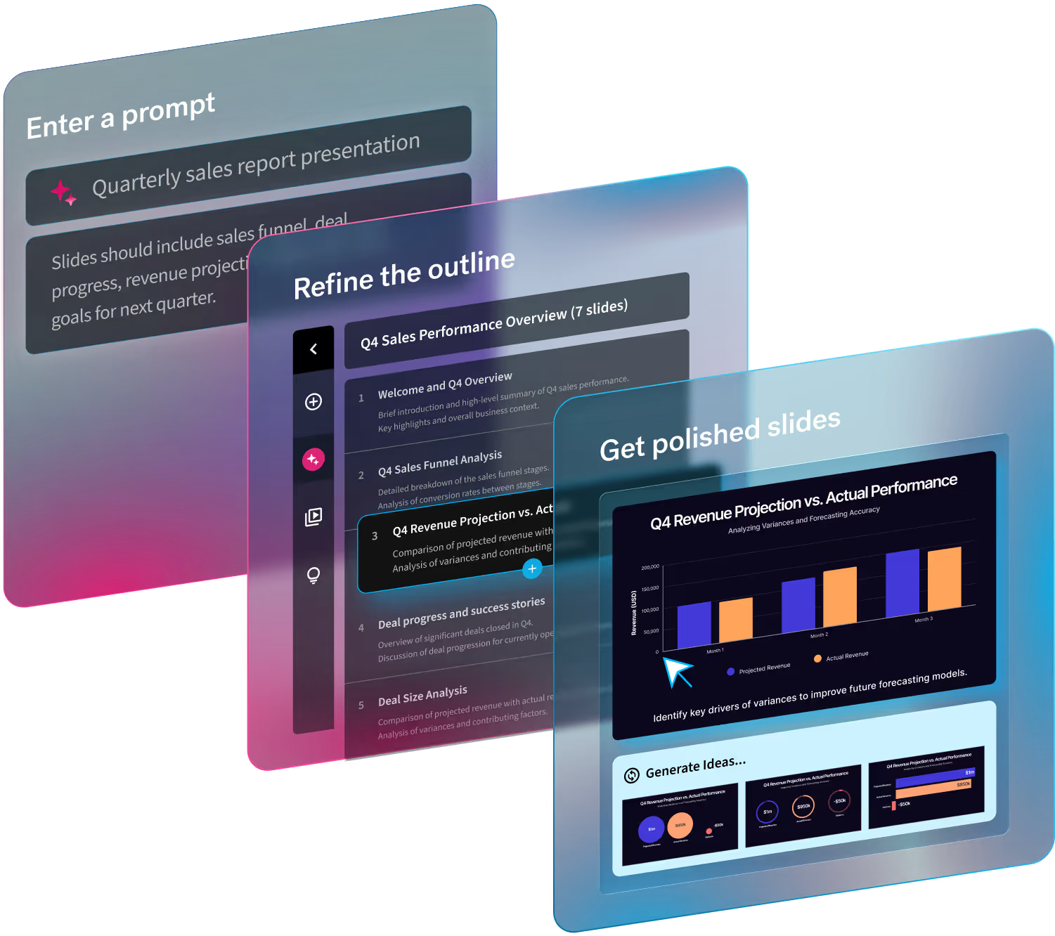
Try layouts without retyping. You can explore multiple Smart Slide layouts, all while preserving your exact copy and numbers, which makes the alternating-layout idea practical instead of tedious. If you would rather start from a prompt, choose your brand kit, image source, language, and AI image style before you generate.

.avif)

.avif)
.avif)