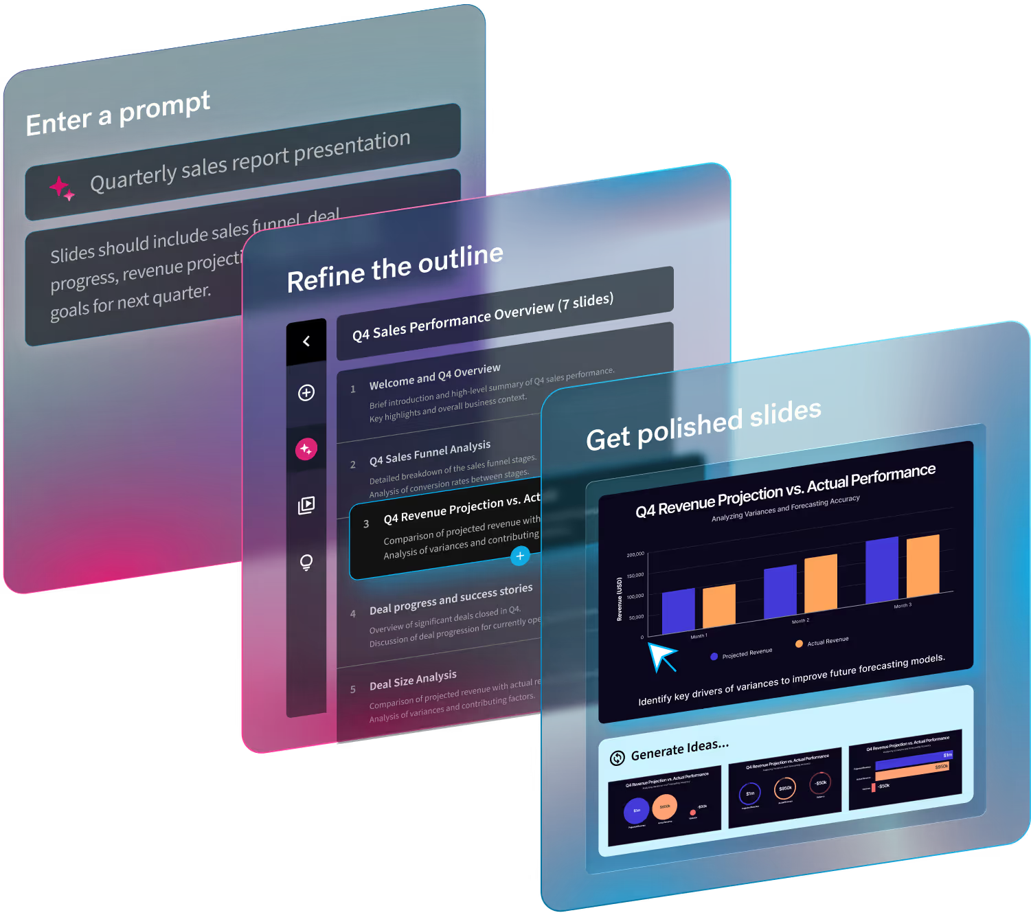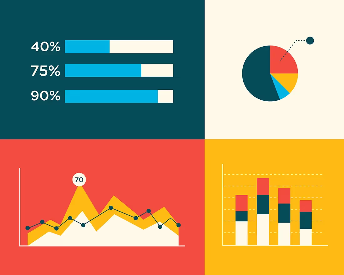
Any avid presenter will tell you the importance of data visualization. If you’re new to presentations (welcome), data visualization is the representation of data, numerical information, or statistics through graphics, images, infographics, or other supporting visuals. Many presenters will use data visualization to better engage their audience so that the information is easier to digest. Since the majority of your audience are visual learners, using data visualization will help your story land better. In fact, people are 65% more likely to remember what they saw if it’s packaged up with strong visuals.
All that to say, different types of charts and graphs can really take your presentation to the next level with a more successful outcome. And that’s the goal, right? But how do you know which types of graphs you should be using? When pitting charts vs. graphs, there are different variables to consider to achieve the best visualization for your story.
In this blog we share why graphs and charts are important for your team’s presentations, and the types of graphs and charts you need to know in 2022.
Why graphs and charts are important
As we mentioned above, data visualization can be the difference between your audience taking action and forgetting everything you said. At the end of the day, your presentation should be prompting your audience to take action, whether that’s to change their perspective on a topic or get them to sign on as a client. And like it or not, data can help you persuade your audience better than words can.
We know that numbers don’t lie and are a strong way to back up your story, but that doesn’t always mean they’re easy to understand. By packaging up complex numbers and metrics in visually appealing graphics you’re telling your audience exactly what they need to know without having to rack their brain to comprehend it. Graphs and charts are important in your presentation because they take your supporting statistics, and story, and make them more relatable.
Different types of charts and graphs
Of course, there are countless different types of graphs and charts to choose from, and knowing which is best for your story can be a challenge. Below are 7 types of graphs and charts that your team needs to know and should be using in 2022.
Flowchart
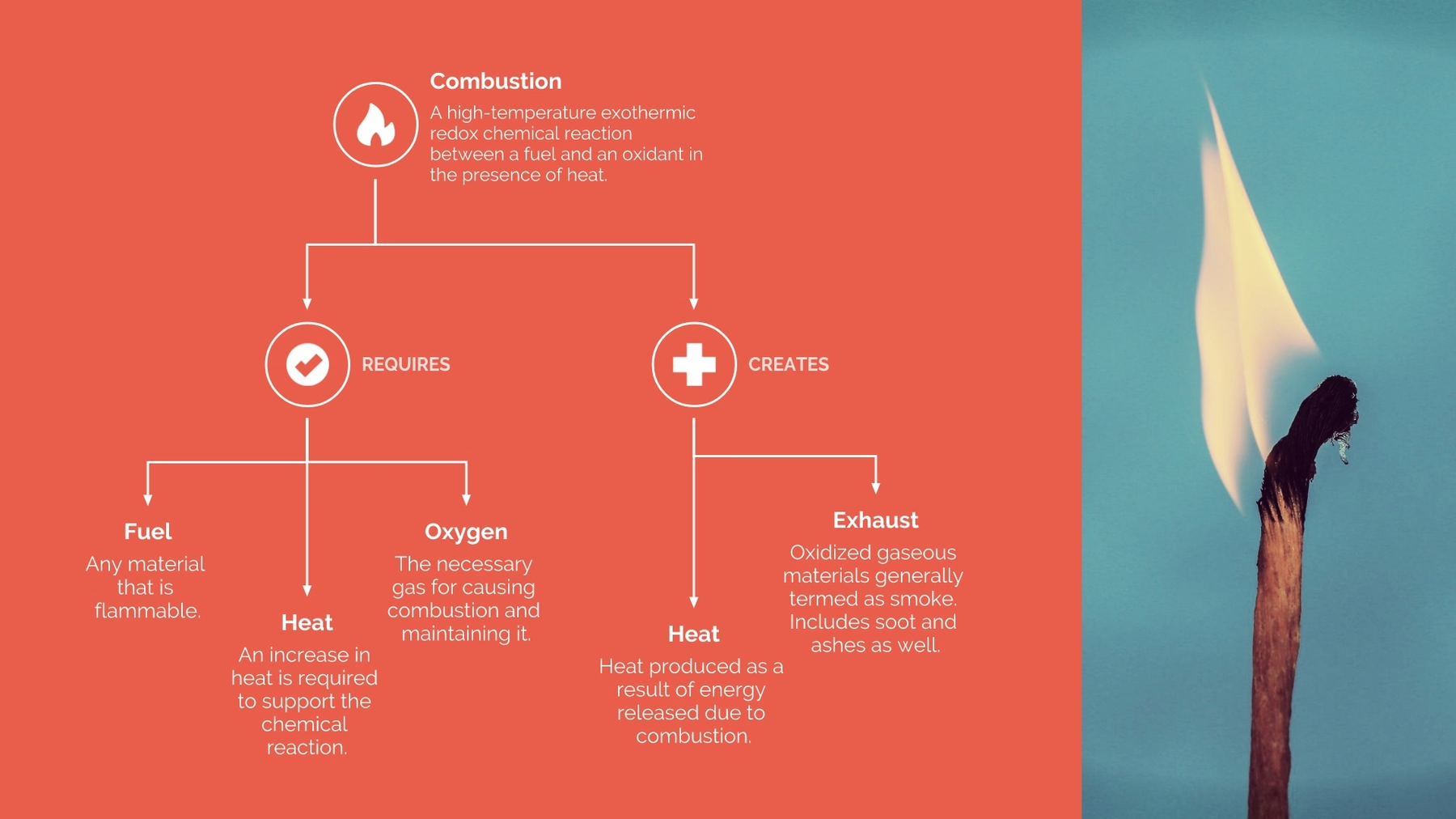
A flowchart is a diagram that shows the sequence of steps and decisions needed to perform a process. Each step in the sequence is noted within a diagram shape. Steps are linked by connecting lines and directional arrows. This allows anyone to easily and logically follow the process from beginning to end.
Timeline or journey
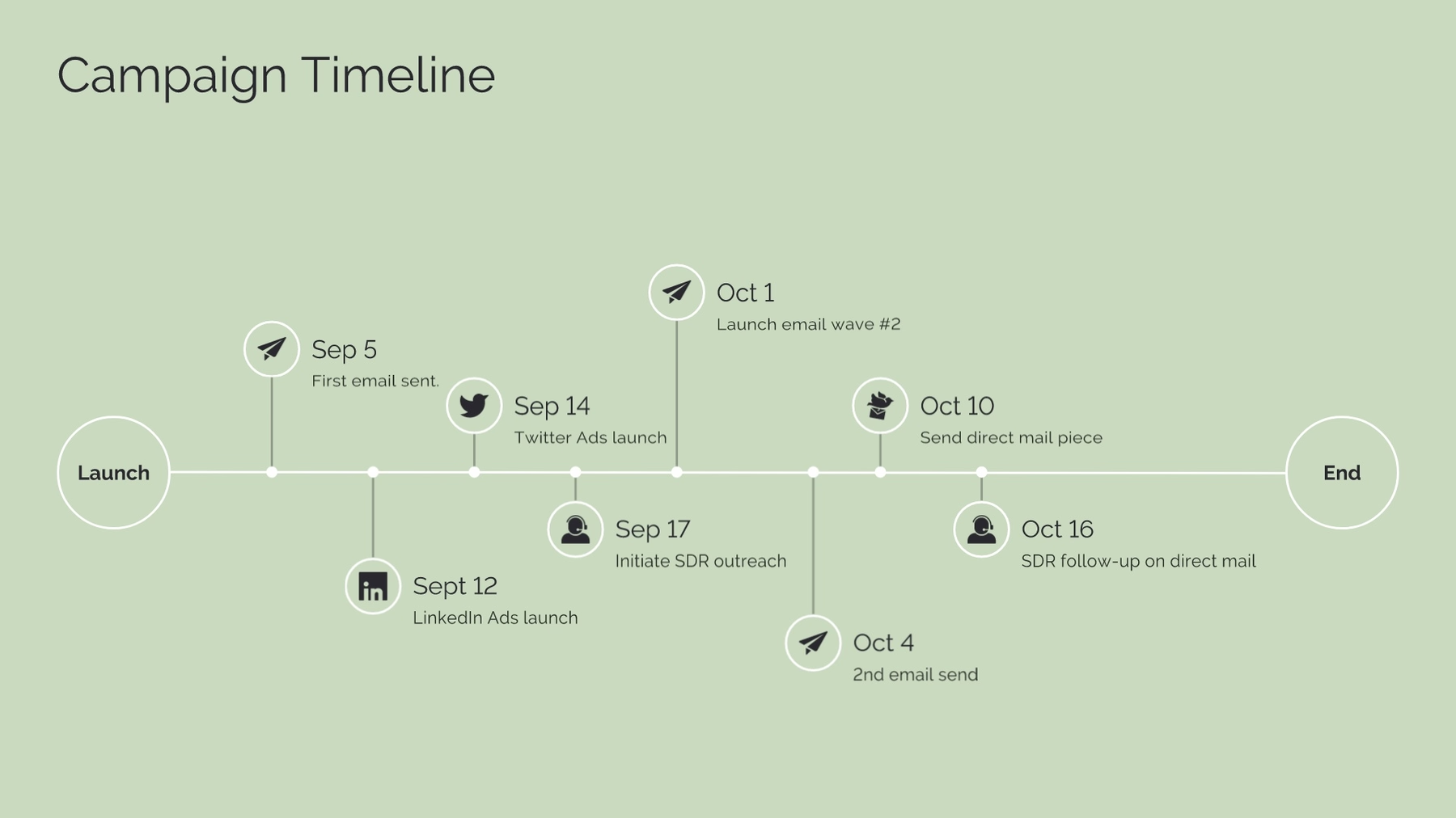
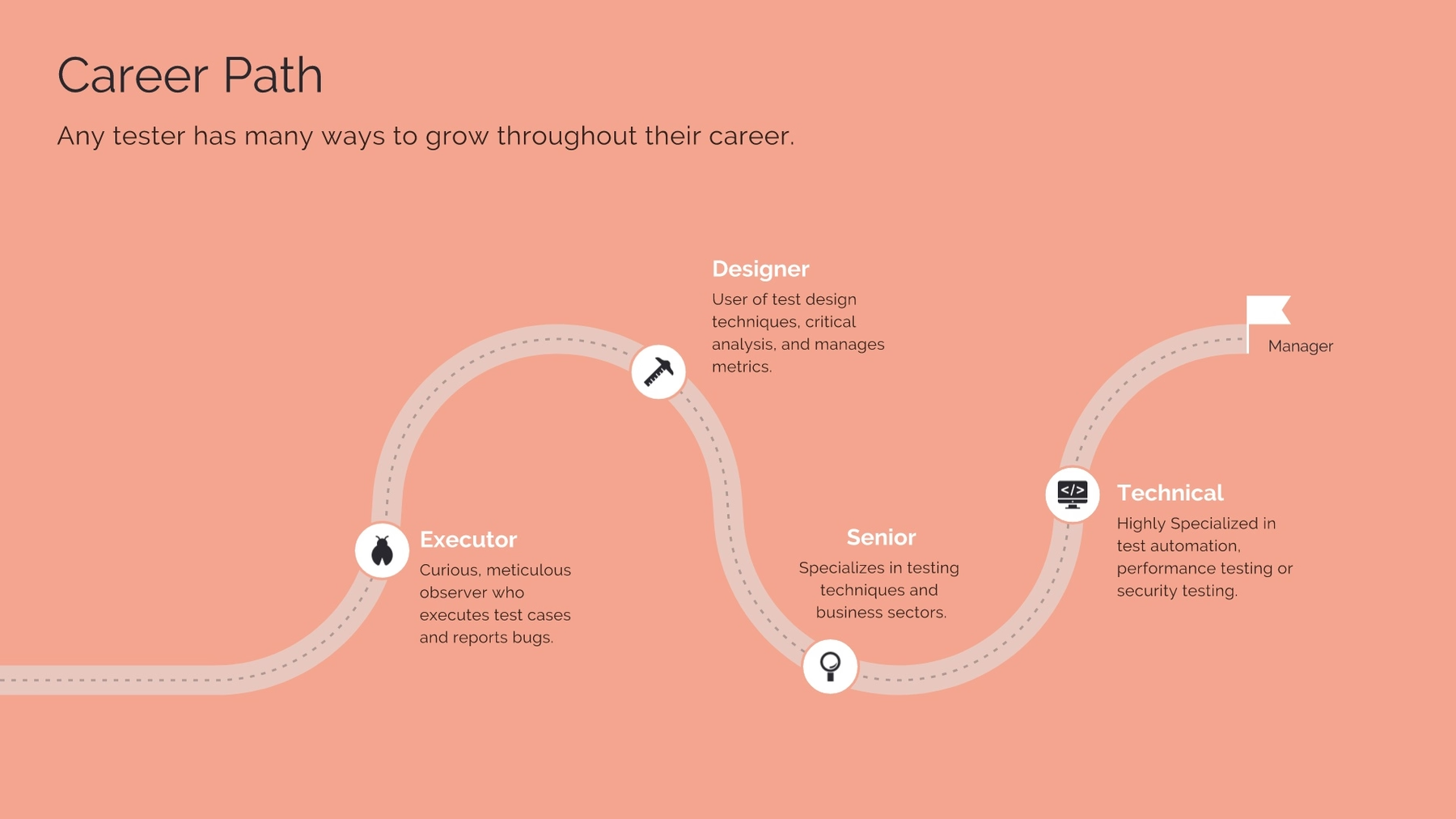
A timeline is a visual representation marking all major events over a period of time. Timeline slides have many versatile uses—everything from project plans, to status updates, to “next steps” can be communicated using a timeline. They are most often used for business purposes, but can also be useful for better illustrating scientific and other highly technical processes.
Sometimes our paths aren't linear. Ups, downs, highs, lows— a straight, flat timeline or list of bullet points doesn't communicate those nuances. With our new journey template, we created a winding twist on the classic timeline to give you more options for communicating the sequence of events over an abstract period.
Infographic
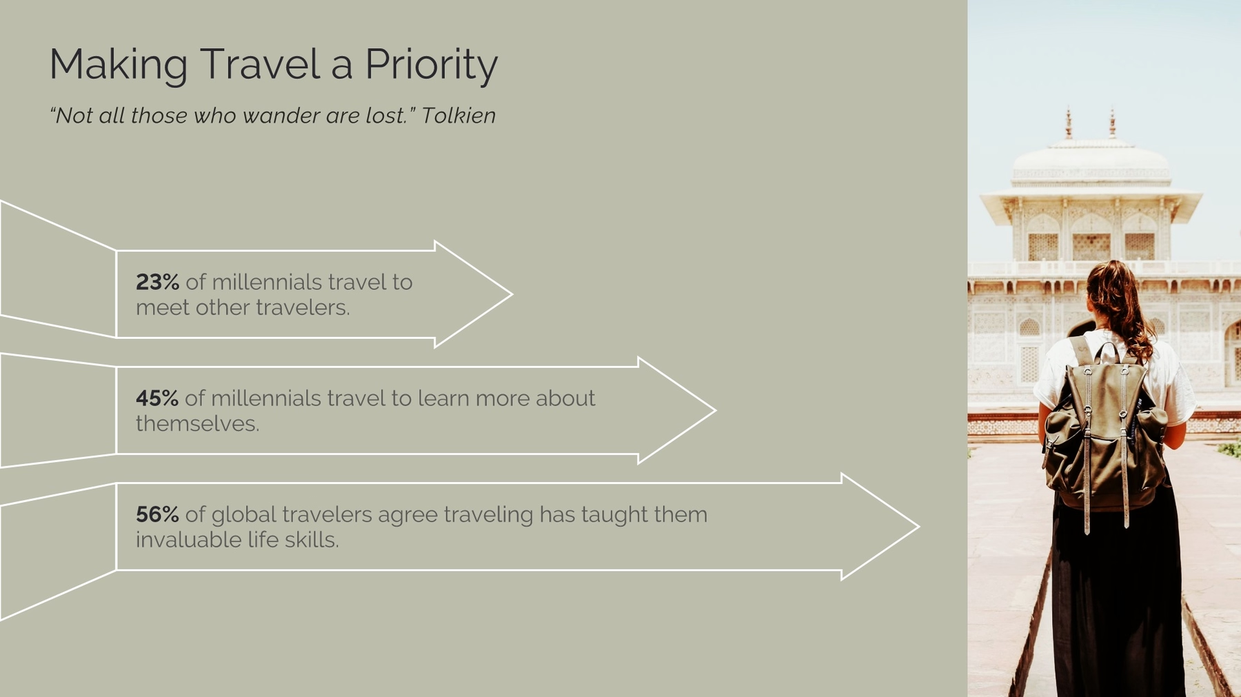
Need to dress up a plain list of data? An infographic presentation slide displays your data in an interesting, impactful way. Instead of adding a regular bullet list to a slide, an infographic slide uses arrow bars to organize your data. Arrows can imply relationships or movement between data points, explain steps to achieve a goal, or make any list in your presentation look well-designed.
Thermometer
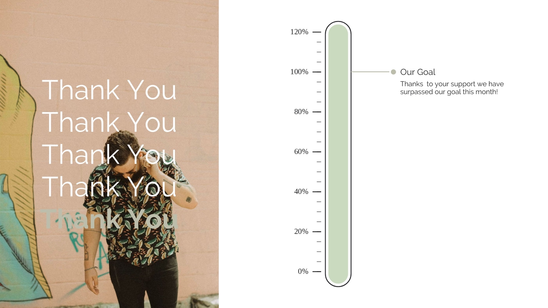
A thermometer slide template uses a thermometer to show the percentage of a value. A thermometer graphic looks like a classic thermometer. Essentially, it’s a vertical graph with numerical values instead of degrees. The “temperature” is the shaded part in the thermometer graphic, which usually represents a defined value.
Data comparison
For a visually interesting twist on a plain bar chart, add a data comparison slide to your presentation. Our data comparison template is similar to a bar graph, using bars of varying lengths to display measured data. The data comparison template, however, displays percentages instead of exact numbers. One of the best things about using our data comparison slide? You can customize it for your presentation. Create a horizontal or vertical slide, remove or add grid lines, play with its design, and more.

Pictograph
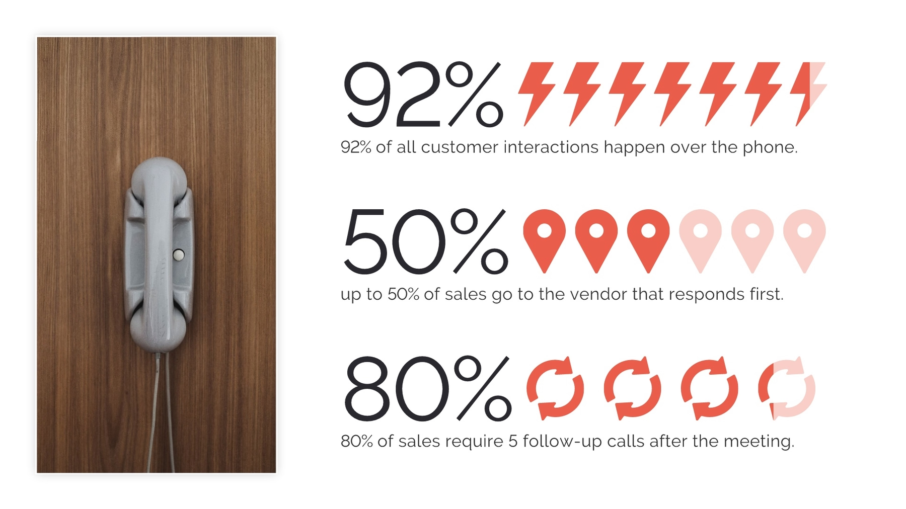
We know that over 65% of people are visual learners, so use that to your advantage. To make sure your presentation is memorable, consider adding a pictograph template. A pictograph template uses repeating rows or a grid of icons to represent data. Also called an icon chart, picture chart, or pictogram, pictographs display data in a simple, compelling way.
Donut chart
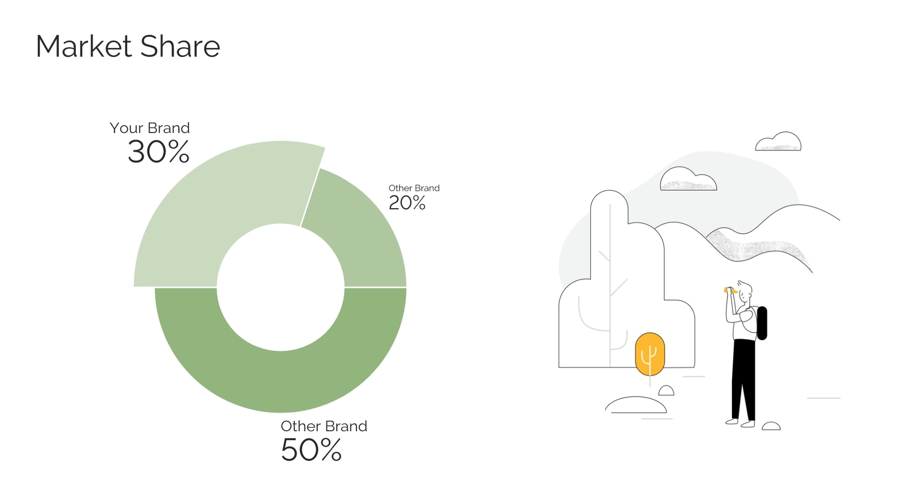
You may notice that a donut chart looks like another popular type of diagram where each of its slices represents a proportional relationship of parts to a whole: a pie chart. While a donut chart is essentially the same as a pie chart in function, with its center cut out, the “slices” in a donut chart are sometimes more clearly defined than in a pie chart.
How your team can rethink data visualization in 2022
Gone are the days of staring at a blank presentation slide trying to figure out how to create a decent-looking chart or graph. Beautiful.ai’s Smart Slide templates give you a jumping off point so you can focus on your story instead of the nitty gritty details of slide design. Because our Smart Slide templates are pre-built and handle the heavy lifting of design, it’s low-stakes to toggle between different layouts and variations to see which type of graph or chart might tell your story the best. In 2022, your team can rethink how they structure their story by browsing our inspiration gallery of curated slide templates and let the designs spark your creativity. Once you’ve selected and customized your Smart Slide, we recommend experimenting with other visual elements in 2022 like animations, audio (voice-over or soundtracks), and video to really take your presentation up a notch.

.gif)
.gif)


