

We’ve all been there: in the audience of a less-than-exciting presentation. And there’s nothing scarier than a bad presentation (not even Michael Myers on Friday the 13th). When you have your finger on the pulse of presentation trends, it’s easy to pick out what makes a good presentation, and what makes a bad one. You’ve heard us talk about Frankendecks time and time again. It’s a term that has become increasingly popular in the presentation world, but we recognize that not everyone knows what it means as it relates to deck design.
In the spirit (see what we did there) of Halloween, we’re breaking down everything you need to know about Frankendecks, what they are, and how to avoid them in your next presentation.
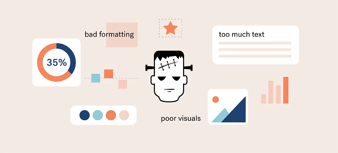
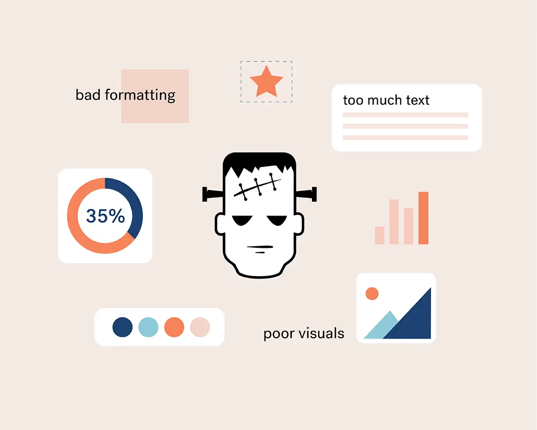
What are Frankendecks?
Whether you realized it or not, you’ve probably encountered a Frankendeck (or 10). Urban Dictionary describes it as, “A deck of PowerPoint slides that's been repeatedly added to over the years without ever having anything removed. Hideously overgrown and disorganized, it's developed an out-of-control, audience-killing, twisted life of its own.” Basically, a Frankendeck is an excruciatingly bad presentation. It’s the cause of “death-by-PowerPoint”, and it’s more common than you may think. A Frankendeck might not seem scary, but it can sway how your story is received by your audience, which can ultimately affect the bottom line of your business. And there’s nothing more frightening than losing out on money, or a potential new client, when you’re trying to scale (just ask any entrepreneur).
Characteristics of a Frankendeck
Luckily, the characteristics of a Frankendeck are easy to spot (which makes them easy to avoid). While Frankendecks aren’t one-size-fits-all, and can take on many different forms of life, these are the top four most common characteristics.
Inconsistent branding
A Frankendeck will often have a disturbing amount of colors that don’t necessarily complement each other. Similarly, the fonts might be too small, outdated or unprofessional. The slides within the deck will look like a hodgepodge of different themes, and you’ll lose the element of trust and familiarity with your audience.
Cluttered slides
As Urban Dictionary points out, a Frankendeck is often added to by various team members, year after year, without actually removing anything. This results in cluttered slides. When we say cluttered, we mean overlapping photos, lengthy blocks of text, too many bulleted points, and various ideas on each slide. Slides like this make it hard for the audience to pinpoint the presentation’s key point, and it will be wildly difficult for them to follow along.
Asymmetry
We’re not all professional designers, and that’s okay. But that doesn’t mean that asymmetrical slides should make it out in the wild. We’re talking about sloppy photo collages, text boxes that aren’t aligned properly, and too many words crammed in each text box. To be frank, asymmetrical slides just look sloppy and have no place in client-facing decks.
Low quality visuals
Picture this (pun intended): you’re in the audience of a presentation and an image pops up on a slide but you can’t quite make out what it is. It’s pixelated, sized all wrong, and doesn’t flow with the rest of the content in the presentation. What you have just witnessed is a key characteristic in a Frankendeck. We’re visual learners, so low quality visuals can single handedly kill the retention rate of your audience.
How to avoid Frankendecks with Beautiful.ai
You put a lot of effort into creating your last presentation. We get it, you’re passionate about telling your story. But your hard work is pointless if your presentation isn’t effective. Not to worry, we’re here to help you avoid the infamous Frankendeck with these simple tips.
Custom themes
In Beautiful.ai we have custom themes to help keep your slides consistent and on-brand throughout the entire deck. Before you dive into the deck design, you can customize your theme with your own color palette, fonts, and logos (when applicable), and those selections will automatically be applied to each slide in your presentation. Having a consistent theme makes your deck look clean, professional, and reliable.
Pre-built presentation templates
Even non-designers can thrive in Beautiful.ai. Our pre-built presentation templates are curated by industry experts so that there’s something for every story, every team, and everyone. Browse our inspiration gallery to help kick start your creative juices, and customize the deck with your own content. Using a pre-built template helps you lay out your ideas without cluttering each slide with a cluster of information. Think of our templates as a guideline for what should, or shouldn't, be included on the slide.
Smart Slides
Asymmetry is never an issue in Beautiful.ai. Our Smart Slide templates use design best practices to keep your slides organized and in check. Your text boxes and images will always be aligned, sized correctly, and properly formatted. And don’t worry, even if you don’t know what you’re doing, our Smart Slide templates will tell you when you’ve added too much text so it’s nearly impossible to make an ugly, disproportionate slide.
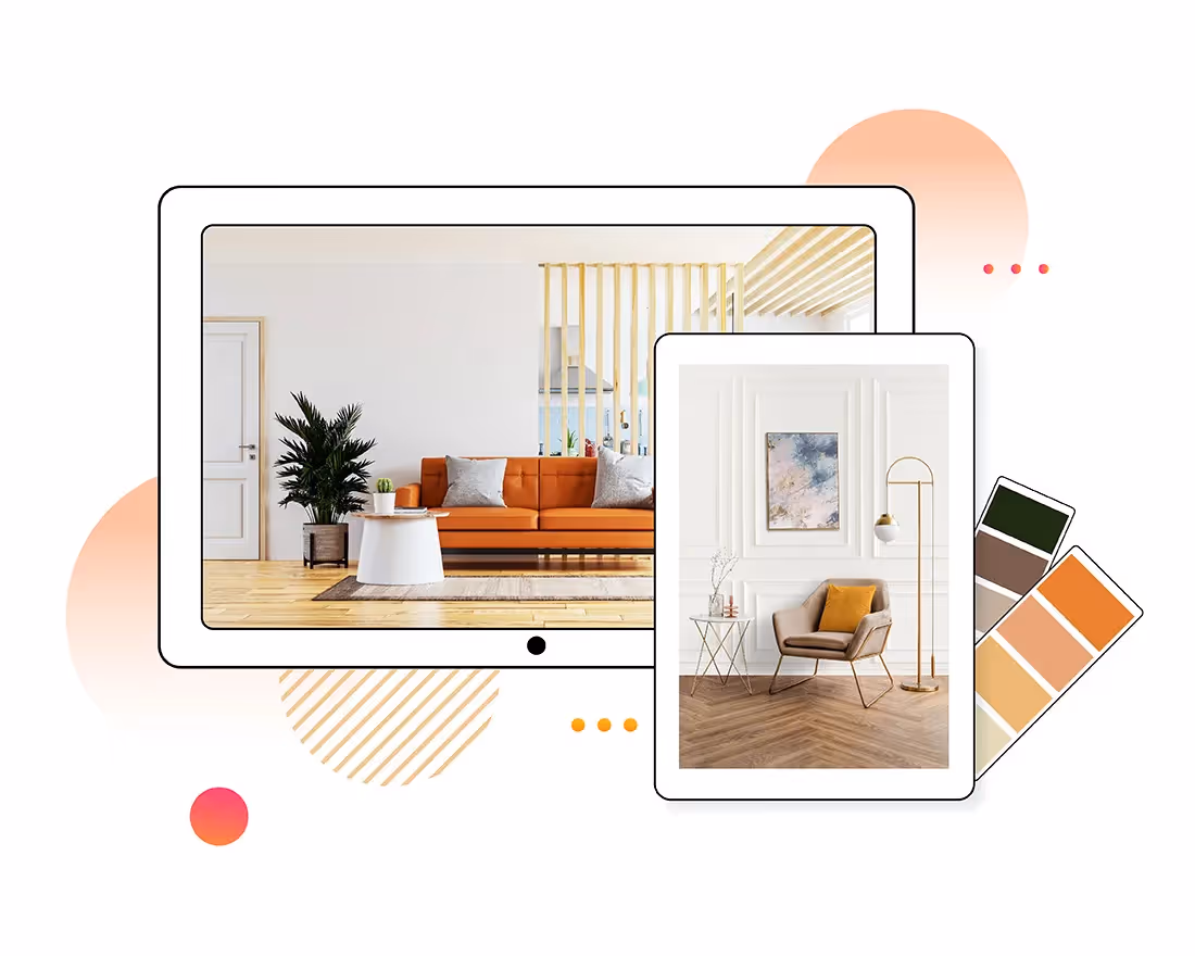
Stunning visuals
Supporting visuals can make or break your presentation. Luckily in Beautiful.ai we have hundreds of thousands of high-quality assets at your fingertips. Search our vast library of free icons, logos, and photos right from within the product to see what fits best with your content. Your images should always be on-brand, and in line with the story you’re trying to tell, and we’re confident you’ll find the right visuals in our product.


.avif)

