


Traditionally, there’s nothing sexy about data. We’re here to change that. Sure, we know that data helps prove a point or drive your message home, but in most cases it’s pretty hard to digest. Hitting your audience with a number heavy slide likely won’t move them to take action. Why? Because they won’t retain the information. We’re now in an age where visual information runs the show—and rightfully so considering 65% of people are visual learners. So what does this mean for your presentation? You’ll want to turn your data into a story and grab their attention from beginning to end.
To bring your story to life, you may want to use infographics. An infographic slide blends data with text and visuals to tell a persuasive story. Instead of adding a snooze-worthy bullet list to a slide, an infographic presentation template uses diagrams to organize your data in a more visually appealing way. An infographic presentation slide can imply relationships or movement between data points, explain steps to achieve a goal, or make any list in your presentation look well-designed. And, of course, they make it easier for your audience to digest the information.
Here’s the good news: we can make your data look beautiful with one of our many infographic slides. Here are three easy ways to create an infographic presentation slide using our Smart Slide templates.
Map out content
Use our flowchart template to show processes, explain connections and more. This could be anything from a customer journey to auditing a specific process within your organization. A flowchart is a type of infographic that shows the sequence of steps and decisions needed to perform a process. Each step in the sequence is noted within a diagram shape. The steps are then linked by connecting lines and directional arrows. This allows your audience to easily and logically follow the process from beginning to end, so they know exactly what your key takeaways are.
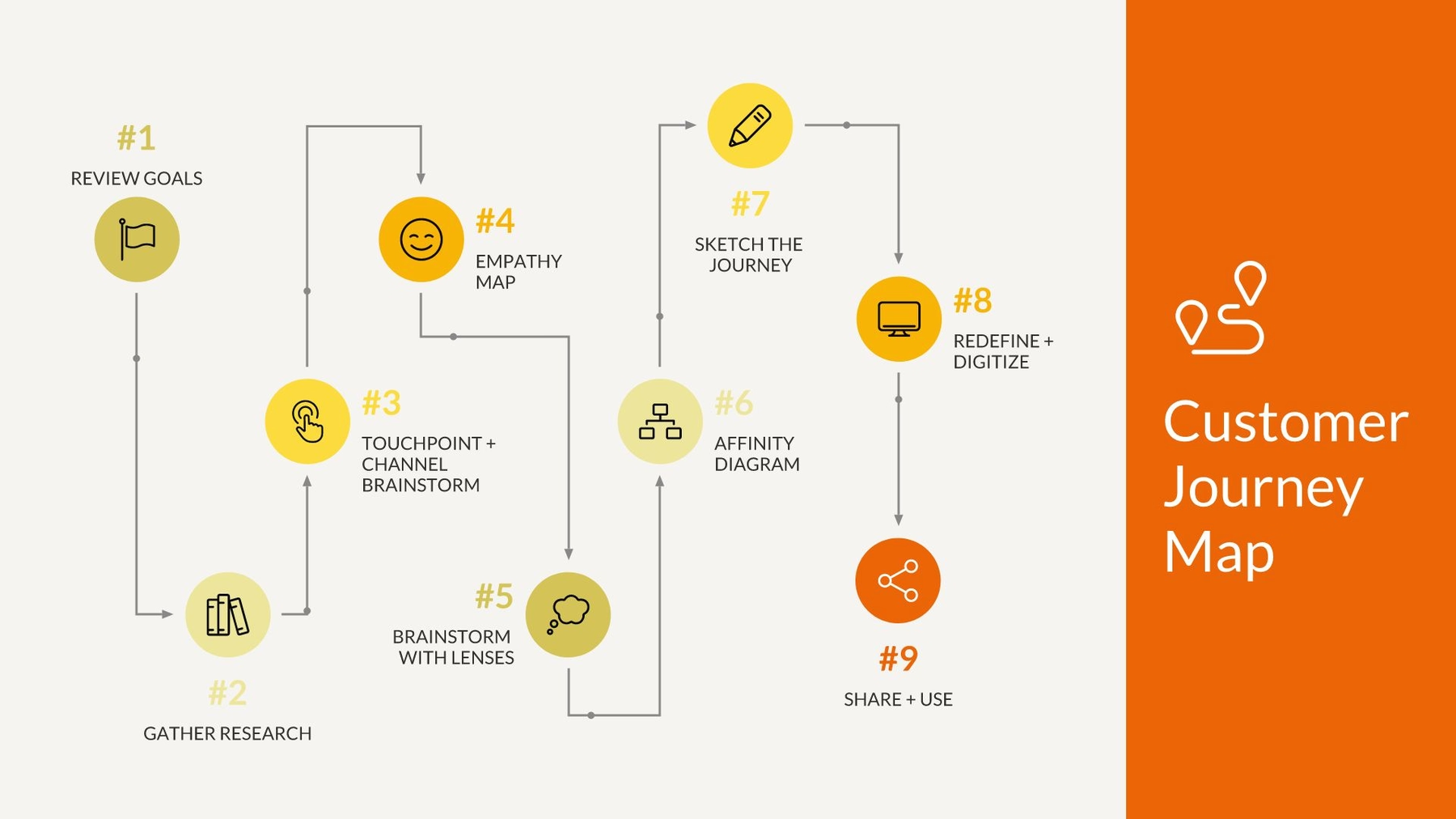
A flowchart infographic slide template is great for process documentation, auditing a process for inefficiencies or malfunctions, or mapping computer algorithms.
Pro Tip: If you’re explaining steps in a process in your infographic slide, number each shape. Comparing percentages? Place the percentage in or around each diagram shape.
Reflect demographics
You can use the arrow bars or percentage template to display audience information and demographics. The arrows help set your data points in motion by showing any growth, steps, or corresponding relationships. Similarly, the percentage template (or pictograph) uses repeating rows or a grid of icons to represent data. Also called an icon chart, picture chart, or pictogram, pictographs display data in a simple, compelling way so that your data is loud and clear.
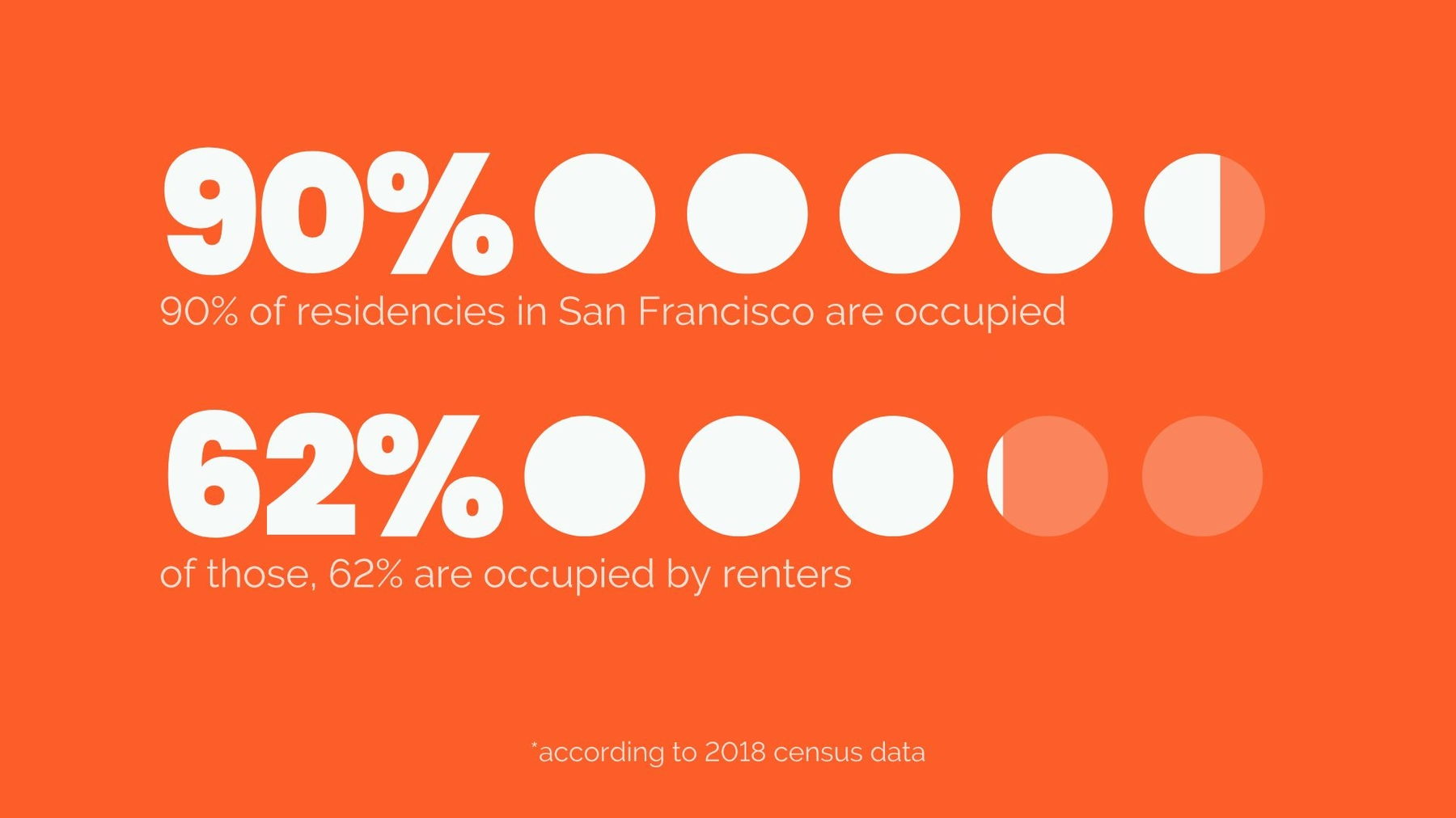
You may choose the arrow bars template to share important data visually, lay out steps in a process, or show relationships between different data. But to report progress to a goal, add variety and visual interest to your presentation, or make statistics memorable and impactful you might use the percentage template.
Pro Tip: A longer arrow bar implies a larger number or percentage. Make sure the size of each bar in your list is proportional to your data.
Visualize market share
Use a comparison slide to plot share of voice. For a visually interesting twist on a plain, old bar chart, add a data comparison infographic slide to your presentation. Our data comparison templates are similar to a bar graph, using bars of varying lengths to display measured data. The data comparison infographics can be composed of comparison slices, bars, or circles, and will usually display percentages instead of exact numbers. One of the best things about using one of our data comparison infographic presentation templates? You can customize it for your story. Just make sure your data makes a statement and steals the show.
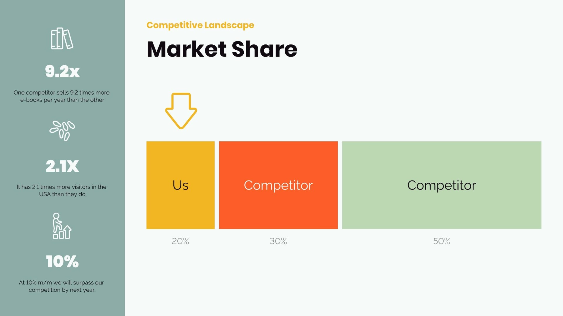
A compare slice infographic slide can be used to track data changes, point out trends or patterns, or show data in percentages.
Pro Tip: Give each block a unique color, add animations or transitions, or play around with fonts and sizing to make your infographic slide template pop.
Ready to get started with one of our infographic presentation templates? Search infographics in Beautiful.ai when you add a slide to any presentation and slide template options will appear.


.gif)
.gif)
.gif)
.gif)
